Pros
- Clean ribbon-based interface removes the clunkiness of the older PowerPoint
- New animations pane makes it easy to tweak effects
- Cool new (and modern) themes to wow your audience
Cons
- New user-interface concertinas several ribbons into one forcing a slight learning curve
Our Verdict
In terms of features PowerPoint is at least the equal of the former version but in terms of usability it’s advanced significantly. It really is commendable that Microsoft has managed to concertina so many features into a ribbon-based interface that can even look Spartan at times despite the power on offer. Above all, however, the clunkiness of the old PowerPoint is a distant dream. The new PowerPoint feels positively nimble.
As with other apps in the new Office, updates to PowerPoint are there largely to keep it synced with the Windows release. Thus you get the same collaborative/co-authoring tools, plus the ability to connect with OneDrive, as well as new slide transitions.
Read more Office for Mac 2016 reviews: Word for Mac 2016 review | Excel for Mac 2016 review | Outlook for Mac 2016 review
Wondering when the final version will launch? Keep up-to-date with the rumours at Microsoft Office for Mac release date rumours
There’s only really one big new feature outside of the global updates, which is a pane that appears at the right of the screen when an animation is applied to an on-screen element. Previously what there were of these options were scrunched-up at the right of the Animations ribbon or assigned to the now-banished Inspector/Toolbox floating window (provided you had it open or even knew of its existence). With a pane all to themselves, the myriad of tweakable options are in plain sight of the user and easily adjustable.
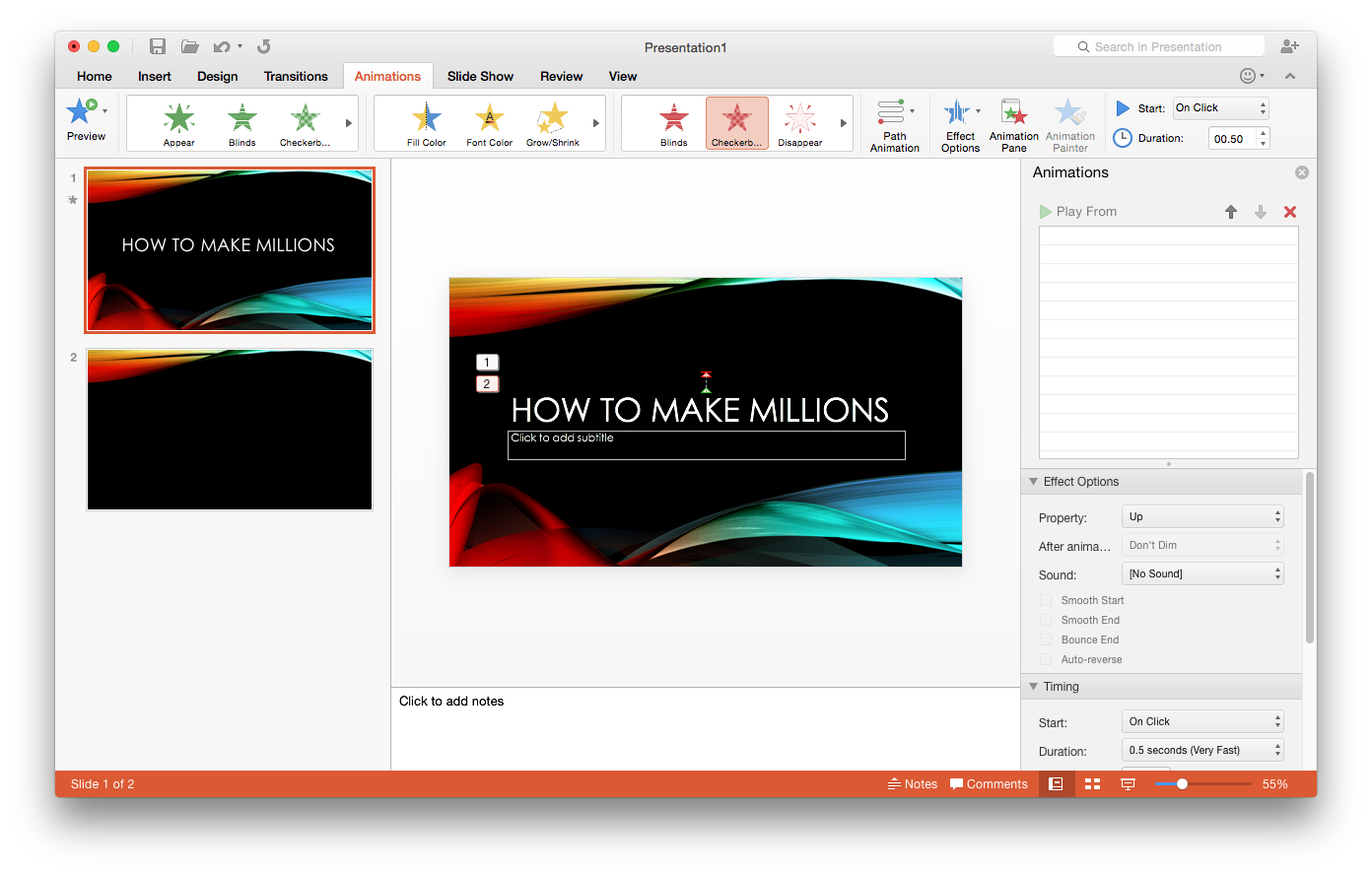
Switch to viewing comments via the status bar button switches the side pane to a tabbed view, where a Comments tab shares space with the new Animations tab. Notably, tabs can be “torn away” just like browser tabs to create a new floating window, so the Inspector/Toolbox lives on in perhaps in spirit.
Check out the rest of our Office 2016 previews: Excel for Mac 2016 preview | Outlook for Mac 2016 preview | Word for Mac 2016 preview
Outside of the collaboration/cloud features mentioned earlier, however, the benefits of the new release are found mostly in the improved interface. The number of ribbon toolbars has again been rationalised, with the Tables, Charts and SmartArt ribbons now finding a home on the Insert ribbon. The Themes ribbon has been swapped for a Design ribbon, although otherwise appears mostly the same, while there’s an entirely new View tab that lets you switch between Normal, Outline, Slide, Notes, and Handout views without needing to use the menu or status bar. Although this degree of redesign might spook those who’ve been using PowerPoint 2011 for a long time, the reality is that it’s all common sense and the clean user interface design clears-up any risk of ambiguity. Everything’s the same. Just better.
Presenter mode, wherein you can attach an external display to show a presentation while seeing a preview plus notes on the Mac’s built-in screen, has also been visually overhauled so it sleek, and not as clunky/1990s as the previous release. It’s also gained a button that lets you switch between the main and built-in displays quickly.
As with the other Office apps, the Scrapbook has been banished.
Read:
PowerPoint for iPad vs Apple Keynote