
Pros
- Lollipop genuinely moves forward the mobile OS
- Both iOS and Lollipop look great with bold designs
- Lollipop optimised even for older devices (unlike iOS right now)
Cons
- Android’s app store is rubbish. End of story
- Android owners probably won’t get an upgrade to Lollipop anyway
- Lollipop can’t integrate with desktops so no Handoff or Continuity
Our Verdict
Brace yourself. I hate to say it but Lollipop might be a superior operating system compared to iOS – or at least iOS in its present state. Personally, I still prefer iOS, and I think you might too, but that’s the key issue – it’s now a matter of taste, rather than rejecting Android because it’s so woefully poor quality, as was the case in the earlier 4.x releases. Things I haven’t mentioned here but I admired include Lollipop’s ability to let setup multiple user accounts (useful for sharing your phone or tablet with kids), and the ability to unlock via a Bluetooth smartphone. But a top-spec feature list is nowhere near the full story. Most of what makes Android unique is available in the App Store for iOS too, such as Google Now, Chrome and Google Docs/Drive. And Lollipop does little if anything to address Android’s many weaknesses – the poor app store, for example, where innovation is rare and most apps are simple knock-offs designed to churn ad revenue. Or the fact that tablets are a mere afterthought for most Android app developers, or the fact Android is fragmented out in the real world thanks to a lack of upgrade paths provides by manufacturers, or Android’s simply huge malware problem, or the distinct lack of regard for security (somewhere iOS excels). Google is attempting to crack down on some of these issues but the ultimate tragedy of Lollipop might be nobody gets to use it in its pure form thanks to manufacturer fiddling/personalisation, and a lot of Android owners won’t get to see it at all thanks to no upgrade option – or at least not until their one or two-yearly contracts are renewed with a new device. By that point Android will probably have moved on yet again.
In this comparison review we will pitch Apple’s iOS 8 against the latest offering from Google, Android 5.0 Lollipop, if you are an iOS user you can see exactly what you are missing.
iOS 8 v Android Lollipop: Setup and the cloud
Unsurprisingly, setting up both iOS and Lollipop involve being pushed towards cloud services – iCloud in the case of Apple, and the Google Drive/Gmail ecosphere in the case of Google. Which is better? That’s another article in itself, but privacy for our confidential data has to be a key issue and we take to heart what Tim Cook said recently. As for Google, well, your data is the unit of currency for their services.
First use of Lolipop involves frequent step-by-step start-up wizards pointing out new features, along with pop-out balloons telling you where things are and how they work. It gets baffling very quickly, even for those who have minds that easily take-in such information, and makes for a stuttered introduction process because you’re frequently held-up going to where you want to be – the equivalent of walking down the high street and being accosted by survey takers and chuggers.
Apple offers gentle training with the Tips app, new to iOS 8 and which pops up weekly notifications, but other than a handful of very brief clues here and there, the whole raison d’etre of iOS is not to require instructions. To paraphrase Steve Jobs when he was talking of styluses on touchscreens: if your OS or apps require instructions then you’ve blown it.

Apple’s Tips app trains users gently but most of iOS is designed to be intuitive
iOS 8 v Android Lollipop: Look and feel
The look and feel of iOS 8, and introduced with iOS 7, is infamously Marmite – people love it or hate it. Although dangerously close to being ideological in its push for flatness and to banish skeuomorphism, few would argue that the look and feel introduced with iOS7 wasn’t bold – and boldness is what Apple does best.
However, when many are forced to use accessibility tools such as bolding text, reducing contrast, or turning off animations in order to make an interface acceptable – as they were with iOS 7 and then 8 – then something has gone wrong. Amazingly, no fixes were offered in iOS 8 aside from a few more accessibility controls to tone things down.
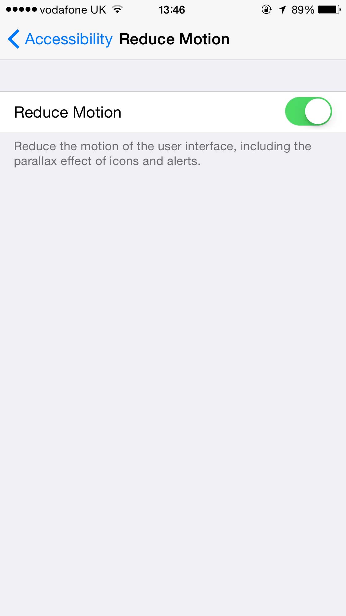
Accessibility tools in iOS to do things like reduce zoom effects are considered an essential feature for many Apple users
Lollipop also isn’t ashamed to make bold use of colour, although in a more restrained way as part of its quirkily-named Material Design concept. Icon text has shadow in Lollipop – something banished from iOS on aesthetic grounds, but without it it’s impossible to view to app icon labels against most wallpapers.
Gone is the any-colour-so-long-as-it’s-dark approach of earlier Android and in its place are mostly white backgrounds in apps like Settings. Google invented the card-based approach, which utilises the visual metaphor of the user shuffling through index cards, and it’s in heavy use in Lollipop in the task switcher (called Overview), in Google Now (see below), and in apps like Settings in order to differentiate various sections. Aesthetically it can be a little stark but it does the job very well.

Lollipop makes heavy use of the cards visual metaphor, and it works very well
Read: iOS 9 release date rumours and features wishlist
iOS 8 v Android Lollipop: Launcher
All of the above is somewhat moot because, ultimately, the Android device manufacturers are likely to skin Lollipop with their own icons and wallpaper choice in order to create product differentiation. Thus, they are the ones who’ll decide how Lollipop looks to most users.
When it comes to launching apps, or doing just about anything, everything is animated in Lollipop. Open the phone app from the lock screen, for example, and it expands out in a screen-consuming circular fill. Apps scroll-up from the bottom of the screen when activated. Even buttons and switches are animated. This is always functional as well as fun, and there’s never animation for the sake of it – Google says that “motion [must] provide meaning”. Arguably this is true of iOS 8 too although some people find the rapid animations a little jarring and a little flashy. To quote a friend of mine, “I don’t need Safari to explode out of its icon at me. I just want it to open quickly.” It feels as if Lollipop has the benefit of hindsight following such criticisms, and is much more restrained.
iOS 8 v Android Lollipop: Notifications and widgets
iOS 8 introduced widgets to Notification Center. These provide quick access to various app functions – everything from seeing the latest news headlines to quickly creating and viewing notes, provided you have the right apps installed. It works well so long as you frequently use Notification Center (I don’t). Lollipop continues Android’s ability to add widgets to the launcher alongside app icons if there’s space, or letting you add widgets to launcher pages of their own. Arguably, this is a superior approach and certainly more intuitive – the ability to wake your phone and then view vital information provided by a widget, before you tap a nearby app icon, is simply more efficient.
Notifications appear at the top of the screen within Lollipop, much like in iOS, and some have buttons that let you switch to the app for certain features (such as replying for emails). Dragging down from the top of the screen reveals the notification center on both operating systems, although with Lollipop you can continue dragging to access the Control Center, which is virtually identical to that in iOS. It even includes a new Flashlight option if your device has an LED flash.
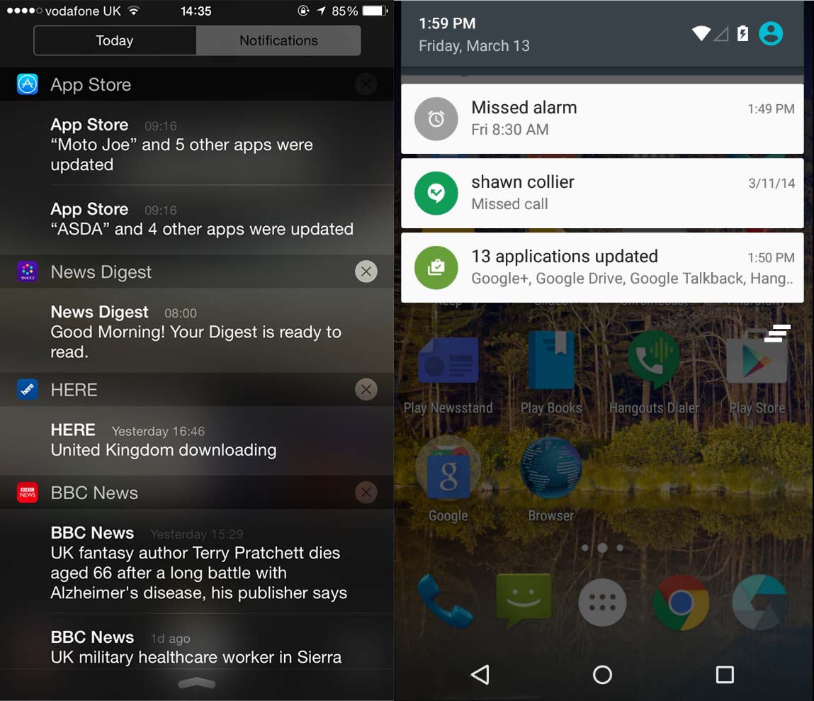
Lollipop’s notifications and iOS notifications both drop down from the top of the screen, and are visible on the lock screen too
Tapping and holding a notification in Lollipop reveals details of the app itself – a nice touch – and you subsequently can tap to choose if the app can keep notifying you. This is good for easily dealing with pestering game notifications, for example. Additionally, clicking the hardware volume control on the side of the phone or tablet lets you set whether you want to deactivate notifications entirely (and for optionally how long, measured in hours), or whether you want to switch to priority notifications only (and again with the possibility of setting a time limit). Yes, iOS has a similar feature in its Do Not Disturb mode, configured via the Settings app, but Lollipop’s approach really puts to rest the idea that Android merely copies iOS. There’s some real innovation going on.
iOS 8 v Android Lollipop: Task switching
iOS’ multitasking system lets you switch between apps by double-clicking the Home button. This hasn’t evolved a great deal in recent times and the addition of Favorites and Recent contacts to the top of the screen in iOS8 has annoyed some. However, switching apps remains fiddly and more work than it could be.
In Lollipop’s Overview system, brought up by tapping the square hardware button on a device or the on-screen control, each browser tab from Google Chrome appears as a separate card, alongside apps. This is an example of what Google calls “document-centric” working. Theoretically other apps can take the same approach of splitting out individual files as individual cards too – word processing documents might have their own cards, for example, or movies you’re playing.

iOS’ multitasking screen hasn’t changed much since being introduced but Lollipop’s Overview screen takes a new card-based approach
Document-centric ideology has an ulterior motive. Google wants us to accept that cloud apps accessed via a browser, such as its Google Docs suite, are just as valid as “proper” apps. However, this isn’t to say Overview doesn’t make inherent sense. For example, a huge issue within Safari on my iPhone and iPad is that I build up hundreds of tabs as time goes on and getting rid of them is a drag – I have to switch to viewing them in Safari, and then swipe them out of the way, or tap the X to close them. By moving browser tabs to the main task switcher, Lollipop makes you aware of them, and gives you the opportunity to efficiently kill them when you realise they’re no longer needed. Indeed, doing so becomes second nature in order to keep the Overview rolodex easy to view. And being able to switch to that document you’re working on, rather than switching to the app and then switching to the document, really does save time.
iOS 8 v Android Lollipop: System
Both iOS 8 and Lollipop use a specific app called Settings to let you tweak the system. Read our Complete guide to iPhone and iPad settings. In Settings on iOS you’ll also find centralised controls for apps, and this is part of iOS’ intricately thought-out design – outside of the basics, users simply aren’t asked to wade through lists of switches and sliders within an app. However, Lollipop continues the tradition established in desktop computers of each app having its own settings panel, usually accessed by tapping the menu button and then the Settings entry. Some of these can be ridiculously complex.
New system features included with Lollipop include battery saver mode, designed for manual activation should the charge start to run low, and which turns off background services. This is well thought out – the top and bottom of the screen turn red to show it’s activated, for example – but the fact it even exists shows a fundamentally different philosophy compared to Apple. If your battery is running low on your iPhone, iOS will do certain things automatically. When navigating via Maps, the screen will turn off unless you’re approaching a junction or turn, for example (pro tip: can activate this feature at any time by locking the screen while navigating).

The System app in both iOS 8 and Lollipop provides access to core features
In other words, the old truism slaps us again in the face: Apple stuff just works. Apple has sweated the details. Why is something as essential as battery saving an optional toggle in Lollipop?
While Apple beat Android to the draw with 64-bit support in iOS 7, and is rumoured to be bringing significant refinement and performance optimisations along with iOS 9 later this year, Google has sneaked ahead with its ART runtime in Lollipop. This is one of the underlying levels of Android that uses various tricks to make the system and apps run faster. It appears to deliver, too, with many reporting that Lollipop works well even on older devices. This is a stark change to the ferocious consumption of resources that characterised previous Android releases. Meanwhile, iOS users, particularly those of iPads of just a few years old, continue to be frustrated by laggy performance and serious bugs that simply shouldn’t have made it into a major release.
iOS 8 v Android Lollipop: Assistant
Siri hasn’t seen a great deal of improvement recently although remains as useful as it ever was – and as obstinate in failing to understand what you say, and as keen to bounce the user out to web searches when it misinterprets. In iOS 8 Siri is bafflingly backed up by Microsoft Bing search, implemented in an apparent fit of pique against Google, although you can still say something like, “Google washing machines” to force the use of Google. Siri is also backed-up by the superb Wolfram Alpha knowledge engine and direct access to Wikipedia.
Read: Funny things to ask Siri
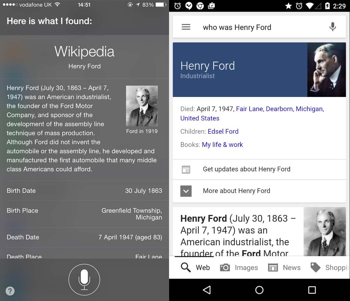
Siri vs Google Now doesn’t produce a conclusive winner, although Siri has bags more personality
In iOS 8 users gained the ability to activate Siri at any time if the device is charging by saying “Hey Siri”, then speaking the query. This was arguably stolen from the “OK Google” feature from Android Kit Cat, and which is present within Lollipop as part of Google Now. If the Android device’s screen is lit-up – even if locked – saying OK Google will make the device listen. If the device is charging then it will listen even if it’s sleeping (although support varies depending on manufacturer).
Google Now is accessible from a right-swipe from the home screen, a little like the search screen in older versions of iOS 8, and its goal is to be ready with information you want so you don’t even have to search for it. It learns what you like and do because it can – Google collects an immense amount of data about you via your email and searches. Thus, Google Now will learn your favourite sports team, and your favourite music, and where you live and work, and what your parcel number is in order to track it, and so on. This is either extremely creepy or sci-fi brilliant, depending on your point of view. Notification and Siri will give some of this in iOS 8, such as telling you how long it would take to drive home from your current location, but Google Now is far more immersive.
Google Now provides access to information you might search for, before you get a chance to search!
In terms of typical spoken commands (“Create a reminder to buy milk tomorrow at 9am”, “Who was Henry Ford” etc), a side-by-side comparison with Google Now was pretty much a dead heat in our tests. Sometimes Google Now failed to interpret the request and sometimes Siri did, but both do pretty well. The bug difference with Siri is that it has personality and even humour. Google Now’s feedback is like a robot bolted onto Google’s search engine.
Read more about Android:
20 funniest troll comments by Android fanboys