
OS X 10.10 Yosemite is out, and, while there aren’t many surprises in the interface—which Apple has been showing off since June—users are getting their first tastes of the new look and new features. And many of them are finding that there are some annoyances the way Yosemite displays (or doesn’t display) certain things. Here are my top four Yosemite annoyances and how you can fix them.
Banish translucency
I don’t get the whole thing about translucency. It certainly looks cool, and the technology required to render both a translucent menu and what’s behind it is probably quite complex. But what’s the point of translucency? Is it simply, to paraphrase Steve Jobs, when he presented the rotating cube that displayed with Fast User Switching back in Mac OS X 10.4 Tiger, “Because we can?”
I don’t see the point of a blurry interface…
To me, translucent menus just look blurry. And with thinner fonts, it makes it even harder to see what they say. It’s bad enough to have blurry menus, but this extends to some windows. You can see it in the Spotlight window, the Safari window in certain situations (such as when you display Favorites), and in the menu bar. Apple says that “Translucency adds more dimension to your desktop,” but I don’t really need more dimension; I need to see things more clearly. Translucent sidebars in the Finder or iTunes don’t make using OS X any easier.
Fortunately, it’s easy to turn this off. Open System Preferences, then click Accessibility. Click Display, then check Reduce Transparency.
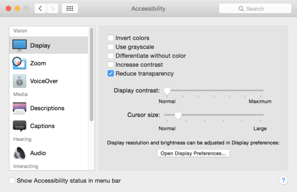
You can get rid of translucency in the Accessibility preferences.
There are two interesting things here. First, that Apple hides this in the Accessibility preferences, rather than in, say, the General preferences, which is where the option to use the dark menu bar and Dock. Second, that Apple isn’t clear on the word it’s using. It’s translucency, not transparency; the Apple web site gets it right, but the Accessibility preferences have it wrong.
End rant.
The case of the missing iTunes sidebar
Since the earliest days of iTunes, the sidebar—the list at the left, which showed your different media libraries, your playlists, and your connected devices—was a familiar and practical tool. But now, in iTunes 12, it’s gone. It had already been granted second-class status in iTunes 11, but iTunes 12 nuked it.
Well, not exactly… You still can display a sidebar, though it won’t show everything the previous versions did. When viewing any of your media libraries, click on Playlists in the navigation bar near the top-center of the window. This displays a sidebar with the name of your currently selected library at the top and your playlists below. This playlists sidebar displays in any media library, and if you click the name of the library—such as Music—you can choose to view your content along with the sidebar.
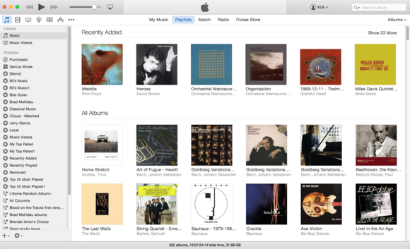
iTunes lets you display playlists in a sidebar while viewing any media library.
While it’s not exactly the same as before, it’s better than nothing.
What’s the address?
In Safari, by default, you no longer see the full address of a web page that you’re visiting. For most people, this isn’t a big deal, but I sometimes want to know the exact address of a web page. Fortunately, there’s an easy fix for this.
In Safari, go the the Preferences window (choose Safari > Preferences), then click Advanced. At the top of this preference pane, in the Smart Search Field section, check Show full website address. You’ll now be able to see the full address of a page.
It’s worth noting that if this option is turned off, you can still see the full address by clicking in the address field; this highlights the URL and display it in full.
Too much information
Spotlight is a great tool for searching for things on your Mac, and it’s now been extended to search the web and Wikipedia, perform conversions and much more. But there’s a lot of information displayed by default when you invoke Spotlight—perhaps too much.
You can whittle this down by choosing System Preferences > Spotlight, then unchecking some of the categories on the Search Results tab.
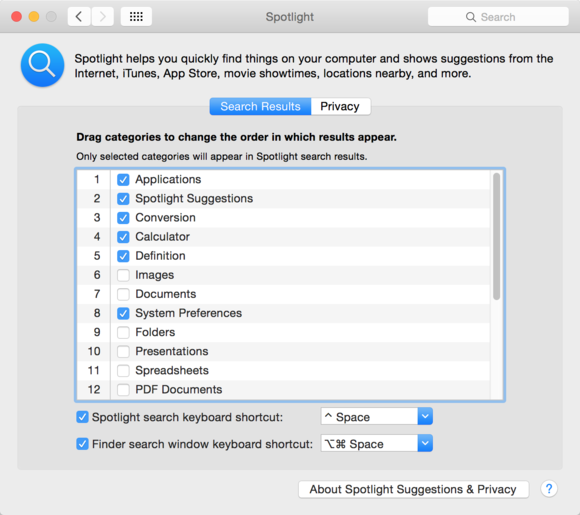
Adjust what Spotlight shows when you search.
Another way to make Spotlight searches more useful is to reorder the different results. If you want, say, your contacts to be at the top of the list, just click on Contacts in the preference pane then drag it up the list. You’ll see a small line display as you move items up and down. Customize Spotlight so it works the way you want it; you may want to leave all the categories checked, but just move down to the bottom the ones you don’t use often.
Author: Kirk McElhearn, Contributor

Kirk McElhearn (@mcelhearn) writes about Macs, music and more on his blog Kirkville. He also runs Kirk's iTunes Forum, where users can discuss iTunes, iOS devices, music, and more.