OS X Yosemite is the perfect desktop operating system for people who just want to get stuff done.
In early 2012, Apple CEO Tim Cook famously compared Microsoft’s attempt to make Windows an OS that’s friendly to tablets, notebooks and desktops alike akin to combining a refrigerator with a toaster. Consumers have largely agreed with this criticism, if Windows 8’s and 8.1’s paltry usage numbers are any indication. However, some enjoy having mobile features integrated into their PC.
This is the kind of tough problem that Apple has been adept at tackling, and Yosemite is its latest attempt to make the magic work for everyone that has bought in to its ecosystem.
Unlike Windows, which fully embraced a mobile-ish interface, but failed to bring desktop-friendly mobile features along for the ride, OS X Yosemite is dedicated to serving notebook and desktop users. At the same time, it adds mobile functionality where it matters.
The result is a wonderful operating system that provides the best of both worlds without slipping into a compromised, hybridized approach.
Yosemite’s new look
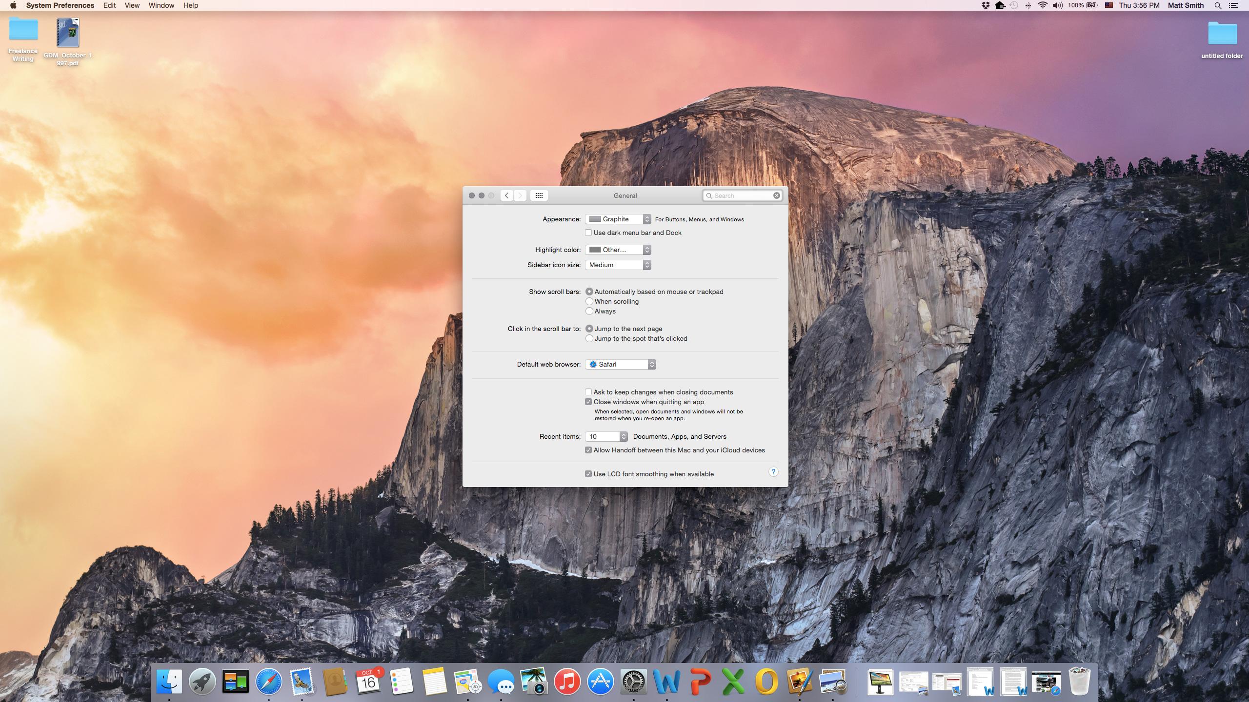
While it’s still a desktop operating system at heart, Yosemite borrows design elements from iOS to unify the look of Apple’s devices. This comes in the form of design changes that gives the software’s aesthetics a more flat look. Apps and icons that emulate the texture of their real-world counterparts are out. Colorful, abstract alternatives are in.
No individual part of Continuity is incredible on its own. As a whole, though, it does feel a bit like magic.
The Contacts app provides the best example of this. What was once a bloated notebook, is now a simple white sheet. Finder has been updated too, with a roomier sidebar, brighter folder icons, and some tweaked button design.
These changes sound more important than they actually are. We’ve used Yosemite since the first beta was released, and we can assure you the new design is easy to navigate. Within a week we’d largely forgotten about the update altogether. A quick refresher tour through Mavericks was required to remind us that the look had changed at all.
Regardless of what your opinions of Yosemite’s new looks are, the changes won’t impede your ability to use the newest version of OS X.
Continuity just works, for the most part
Nothing in Yosemite is a better example of its approach to mobile integration than Continuity, which is a phrase that includes four separate features.
Continuity lets Mac owners with an iPhone send text messages and make phone calls directly from their computer. It also lets any Mac owner with an iOS device transfer app sessions between devices with a single touch.
Setting up Continuity is as simple as ticking a checkbox, and the feature is turned on by default. Your Mac, iPhone, and iPad should “just work” together if they’re all connected to a common iCloud account, and they’re within Bluetooth range of each other.
We instantly fell in love with Continuity. The text-messaging feature is arguably the most useful of the bunch, as it lets Mac owners use a method of communication that’s usually specific to smartphones directly from the desktop. Sending a text through the Message app on a Mac is easier than doing the same on an iPhone.
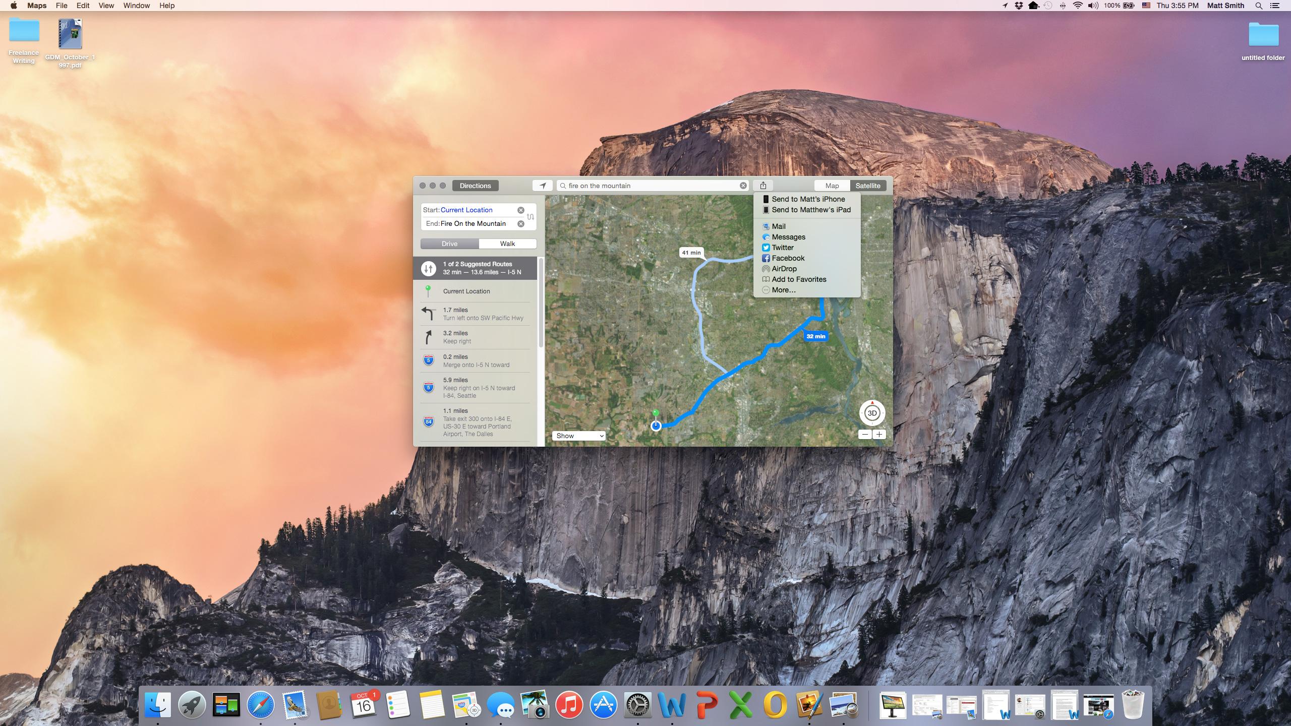
Calling from a Mac is a bit less impressive since it’s effectively the same as making a call on speakerphone, but it’s a nice addition. We particularly like the integration with Safari. Phone numbers are automatically highlighted, and can be called with a single click.
Speaking of Safari, the Web browser serves takes the spotlight in Handoff. Browser sessions can be instantly transferred between an iPhone, iPad and Mac with the touch of an icon. This is handy, and works in a flash.
We instantly fell in love with Continuity.
Last but not least is Instant Hotspot, which works just the way it sounds. Using Yosemite, and a hotspot-capable iPhone, you can create a hotspot without touching your phone. You can only use it if you have a hotspot plan through your carrier, however, so this isn’t the end-run around mobile data plans that some hopelessly optimistic fans had predicted.
No individual part of Continuity is incredible on its own. As a whole, though, it does feel a bit like magic. Features that are generally specific to mobile phones are now useable in Yosemite, yet they’re accessed through a familiar desktop interface. Plus, there’s virtually no setup involved.
The only downside is the fact that you have to buy into Apple’s ecosystem in order to take advantage of Continuity. There are no plans to make these features work with other platforms.
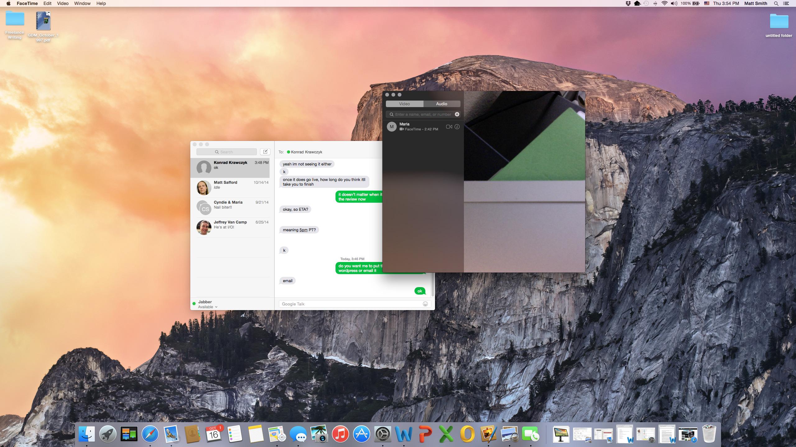
A prettier face for Facetime (and Messages)
The addition of Continuity means users will be seeing the Messages and Facetime apps more than ever before. They’ve received updates to handle the increased attention they’ll get.
Out of the many new features added to Yosemite, our favorite is undoubtedly Spotlight’s new interface.
The updates to Facetime are more modest, and revolve around making Yosemite’s call connectivity feature work. Users can now access their iCloud call history, and call waiting too. Mac owners can also answer directly from the login screen, which is helpful when you’re receiving an unexpected call.
One feature that’s missing, strangely, is a dial pad. Yosemite only lets users call from Contacts, Maps, or Safari.
Both apps have received a new layer of paint that brings their aesthetics in line with the look of Yosemite. For the most part, this means each app looks like its iOS counterpart on iOS 7/8. Both have a clean interface, with few options to distract or confuse users.
All hail desktop search
Out of the many new features added to Yosemite, our favorite is undoubtedly Spotlight’s new interface. We praised Yosemite’s desktop search feature in our preview, and we still stand by that sentiment.
To be clear, Spotlight is not entirely new. It has been a part of OS X for years. What’s new is the desktop search interface that appears when Spotlight is summoned using a keyboard shortcut, or from its menu bar icon (it does not appear when Spotlight is used through Finder).
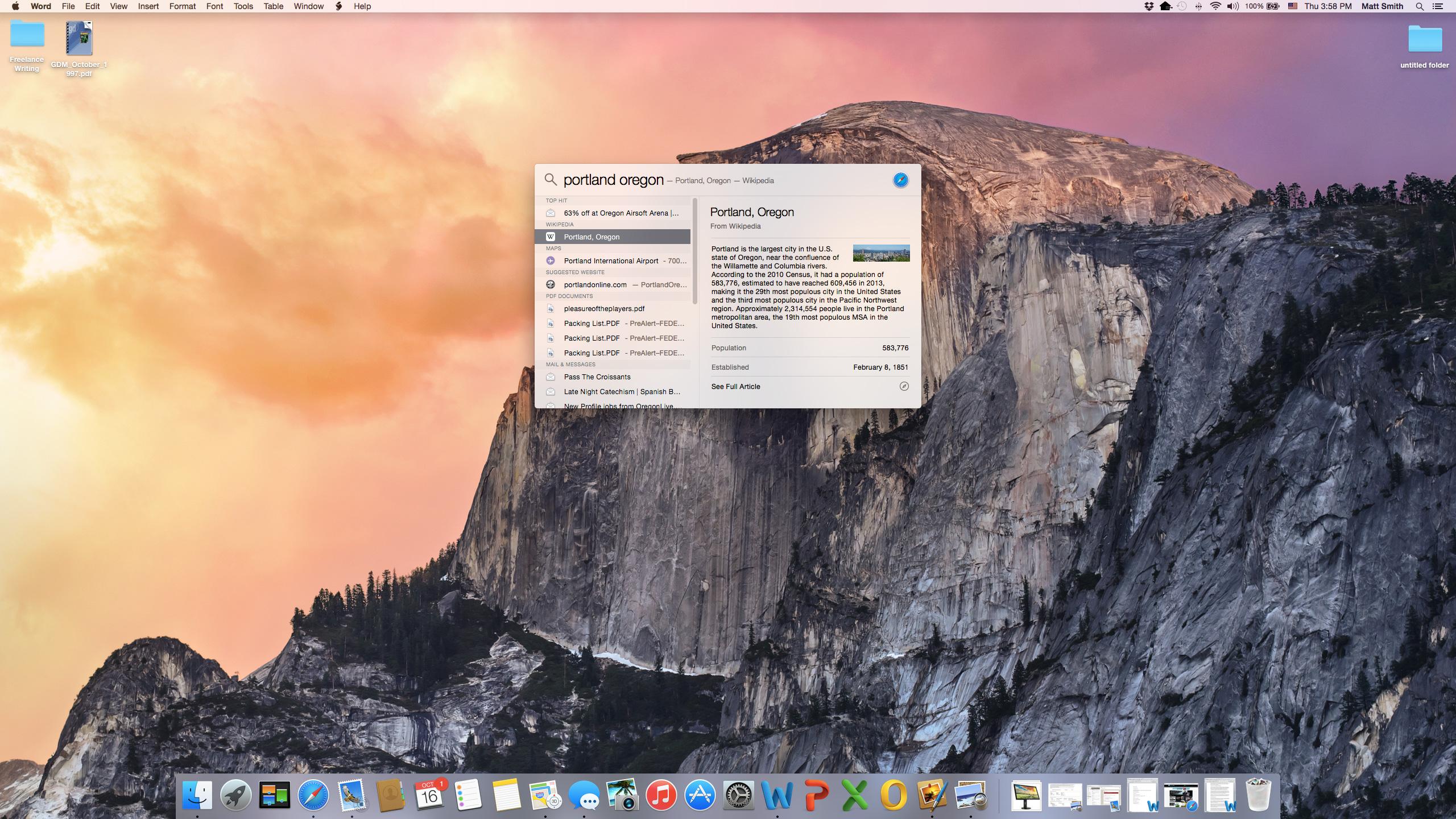
This new interface consists of a small box that shows results directly in the middle of the display. It isn’t a window, though it does look like one. It doesn’t appear in Mission Control, and it can’t be moved or re-sized. That’s both a positive and a negative. It can be annoying if it appears on top of content you’d like to see, but it also can’t get lost in a mess of open windows. Your last search result is always saved, and it will reappear when you open Spotlight again.
Search results are pulled from both local, and online sources. However, that’s not revolutionary. Windows 8.1 currently boasts this feature. What makes Spotlight better is how it cleverly summarizes information, though.
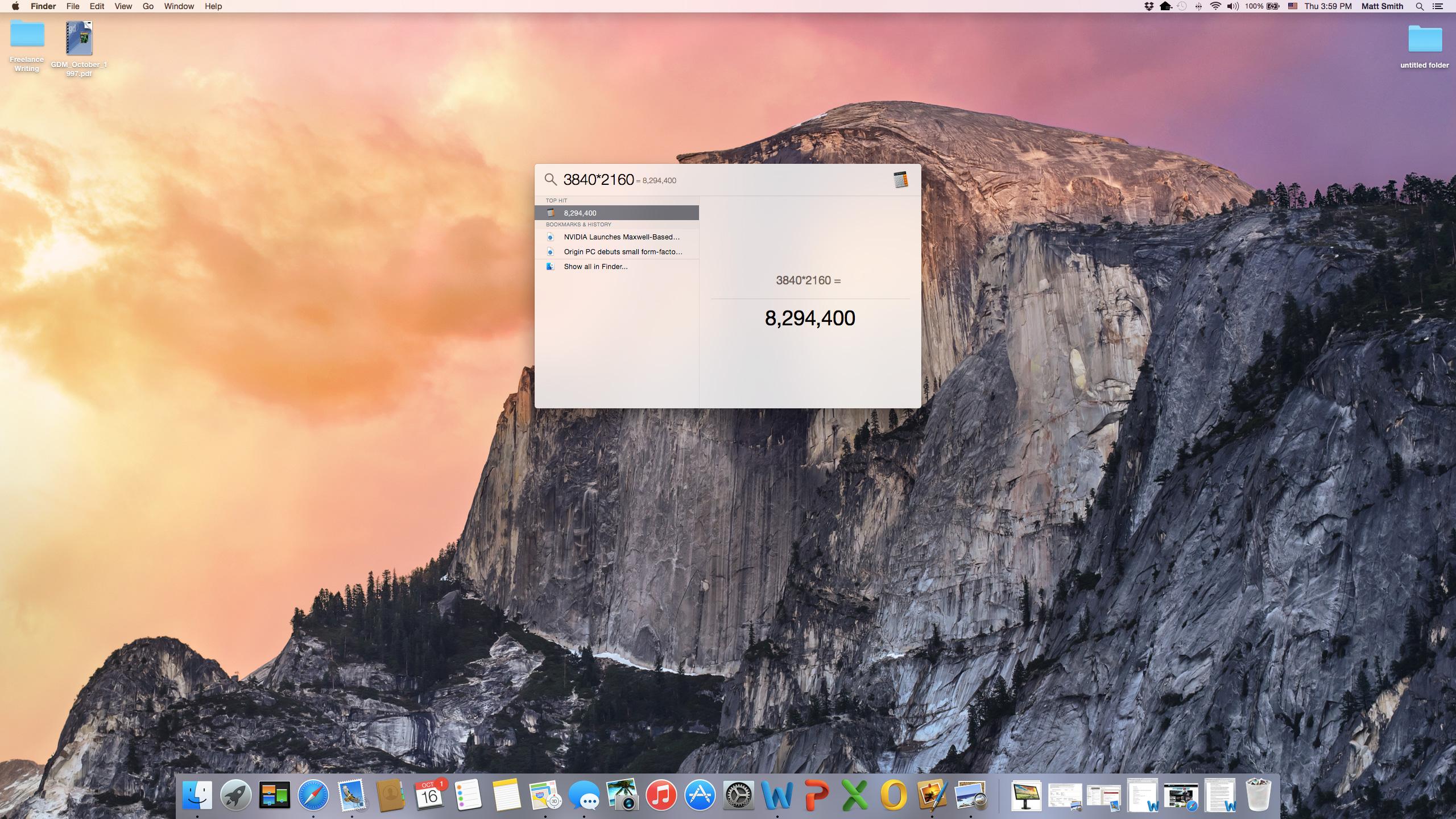
Want to know how many ounces are in a cup? There’s no need to open a browser. Just ask Spotlight. The same goes for most math equations, along with Dictionary, Mail, and iTunes. Search provides summaries of websites too, including Wikipedia, so you can find a quick answer to simple questions within seconds.

All of this functionality doesn’t detract from Spotlight’s core function, however. It’s still a great way to search for files on your computer. Any file saved to your Mac or iCloud account is instantly indexed, and search-able. During our time with Yosemite, we found that Spotlight is now so accurate and quick that it nearly renders Finder redundant.
That, in turn, makes OS X more understandable for users who find navigating files and folders a bit intimidating.
A trek through Safari
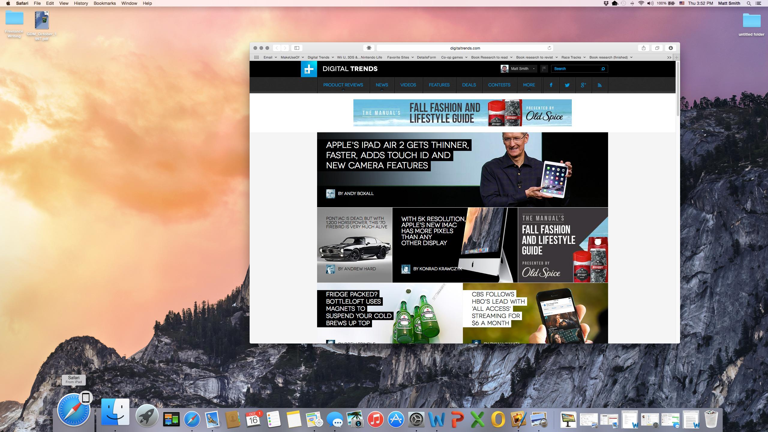
New versions of OS X also bring a new version of Safari, and Yosemite is no different in this regard. A brighter, flatter appearance has replaced the dark, textured look of the previous version, but that’s just a fraction of the story. Apple has added or tweaked a long list of features.
Interface elements have been compacted, which results in a slightly narrower title bar, and more room for content when Safari is used in full-screen mode. Search is now a tiny line flanked by a few options, some of which (like refresh) are context-sensitive. The new Safari takes lessons from Spotlight, and provides excellent search previews that can include brief summaries, and thumbnails. It’ll even display open tabs from devices that are connected to your iCloud account if they are relevant to your search query.
Mac OS X Yosemite is an excellent operating system.
Tab management has been improved with a Tabs button that opens an interface which is similar to Mission Control. All open tabs are displayed and grouped by Web domain, so they can be easily identified and dismissed. This same view shows any open Safari tabs on other Macs and iOS devices registered to your iCloud account. Anyone who works with multiple tabs on a regular basis will adore this addition.
Sharing is better, thanks to the addition of a share button that’s almost identical to the one found in iOS (but it opens a list rather than an icon grid). The share menu supports all major social networks except Google Plus by default. It also provides quick access to Airdrop, which can be used to share content between Apple devices that aren’t registered to the same iCloud account. This feature works between Mac and iOS, and is extremely handy when you’d like to show a friend a Web link, but don’t want to re-type the address, or post it to Facebook.
Apple has boasted that Safari is up to six times faster than competing browsers. That represents an ideal situation in a specific benchmark, so it’s not representative of everyday use. However, we were surprised to see Safari score 3,554 in the Futuremark Peacekeeper benchmark on a mid-2012 Intel Core i5 MacBook Air. That essentially ties Google Chrome’s result of 3,531 on the same machine. Safari has made major strides in performance over the last few years.
Benchmarks aside though, Safari still feels a bit slow. Web pages load about as quickly as they do in other browsers, and using them feels smooth even with high-resolution images and video on-screen. Switching between tabs or the new tab management interface results in momentary jerks and starts though. While it’s not a deal-breaker, the difference between Safari and Chrome, which is much smoother when numerous tabs are open, is noticeable.
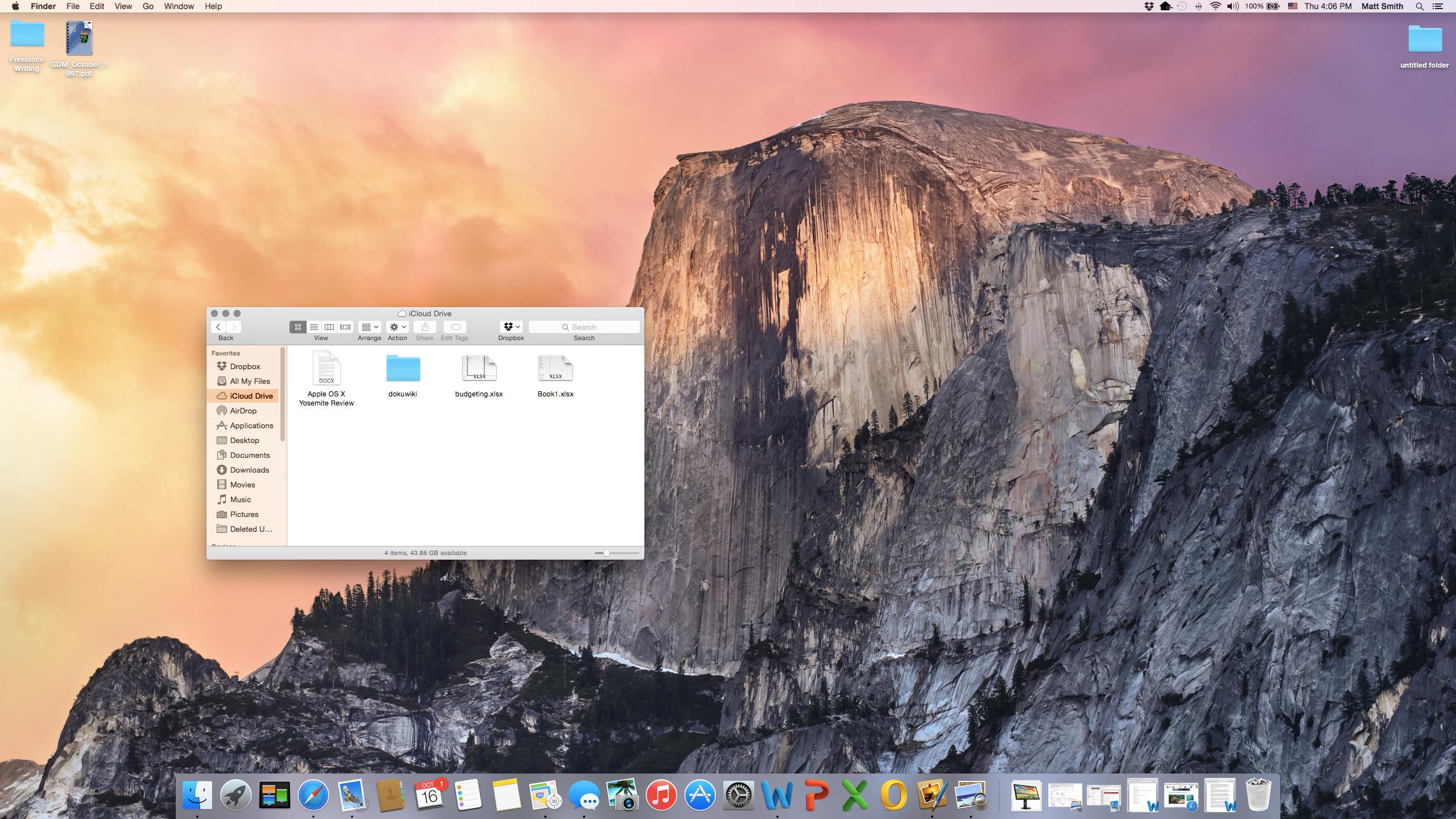
Floating through iCloud
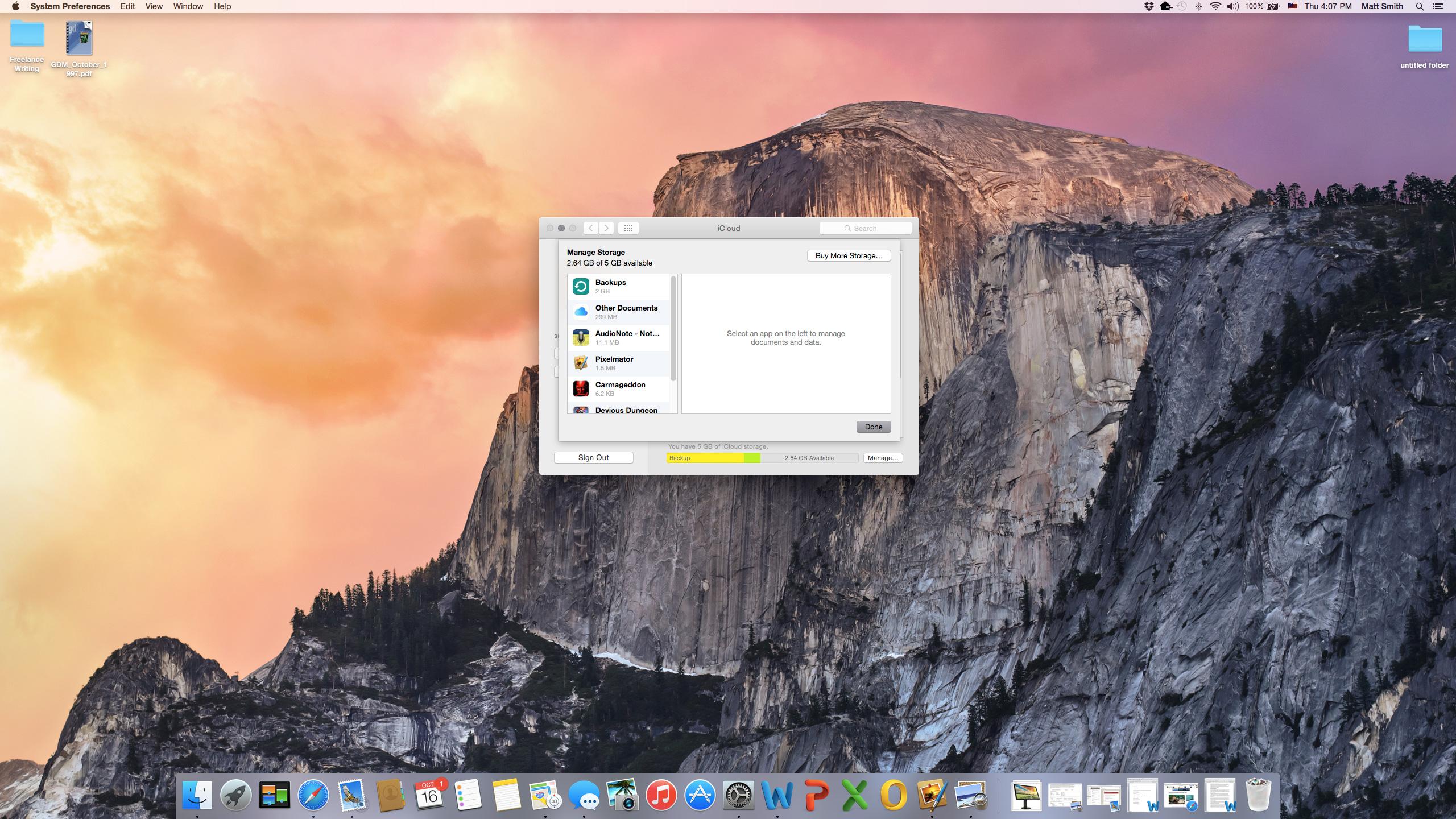
Yosemite adds support for Apple’s recently introduced iCloud Drive, which is a cloud storage service that comes with every iCloud account (and is thus enabled when you register a new Mac, iPhone or iPad). Users receive 5GB of storage for free, but you can pay to get more if you want.
Yosemite borrows design elements from iOS to unify the look of Apple’s devices.
There’s also an understandable, but unfortunate barrier between iOS and OS X files. While Apple claims that users can access Drive on both, whether you’ll be able to use files between the two platforms depends on the software you use. Anyone with iWork will find integration to be seamless, but users who rely on third-party software are out of luck (for now, at least).
At least managing iCloud Drive is easy. Unlike competing services that use a local client paired with a Web interface, iCloud is handled entirely through OS X System Preferences. There’s a website too, but users don’t have to open it to access storage, delete backups, or even buy more space.
A useful feature that’s easily missed is the addition of Family Sharing. This lets users designate up to six iCloud accounts (the family organizer, and five family members) as a family. All members of the family receive immediate access to media, books, and apps purchased by other family members through the Apple App Store. There’s also a family photo album, a family calendar, and family reminders.
Family Sharing will save large families time and money, but there’s no reason why a group has to consist of a traditional family. You can just as easily link with close friends, roommates, or your significant other.
Invisible notifications
In our preview of Yosemite, we talked about the Notification Center, a new sidebar that slides out from the right side of the screen when accessed through the appropriate menu bar icon. In our imagination, we saw ourselves constantly accessing it to catch up on the latest news. In practice, however, we barely touched it.
There are two reasons for this. One is that iOS and OS X notify users as events occur. If you have either in your possession, you’re likely to dismiss a notification when it appears. We found little need to access the Notification Center because the message it sent had already been received, and anything that was missed was more likely to be accessed from an iPhone or iPad than from a Mac.
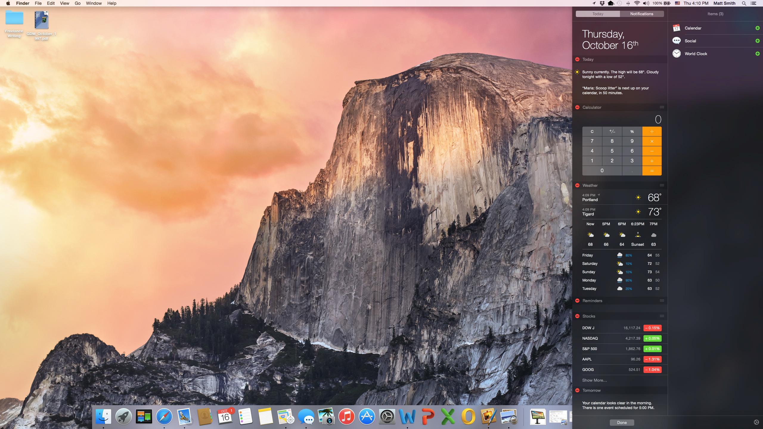
We also found that we tend to keep Facebook and Twitter open in their own Safari tabs when using Yosemite, further reducing the need for Notification Center. Integrating social networks into an operating system is a great idea, but it’s less important on a desktop system that can easily handle multiple tasks than on a mobile device that displays just one app at a time.
The Notification Center also failed to pull us in with its widgets. In theory, they provide a quick view of the calendar, weather, stocks, and other information. In reality, the information in each space is so limited that it’s nearly pointless. Want to view more calendar information? You need the calendar app. Want more weather? You’ll need a website for that. The only widget we found useful is the calculator, but even that is readily accessible through Spotlight.
More customization could help, and it’s possible that third parties will step in to add better widgets or improve the interface. As it stands though, the Notifications Center is a bit of a miss. It doesn’t hurt the Yosemite experience, but it fails to add anything compelling.
Conclusion
Mac OS X Yosemite is an excellent operating system that deftly adds mobile features without compromising the function of the desktop space. In this sense, it’s light-years ahead of Windows 8.1. Continuity, Spotlight, and the new version of Safari are way ahead of the default features Microsoft provides in Windows.
There are a few problems. We’re particularly annoyed by iCloud Drive, which bakes cloud storage right into the operating system, but simultaneously provides far less space than it should. We were also surprised by how little impact the Notification Center has on everyday use.
Even with those issues though, this free update is clearly better than Windows 8.1, and is also a major leap forward from OS X Mavericks. While more configurable operating systems will always win the love of enthusiasts looking to tweak every last variable, Yosemite is the clear choice for desktop owners who just want to get things done.
Highs
- Great, new features
- Makes life easier for iOS device owners
- Free
- Stays true to the desktop experience
Lows
- Notifications center isn’t really needed
- Safari is slow with lots of tabs open
- Default iCloud Drive storage is light
Editors' Recommendations
- Apple fixed one of my biggest macOS gripes with Sonoma — but I still want more
- This secret Samsung laptop may merge ChromeOS with DeX
- Asus Zenbook Pro 16X vs. Apple MacBook Pro 16: creator laptop battle
- Why Apple’s foldable MacBook could be the Mac’s iPhone X moment
- HP Envy x360 13 vs. Apple MacBook Air M2