It's not difficult to get your hands on pre-release Apple software. For a mere $198 a year ($99 each for OS X and iOS) you can download beta versions of operating systems from Apple's developer site even if you've never written a line of code in your life.
This year, Apple is taking things a step further. The new public beta program for OS X Yosemite officially launches Thursday, taking software that has traditionally been protected from the public by a $99 paywall and distributing it to the first million users who sign up on Apple's site. It's a very Microsoft-esque way to roll out an OS: you give enthusiasts a chance to work with an early-but-reasonably-stable build in exchange for valuable bug-squashing feedback. Ideally, it will keep Yosemite from suffering from some of the general bugginess that affected iOS 7.0 when it launched last year.
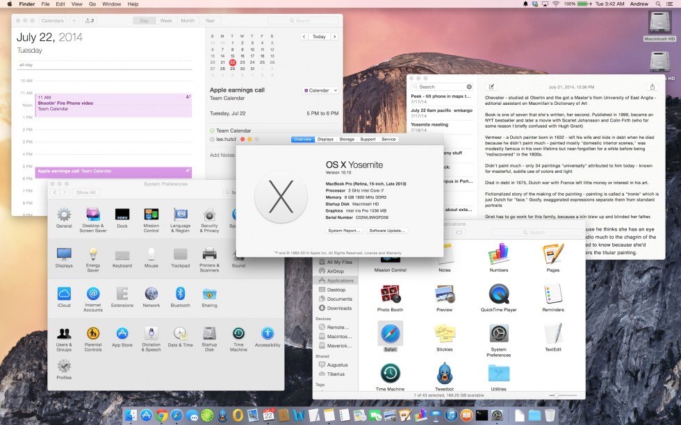
In advance of the public beta, we've been given about a week of time to use the third developer preview and get a sense of what Yosemite brings to the table. Beta subscribers will get a slightly newer build of the operating system, but at this point most of the features are locked down and ready for evaluation by the public.
This preview article won't go as deep as John Siracusa's epic OS X reviews—he'll be giving the final build a much closer look when it's officially released in the fall. This also isn't the place for detailed comments on performance, general stability, or battery life, since those are the elements likely to change the most between now and release. What we'll be doing today is taking a high-level look at the new operating system's redesigned user interface and its biggest features, while shining a light on a few things that could use some more work.
How this public beta thing works
The last time Apple released a public beta of OS X, it was in September of 2000. People 14 years ago could pay $30 for the privilege of testing the very first version of OS X 10.0 (remember when operating system upgrades cost money?). It used around 800MB of disk space and looked like this. It has been a very long time since Apple has tested an OS in public, and a lot of things have changed since then.The company's primary goal with the public beta is to collect user feedback using a simple built-in reporting tool that we're told will be included with the OS. Apple will evaluate this feedback and take it into consideration as it continues to fine-tune the software. However, don't think that complaining will get you your old interface back—spamming Apple with "I HATE YOSEMITE" messages isn't going to help anybody. On the other hand, if you want to tweak the way the new design looks and works, report specific bugs, or give feedback on new features, this will be your chance.
Apple updates its Developer Preview builds roughly every two or three weeks to keep its developers current, but the public beta build will receive updates less frequently. Apple told us that public beta users would eventually be able to update to the final "Golden Master" build of Yosemite without having to reinstall the operating system, so you can use the beta now and move seamlessly to the final version when it arrives. This is basically the same methodology Apple has used for public beta testers of the last few Mavericks updates.
That said, this is still beta software, and you will run into problems. The Yosemite beta (and any updates it receives between now and the final release) should be stable enough for most people, but installing it on mission-critical hardware at this point would be a mistake. If you do install it to a computer you rely on, using a separate test partition would be wise, and you should make a full backup of all your files before you go forward.
Yosemite's new face
The OS X user interface hasn't changed in any significant way since Lion in 2011, and even that was just a refinement of the interface introduced in Leopard all the way back in 2007. When iOS 7 got its all-encompassing facelift last year, though, it seemed obvious that the Mac UI would eventually be updated to match. Yosemite is the release that brings the two UIs back together.
While Yosemite takes many cues from iOS 7, it doesn't blindly clone mobile design elements with no regard for how people use desktop operating systems. As an example, let's look at some of Apple's redesigned icons—it looks like Apple took its current OS X icons and ran them through an iOS filter.
![]()
![]()
![]()
Notice that the new icons still have depth and shadows and that they still come in different shapes and sizes. Many of the third-party Mac apps I use day-to-day—Limechat, Spotify, Chrome—don't even look out of place next to the new icons in the way that iOS 6-style icons look out of place in iOS 7. Apple's approach to the icons extends to every other area of the user interface, from buttons and toolbars to the applications themselves. Yosemite looks very different, but it still looks like OS X. That's not to say that the entire interface is problem-free, but the transition shouldn't be jarring for most.
-
Some windows in Mavericks. Note the drop shadow under Textedit, the active app, and the lesser shadows under the Terminal and Finder windows that help the user arrange the windows as they see fit.Andrew Cunningham
-
Elements of Yosemite's UI are "flat," but it would be incorrect to say the entire OS is flat. Shadows and perspective are still used in icons and windows to accommodate desktop users.Andrew Cunningham
RIP Lucida Grande
-
Apple has swapped Lucida Grande for Helvetica Neue throughout Yosemite.Andrew Cunningham
-
The fonts are a little lighter and cleaner than in Mavericks, though they're heavy enough not to cause problems on non-Retina screens.Andrew Cunningham
With Yosemite, Apple is dropping Lucida Grande and using Helvetica Neue as its system typeface, the same as iOS 7. The actual weight of the typeface used isn't all that different, though—Helvetica Neue is a thinner and cleaner font than its predecessor, but it's not nearly as dramatic as the shift from iOS 6 to iOS 7.
Consider the kinds of displays both operating systems have to account for. iOS 7 only supports two devices without Retina displays, and as a result the non-Retina design feels like an afterthought. It's not unusable, but text is sometimes blurry or overly pixellated in ways that can impair readability. Check how the typeface and the desktop background run together in this image from a non-Retina iPad mini:
The opposite is true for the Mac ecosystem. Only a handful of the systems on the support list have Retina screens at all, so Apple has spent more time making sure text and icons look crisp and clean on lower-density screens where they can look a little jagged or blurry in iOS 7. Text labels that float over the desktop or other windows are always shown against backgrounds. It’s no less legible on standard screens than it was before, even though Apple tells us that the entire OS was "optimized" for Retina displays, and we wouldn't be surprised if it presaged a larger rollout of Retina Macs once Intel's new Broadwell chips finally show up.

reader comments
293