Building a new operating system is a monumental challenge, and in January 2000 when Aqua was introduced, Apple was in the thick of the transition to OS X.
Beyond the staggering amount of development work taking place to smash Mac OS and NeXTSTEP together, Apple was hard at work on the user interface of OS X. But to understand what OS X would become (and how it would look), it’s important to remember where the company had been before.
A Visual Tour of Mac OS
From the original Macintosh up through System 6, Mac OS looked basically the same:
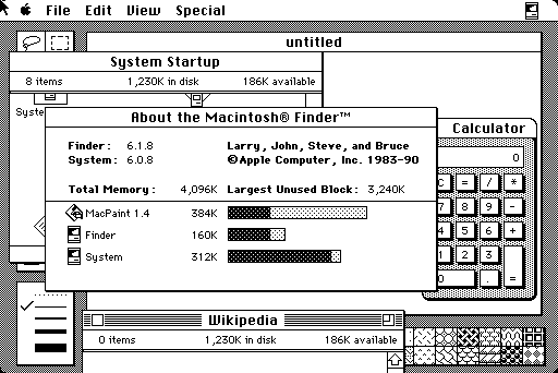
image via Wikipedia
1991’s System 7 brought color to the user interface for the first time:
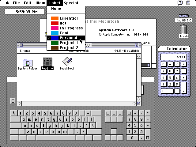
image via GUIdebook
As the screenshot shows, Apple was very conservative when adding color to the Mac’s user interface.
Mac OS 8 brought much more color with its Platinum interface. Notice the monochromatic pinstripes and simple controls. Even here, color is used somewhat sparingly:

image via Wikipedia
Mac OS 8 was released over 12 years after the original Macintosh. For over a decade, the Mac’s UI stayed basically the same. Screens grew in size and color support was added, but Apple moved very slowly.
(OS 9 — released partly as a stop gap carried much of the same UI.)
It would come back to bite them in the ass.
Enter NeXT
While Apple was trudging along with Mac OS, the team at NeXT was hard at work. While the initial release of NeXTSTEP was monochrome, later builds — including OpenStep, pictured below — were in full color.
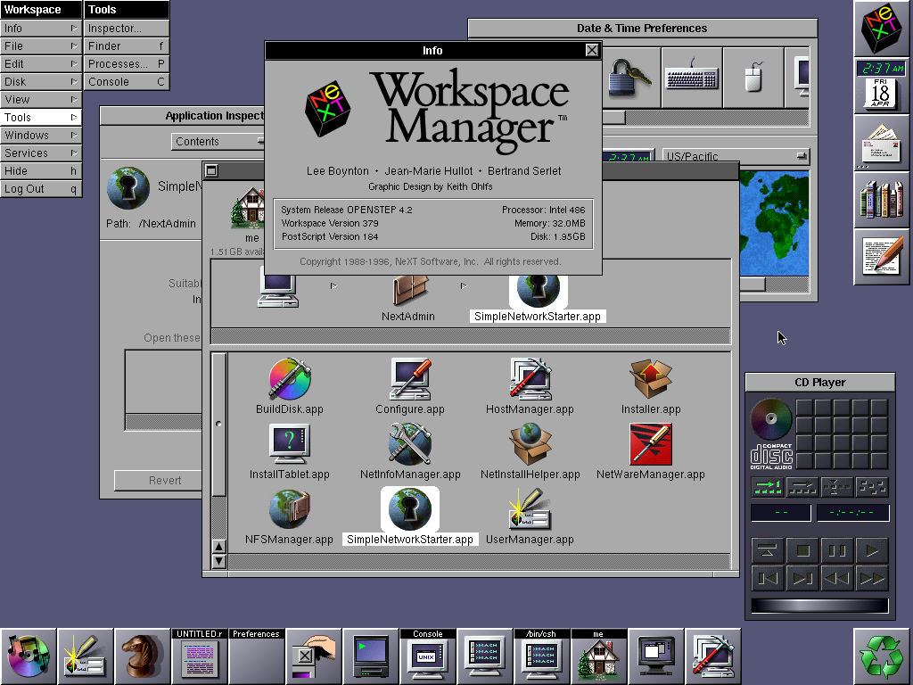
image via GUIdebook
More important than its interface, NeXT offered Apple a next-gen operating system that Cupertino couldn’t create on its own. So, in 1996, Apple bought NeXT.
The Road to OS X
After the purchase, Apple announced Rhapsody, a BSD-based operating system was powered by a Mach microkernel. It contained the object-oriented Yellow Box API framework, the Blue Box compatibility environment for running “Classic” Mac OS applications and a Java Virtual Machine.
In short, Rhapsody was the structure bridging the old and the new. It was also the front lines for Apple’s work on the interface of its new system.
This is how the company described its work:
Rhapsody’s user interface will combine elements from both the Mac OS and NEXTSTEP, but will be closer in look and feel to the Mac OS Finder. We realize that customers need a consistent interface in the two operating systems to deploy them throughout a single organization. It’s important for training and ease of use. One of the advantages of NeXT’s technology is the easy support of multiple user interface paradigms.
Shipping in August 1997, Rhapsody looked like Mac OS with little chunks of NeXT design, as Apple outlined:

image via GUIdebook
Rhapsody would end up becoming Mac OS X Server 1.0 in March 1999. Still running the mash-up of Mac OS’ and OpenStep’s UIs, OS X Server 1.0 was the first retail release of an Apple-branded, NeXT-based OS:
image via Object Farm
After Mac OS X Server 1.0, Apple released a series of “OS X Developer Previews.” DP 1 and 2 should look familiar:
Aqua’s early days
In January 2000, Apple announced a new look for OS X. The UI’s name?
Aqua.
The user interface was designed to reflect the hardware of the day. Candy-colored iMacs and iBooks looked great with Aqua’s bright buttons and colorful window controls.
Aqua first shipped as part of OS X DP3:
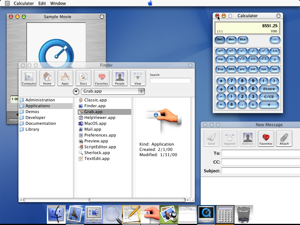
image via GUIdebook
In his review, John Siracusa introduces Aqua this way:
As anyone who’s seen the screenshots knows, Aqua looks very nice. Even in this very first private release, the attention to detail in Aqua is impressive. Everything appears sharp and polished. All the UI elements look just as good as they do in the screen shots on Apple’s web site. Some even look better.
Aqua had some issues, however. Here’s Siracusa again:
The road to hell is paved with good intentions, and I believe that Mac OS X DP3 has its heart in the right place. It certainly looks very nice, and it is generally impressive in action. But the devil is in the details, and Aqua manages to get most of them wrong. The dock is a total write-off. It doesn’t need to be “fixed” so much as it needs to be split-out into individual components that do a particular task (and do it well), rather than a catch-all dock that does everything atrociously. The Finder still needs to be fleshed out, but it’s on the right track with its offering of both the new browser-style interface and the traditional Finder windows. The core OS is sturdy and interesting as ever. As with DP2, I was not able to freeze the system at any time, and performance was quite good, with a few eye-candy-related exceptions (genie on the G3 and opaque window resizing on both machines). I continue to enjoy the technical aspects of Mac OS X, and I hold out hope that Apple will listen to its users and reconsider some of the UI decisions made for Mac OS X.
Just reviewing that screenshot shows some of the UI’s initial problems. The Dock was terrible, the transparency made some content — like window titles — impossible to read at times, single-application mode was super janky and the menu bar’s centered Apple logo was very troublesome.
(Fun fact — Mac OS’ “Apple menu” was still intact on the left end of the menu bar. That logo was just eye candy that apps with too many menus had to skip over. Seriously.)
By the time 10.0 Cheetah shipped in March 2001 (after four developer previews and the Public Beta), Apple had fixed a lot of the weirdness in Aqua, including that Apple logo:

image via GUIdebook
In fact, most OS X users would look at 10.0 and not be surprised by much at all.
This is due to the fact that, for many years, OS X’s UI didn’t change all that much, besides gaining speed. Once Mac hardware caught up to the UI’s demands, Aqua shined.
Mac OS X 10.1 Puma looked a lot like 10.0:

image via GUIdebook
And Mac OS X 10.2 Jaguar looked a lot like Puma:

image via GUIdebook
Aqua’s Slow Decay
These days, there’s not much of Aqua left. While OS X Mavericks’ interface is clearly derived from what Apple announced 13 years ago, it has aged.
The changes started with 10.3 Panther and right off the bat, things went off the rails a little. Many of Aqua’s conventions remained intact, but the pinstripes that once mimicked Apple’s hardware were replaced with our friend Brushed Metal:
image via GUIdebook
Panther’s buttons and scrollbars seem out of place next to the brushed metal, and the window controls are downright cringe-worthy. Mac OS X Tiger didn’t stray far from Panther’s line, although the company did make several improvements to the UI, including dialog boxes and font smoothing. As shown below in this image, even 10.4 included some very Aqua-like elements:
image via Ari Weinstein, who sent me a correct version of the screenshot I had been using originally here.
Tiger’s successor, however, brought sweeping changes.
image via Apple PR
Leopard’s user interface came crashing down like an iron fist. Pinstripes were smoothed over, and brushed metal was swept away. The rounded corners that had defined the Mac’s menu bar since 1984 were removed.
A Brief Note on Snow Leopard and “Marble”
Snow Leopard was rumored to bring a unified UI dubbed “Marble:”
The new theme will likely involve tweaks to the existing design and perhaps a “flattening” of Aqua in-line with Apple’s iTunes and iPhoto interface elements.
At the time, I thought this rumor was really weird. 10.6 didn’t bring a new UI, and Marble sounds more like Leopard than anything else. Oh well.
Modern OS X
In October 2010, Apple held a press event named “Back to the Mac.”
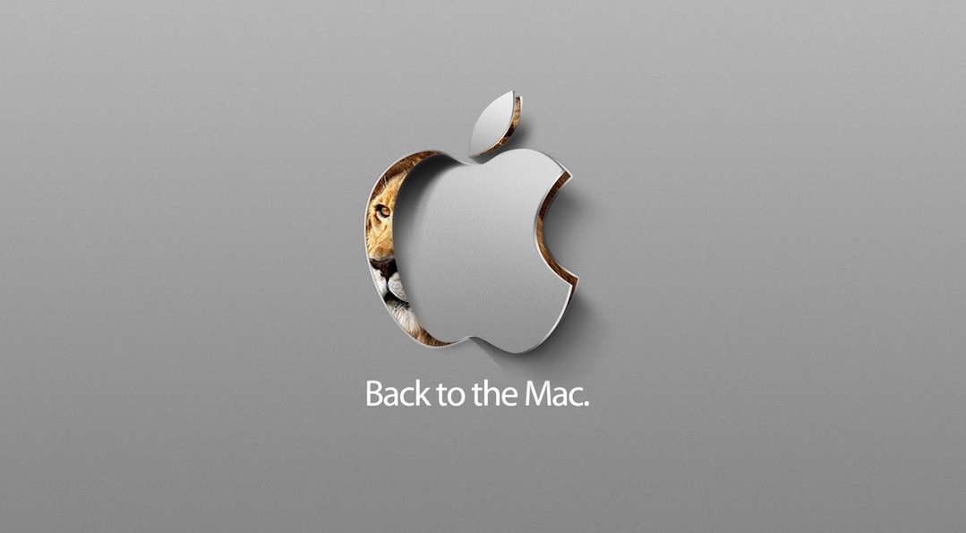
During the event, the company announced Mac OS X 10.7 Lion. The new OS brought many iOS-based features to the desktop, including full-screen apps, improved gesture support, and a grid-based app launcher named Launchpad.
Lion continued down Leopard’s path of dulling Aqua, but brought things like stitched leather, linen and green felt from iOS to the Mac.
Just look at poor iCal:

image via MacStories
10.8 Mountain Lion continued that trend, but fixed many of Lion’s other issues.
Today, OS X Mavericks looks like the successor to 10.6 more than anything else:

image via Apple PR
10.7 and 10.8’s skeuomorphic elements are basically already considered outliers at this point.
But even in Mavericks, there’s not much left of our old friend Aqua. I’m not even sure the name still really applies, at least how Steve Jobs introduced it over a decade years ago.
Homework Assignment: Find an hour to watch John Gruber’s talk from Webstock 2011 on the history of Apple’s UI design. The bits toward the end of the talk are a little dated, but it’s still worth the watch.
The Future
There’s been a lot of chatter that Mac OS X 10.10 (Sigh.) will usher in a new UI.
Based on the product artwork alone, it’d be easy to think that OS X and iOS 7 are closer in appearance than they are:

Both of these icons were present at last year’s WWDC, but Mavericks got only a slight UI refresh — nothing more than losing some stitched leather and a bunch of linen. It was no redesign.
This year, however, many people believe OS X is due for a visual overhaul.
Mark Gurman at 9to5 Mac reported several weeks ago that this would be the case:
OS X 10.10 will be the successor to the current OS X, 10.9 Mavericks. Mavericks focused on power-user features and under-the-hood enhancements to improve hardware performance, battery life, and graphics processing. 10.10, however, will focus on aesthetics. According to sources, Apple Senior VP of Design Jony Ive is leading a “significant” design overhaul for OS X, and the new design will be the operating system’s cornerstone new feature (none of the mockups online, like the one above, are a good indicator of what to expect).
The new design will not be as stark as iOS 7, but it will include many of the flat elements and white textures instead of re-creations of life-like elements. The end-to-end redesign is said to be a top priority at Apple right now, with the specific details about the changes being sworn to extreme secrecy. Apple has been testing new features such as Siri and support for iOS AirDrop compatibility, but it’s unconfirmed if those enhancements will be ready for 10.10.
As Peter Cohen pointed out at iMore, Apple could move OS X closer to iOS without merging the operating systems.
2013 didn’t bring an OS X redesign but it’s not hard to imagine that if Apple does have a new UI ready for OS X, it would fall in line with iOS.
But what would an Ive-inspired OS X look like?
Craig Hockenberry has an idea:
There’s no doubt in my mind that Apple is going to overhaul the look of Mac OS X in the next version. As more and more apps bridge the gap between the desktop and mobile, the lack of consistent branding and design across platforms is becoming a problem.
I fully expect to see flatter user interfaces, squircle icons, a new Dock, and Helvetica Neue as the system font.
I’ll be surprised if Lucida Grande survives as the system font past 10.9. I will, however be sad. It has defined so much of OS X for years, but I bet that 10.10 will bring more than a new typeface.
There are those “OS X Ivericks” mockups floating around and an “OS X Montauk” design over on Dribbble:
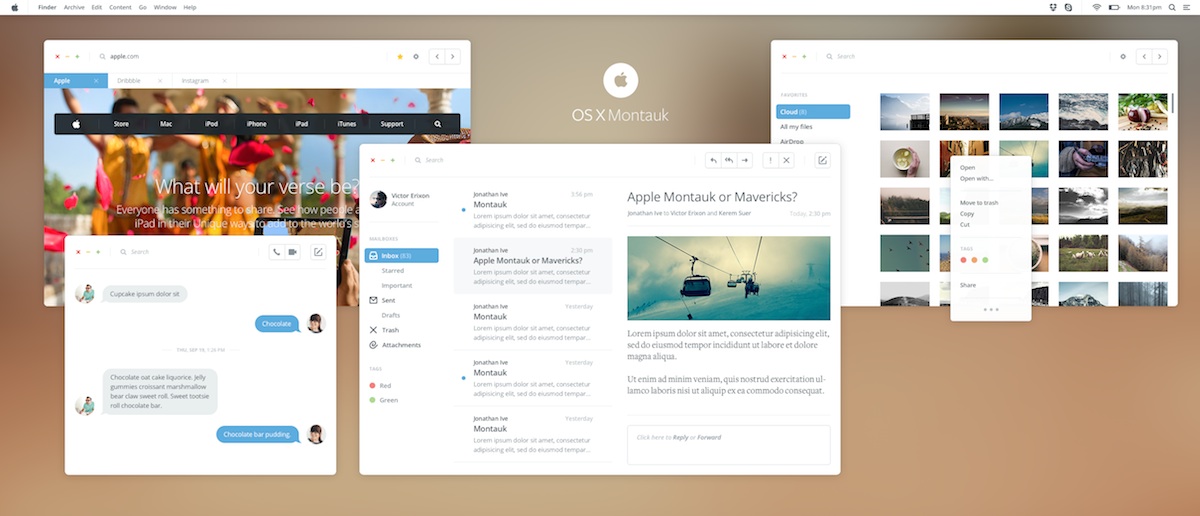
While I don’t know if Apple would go this far with OS X, it is interesting to consider.
Apple’s recent opening of an OS X Beta Seed Program is interesting, too. Surely new builds of 10.9 aren’t so important that Apple would introduce this system. 10.9.3 isn’t much to write home about, and certainly doesn’t require a wide-reaching base of testers.
If 10.10 is going to have a new face, wouldn’t it make sense to let all sorts of people test it before it ships as a final product?
As we spoke about on The Prompt, iOS 7 brought excitement. People showed off the beta to their friends like it was new toy. It’s not hard to imagine that Apple would want to bottle some of that up and dump it on its aging — and comparatively boring — desktop operating system.
I don’t know what’s going to happen during Tim Cook’s keynote on June 2, but there is a lot of smoke pointing to an Aqua-colored fire.