
There’s no question that CEO Marissa Mayer has people looking anew at beleaguered old-guard portal Yahoo. Enough to get pundits to stop using adjectives like “beleaguered”? The jury’s still out. But the stock price is moving in the right direction, employee morale is up—even among those who were asked to stop telecommuting—and the deft acquisition of Tumblr and a flurry of smaller startups points to a desire to swing for the fences and write a new, future-facing story for one of the internet’s original superbrands.
Somewhere along the way, Meyer clearly decided that this “new story” required a different cover: Over the last 30 days, dubbed the “30 Days of Change,” Yahoo! has unveiled a different new logo every day, all representing potential replacements for its 18-year-old visual yodel.
It got the company a lot of mileage, says Julie Cottineau, founder and CEO of digital brand consultancy BrandTwist. “They showed people the visual process rather than simply presenting one big reveal.”
The parade of concepts culminated this week, with the 30th and ostensibly final iteration unveiled—a more austere and streamlined logo that, in Mayer’s own words, aimed at being “whimsical, yet sophisticated. Modern and fresh, with a nod to our history. Having a human touch, personal. Proud.”
Meyer says she “rolled up her sleeves and dove into the trenches” with her four-person design team to create the final look. Given her famously hands-on approach, it’s likely that no aspect of Yahoo!’s transformation has more fingerprints on it than this redesign.
“She wanted her identity to be left on the mark,” says Laura Ries, president of Atlanta-based marketing strategy firm Ries & Ries and author of the book Visual Hammer. “She’s given the logo her own personal touch.”
And so it is unfortunate that this may be Meyer’s first big public failure.
Even before the unveiling of the winning design, Larry Popelka of Bloomberg BusinessWeek’s Management Blog suggested that the project “may be the biggest mistake in Marissa Mayer’s nascent career as chief executive officer”—since logo designs are far less likely to increase business than “make CEOs look silly.”
Now that Yahoo!’s new hotness is out, the reactions seem to confirm Popelka’s warning. TechCrunch founder and CrunchFund principal Mike Arrington called it “godawful,” “boring, “banal,” and “fugly”—“a horse designed by committee” that “looks like a logo that someone would have created with clipart fonts from those CDs back in the early ’90s.” Skift CEO Rafat Ali snarked that the logo made him feel “cheated and violated.” Perhaps most damning was a tweet from serial entrepreneur Derek Pozawek, who noted that “It looks like a gravestone. It probably is.”
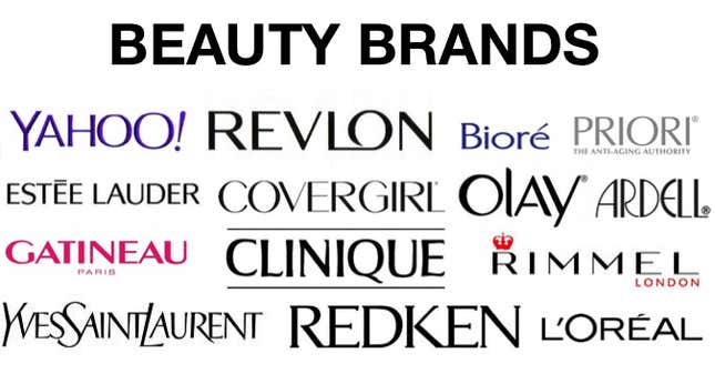
That’s not the only thing that the chiseled-looking, faintly curved semi-serif logo resembles. As a follower of AllThingsD’s Kara Swisher pointed out on her Twitter feed, the typeface (apparently adapted from the well-known face Optima) has an uncanny resemblance to the font used by cosmetics brand Clinique.
And therein lies a major problem for Yahoo. If it were just Clinique, the resemblance might be passed off as an offhand coincidence. A wider scan readily shows just how common the use of Optima-esque fonts is in the broader beauty and personal care category, with global brands ranging from Revlon, Estée Lauder, CoverGirl, Olay and Redken all using similar-looking variations of the face.
BrandTwist’s Cottineau describes the aesthetic Meyer seems to have been seeking as “sleek,” “modern” and “premium”—but these aren’t adjectives that are naturally associated with Yahoo’s brand essence, which, Cottineau notes, is better described as “friendly, energetic and accessible.”
And that creates a jarring sense of disconnect not just between Yahoo’s past and its intended future, but also between Yahoo and its digital peers and rivals.
Visual Hammer’s Laura Ries notes that one of the primary functions of a logo is to “identify a brand in a crowd.” But what if a logo divorces a brand from its crowd entirely?
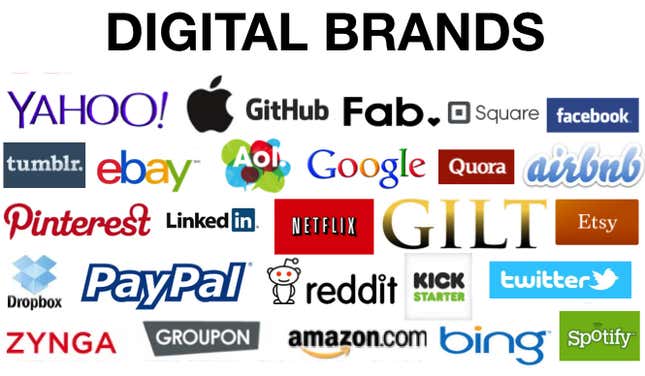
As this comparison shows, other than a handful of niche e-commerce startups, such as daily deals site Gilt Groupe, most online brands are marked by a sensibility that blends visual whimsy and abstract, “flat” design. The combination underscores both the disruptive and unconventional character of the Internet at large and the brands’ desire for broad-based, boundary-free appeal.
Cosmetics and personal care brands, meanwhile, tend to invoke elitism, elegance and heritage; even if they’re widely available, they play to aspirations for products that are niche-focused, costly and tied to a long and illustrious legacy.
These aren’t exactly the image Yahoo needs to convey to consumers, given that it’s perhaps the most “mass” of mass Internet brands, with a business largely dependent on free content and—if anything—is trying to get its users to think forward and not back.
Though it’s tempting to see this misstep as a minor one, Ries points out that a logo is critically important for an Internet brand since they have no physical real-world presence. “Brands like Yahoo!, Google, Amazon, Facebook and Twitter are basically identified by visuals alone,” she says. “A good logo communicates an idea, but you have to know what you want to communicate. And Yahoo has not figured that out.”
This has ominous implications for Mayer’s larger transformation campaign. As brand consultant and former Ant Hill principal Kim Brater notes, the key for a successful rebranding is whether the new identity reflects a true change of vision. “What is Yahoo’s essence? What is their brand promise?—I don’t know. Does their internal team know?” she asks. “Companies with crappy logos can still deliver on their promise, while those that spend millions on redesign can still fail. The logo shift for Yahoo—I’m not sure it was essential for brand delivery at this point.”
In other words, if Yahoo’s facelift is as “cosmetic” as it appears, Mayer’s apparent run of success could be no more than skin deep.