
If you install a lot of third-party apps, you may have noticed a trend: More and more programs these days run as icons in the menu bar—either solely in that mode or as an option in lieu of (or in addition to) a normal Dock icon. The list of such programs is huge, and includes such prominent apps as Dropbox, ScreenFlow, TextExpander, and hundreds of others. (Disclosure: The company I work for, Many Tricks, produces several apps—including Desktop Curtain, Moom, and Time Sink—that also offer the ability to run in the menu bar or the Dock.)
Putting on my user hat (as opposed to my Mac developer hat), I generally like this trend, especially when it means I have some choice about where a given program appears. Having that choice gives me more control over three key features in OS X: the Dock, the menu bar, and the Command-Tab program switcher.
The Dock: I prefer a lean Dock, one that primarily shows active applications. I keep only a handful of icons there permanently, as I rarely use the Dock as a launcher. I also keep my Dock hidden (more pixels for windows), and occasionally I move my Dock to a different screen edge, depending on what I’m doing. (I usually use the Command-Option-D shortcut to toggle its visibility.) This means the Dock isn’t a good place to put icons that convey status information, because first I have to find it before I can see what’s in it. For certain classes of programs, keeping them in the menu bar and off the Dock makes more sense.
The menu bar: Unlike my Dock, the menu bar is always visible, and always in the same location. This makes it a perfect spot to keep apps that display information or that I want quick access to but don’t need to interact with regularly. What types of programs have I just described? Utility programs, primarily—apps that I have running all the time, but that don’t necessarily require ongoing interaction or an ever-present window. The menu bar is ideal for such programs, because I can tell that they’re running and I can get to their interfaces, and they’re not stuck in my Dock.
The Command-Tab program switcher: This may be the best reason to keep certain programs in your menu bar and not in your Dock—you won’t see menu-bar-only programs in the Command-Tab program switcher. It may seem like a small thing, but given that I switch programs hundreds of times a day, this arrangement is a big timesaver: It’s much easier to find the program I want when I don’t need to navigate through a series of utilities that I rarely access directly.
Do I really need to see that I’m still running TextExpander for shortcut handling, or that I’m still running ScreenFlow for recording screencasts, every single time I press Command-Tab? Absolutely not. By keeping these apps in the menu bar, my Command-Tab switcher contains only the programs I actually want to switch to and from. Segregating my “helper” utilities to the menu bar (when I can) leaves the “real” applications for the Dock and Command-Tab program switcher.
Menu bloat
Menu-bar icons are not always a perfect solution, however. One big usability issue is that you can’t easily rearrange the program icons in your menu bar. (You can rearrange some menu-bar icons by holding Command and dragging, but this technique is reserved for Apple’s own apps.) The order of the icons on the menu bar is based on the order in which the apps launched, so you have to quit and relaunch your menu-bar apps in the right order if you want to achieve a specific arrangement in the menu bar. If you then quit and relaunch one of the programs, the order changes again.
Another usability issue is that you’re never quite sure what will happen when you click a menu-bar icon. The majority of menu-bar icons open a drop-down menu when clicked, but some display an attached window, while others open a standard Mac application window. The inconsistency can be jarring.
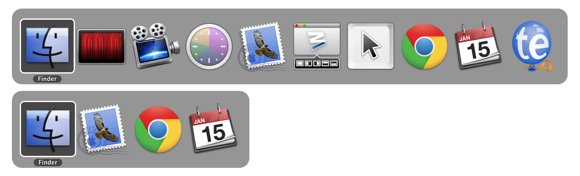
The last problem is bloat. On my 27-inch iMac, I presently have 14 apps with menu-bar icons running. And although that isn’t a problem with 2560 horizontal pixels available, it’s a different story on my 1366-pixel 11-inch MacBook Air: Running a similar set of menu-bar apps there leads to the loss of all available menu-bar space.

As more utility apps offer the option of putting an icon in the menu bar, bloat may become an issue on my big iMac, too. Even if I don’t run out of usable space, having 25 icons lined up across the top of the screen is something of a usability nightmare.
While Apple has provided no official fix for this issue, one third-party app—a menu-bar application, naturally—not only solves the space problem but also corrects the arrangement issue: Bartender allows you to consolidate all of your menu-bar app icons, including the Apple-provided ones, onto what you might call a sub-menu bar. You can easily rearrange items on the sub-menu bar by Command-dragging them, and you can choose to have apps that indicate changes by modifying their icons to appear temporarily on the main menu bar when their state does change.
Here’s what my previously overcrowded MacBook Air’s menu bar looks like with Bartender installed and set to consolidate just the third-party menu-bar icons:

The ability to free up menu-bar space and rearrange the icons makes Bartender well worth its $15 cost of entry to me; the only drawback is that it puts menu-bar apps two clicks away instead of just one. On a small-screen Mac, though, I think that’s a reasonable trade-off to make.
To menu bar or not to menu bar?
Given the issues with menu-bar apps, and the need for a $15 add-on to manage the chaos, is this setup really worth the hassle? For me, the answer is yes. When I’m working, I like to focus on my tasks, and that means keeping my Dock and Command-Tab program switcher populated with just those programs I’m interacting with. Although I use ScreenFlow, TextExpander, and similar apps all the time, I rarely interact with them. For these types of apps, the menu-bar option provides the best mix, giving me instant access to their interfaces when I need them, yet keeping them out of my way while I’m doing my normal work.
Author: Rob Griffiths

Former Macworld Senior Editor Rob Griffiths founded Mac OS X Hints. He's now master of ceremonies at Many Tricks Software.