Apple promised that the eleventh major version of its media cataloging, syncing, and playback app would feature a "dramatically simplified new interface" and better integration with iCloud. So last Thursday, Apple finally released the highly anticipated update to iTunes after an initial one-month delay.
iTunes 11 isn't the ground-up rewrite some users may have expected. It's largely the same jumble of media storing, indexing, and playback for music and video, as well as ePub or PDF books and apps for your iOS devices. While some of the interface changes are indeed welcome, a few features that users relied heavily on have been left on the cutting room floor. More disconcerting, however, is that the release is marred by some confusing bugs despite that extra month Apple engineers spent polishing.
First, the good news
Apple definitely realized that iTunes had become a little unwieldy for many users. What started as a significant re-skinning of SoundJam MP—a popular MP3 jukebox app for Mac OS 8—has become the mother of all media apps. On top of importing, sorting, and playing back music, iTunes now handles TV shows, movies, and other video files. It organizes and syncs iOS apps for iPhones, iPads, and iPods. It also organizes and syncs (but does not allow users to read) e-books in iBooks, ePub, and PDF formats. It syncs iTunes purchases via iCloud and can access the iTunes store to buy music, apps, books, and more. Today, iTunes can also stream media over AirPlay to other Macs, Apple TVs, and AirPort Express base stations.
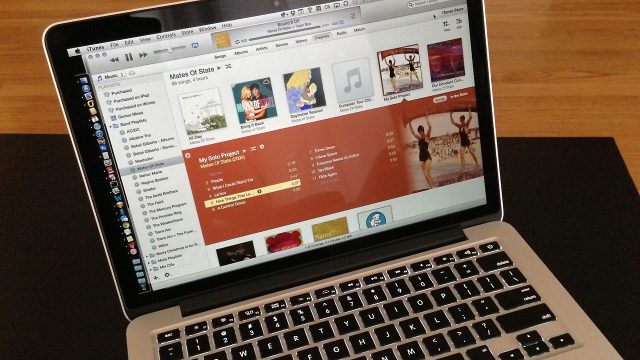
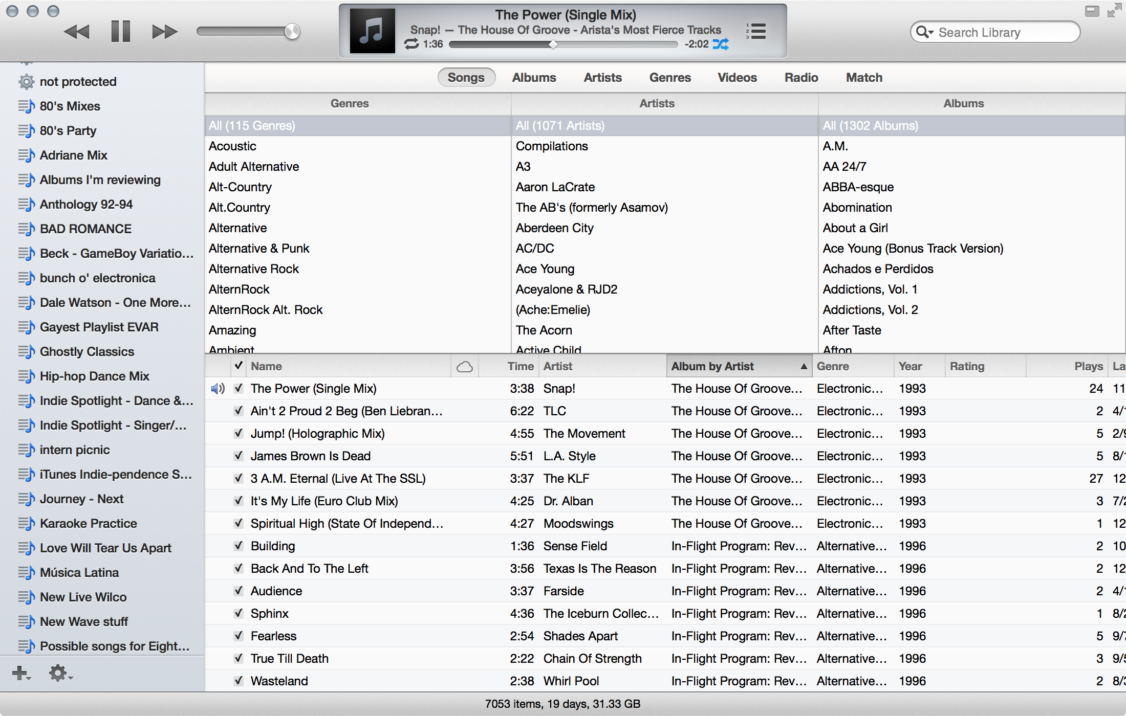
Apple has made a concerted effort to rethink the interface and make it cleaner and more approachable. iTunes 11 favors a visual display of your content, showing your music as a collection of album covers, apps as a series of icons, movies as a collection of preview frames, and books as a series of covers. For many users, especially newcomers, this visual organization will probably be a major improvement. More traditional list views are always available with a click, and they still offer detailed metadata in sortable columns.
At the top of the main window is the typical extended toolbar. The design has been refined; opinions on whether this is an improvement or not vary, but we think it looks nice. On the left, pause/play, forward, and back controls no longer appear as individual buttons. Rather, they are large, clickable shapes—not unlike similar controls on iOS. Continuing to the right are a volume slider, an AirPlay button, the central track info window, and the search box at the far right.
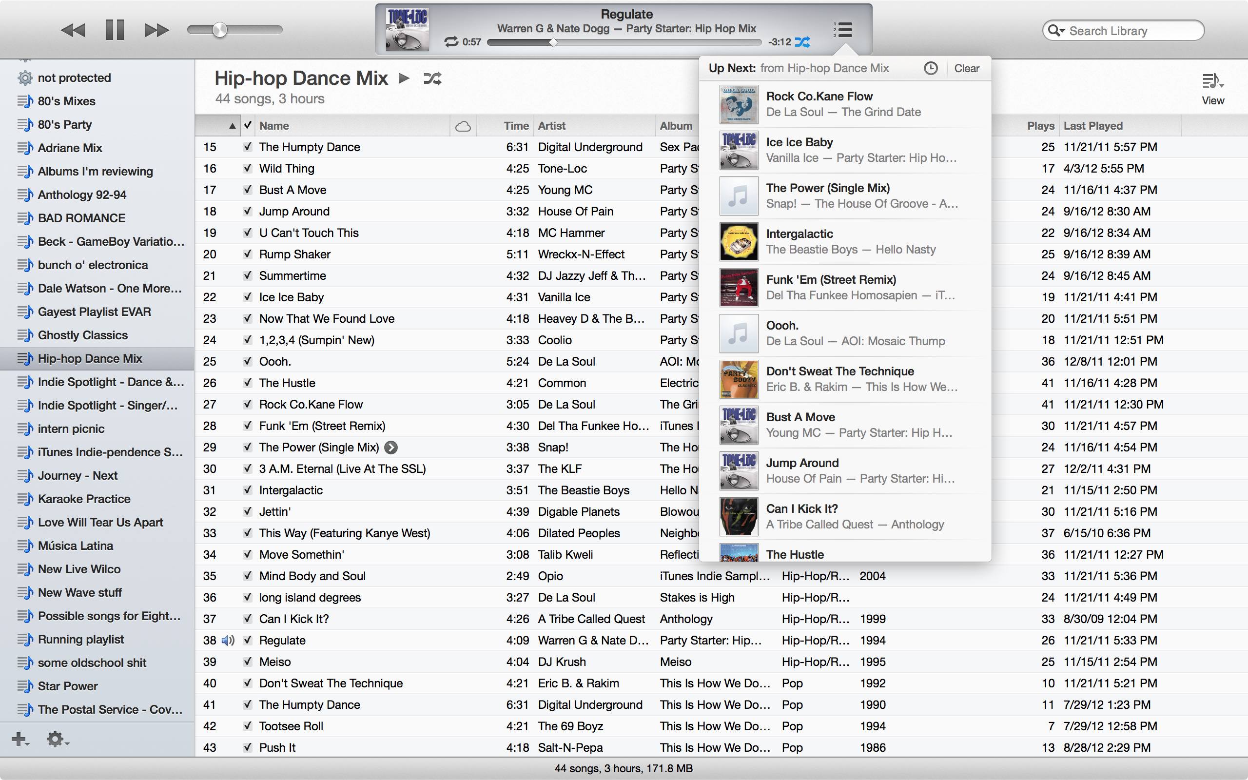
The track info window underwent some visual changes, though it does retain its rounded rectangular shape. Most notably, it now includes an icon that resembles a bulleted list to access the "Up Next" feature. Clicking here shows a list of upcoming songs in a pop-over view, with options to rearrange or insert songs into the current playlist. It appears Up Next is meant to replace the now-absent iTunes DJ, though as we'll note later it doesn't quite have all of that feature's functionality.
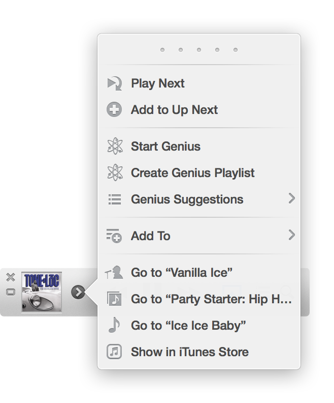
A new arrow icon pops up next to a song title when you hover over the track info window. Clicking the arrow accesses the contextual menu for the currently playing track. You can rate the track, set it to "play next," or add it to Up Next (perhaps redundant for the currently playing track). You'll also have the option to use the track for a new genius playlist, get related Genius recommendations, or add the song to any playlist. And you can have iTunes go to the track, artist, or album in your library or show where the song is in the iTunes Store. (These contextual options are available for any selected song in iTunes.)
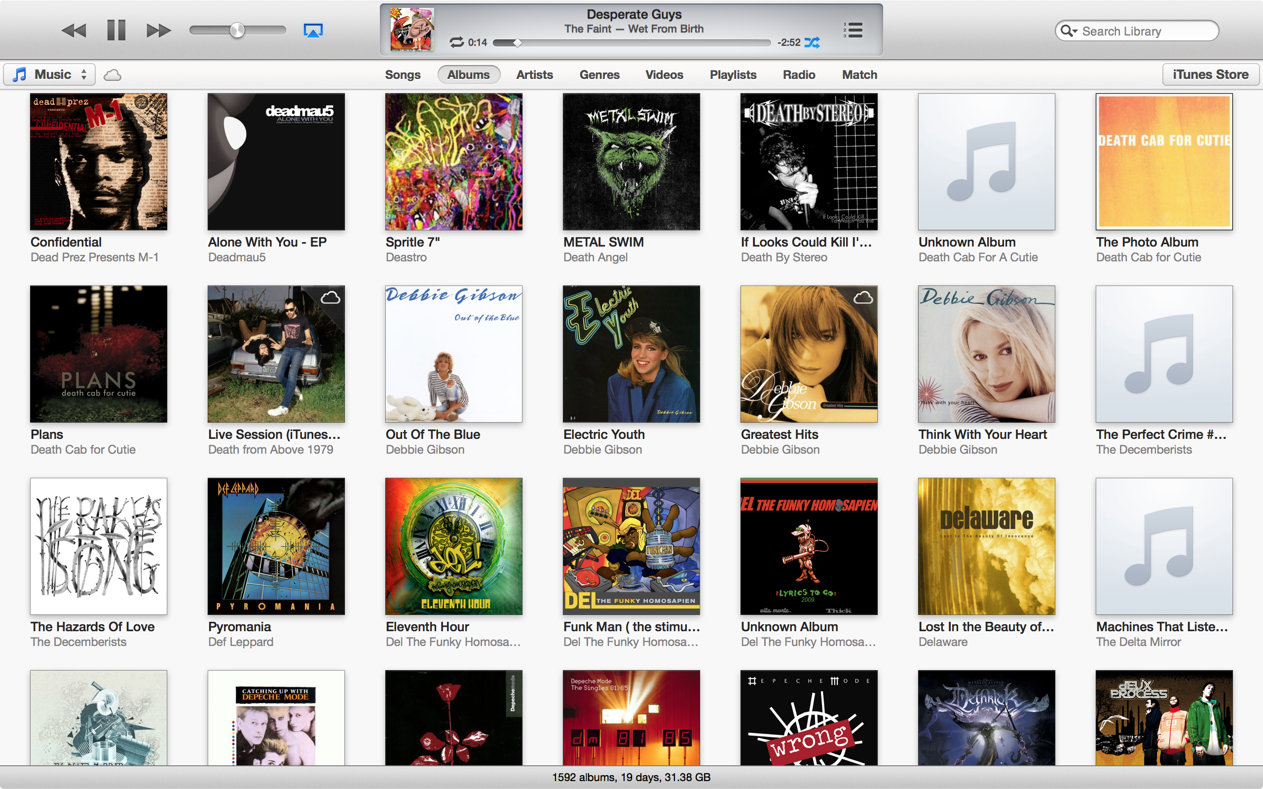
Below the main toolbar is a sort of navbar, which seems meant to replace the sidebar of yesteryear's iTunes. A drop-down menu on the left lets you switch between Music, Movies, TV Shows, Books, Apps, and Tones (ringtones for iPhones, that is). In the middle of this bar will be various options for viewing the selected media type. For instance, if music is active, you can choose to view your music as a list of songs, a grid of albums, a graphical list of artists or genres, or a grid of music videos or playlists... which then opens a sidebar of your playlists on the left, with lists of songs on the right, the usual list of streaming radio stations, and your iTunes Match tracks if you have the feature enabled.
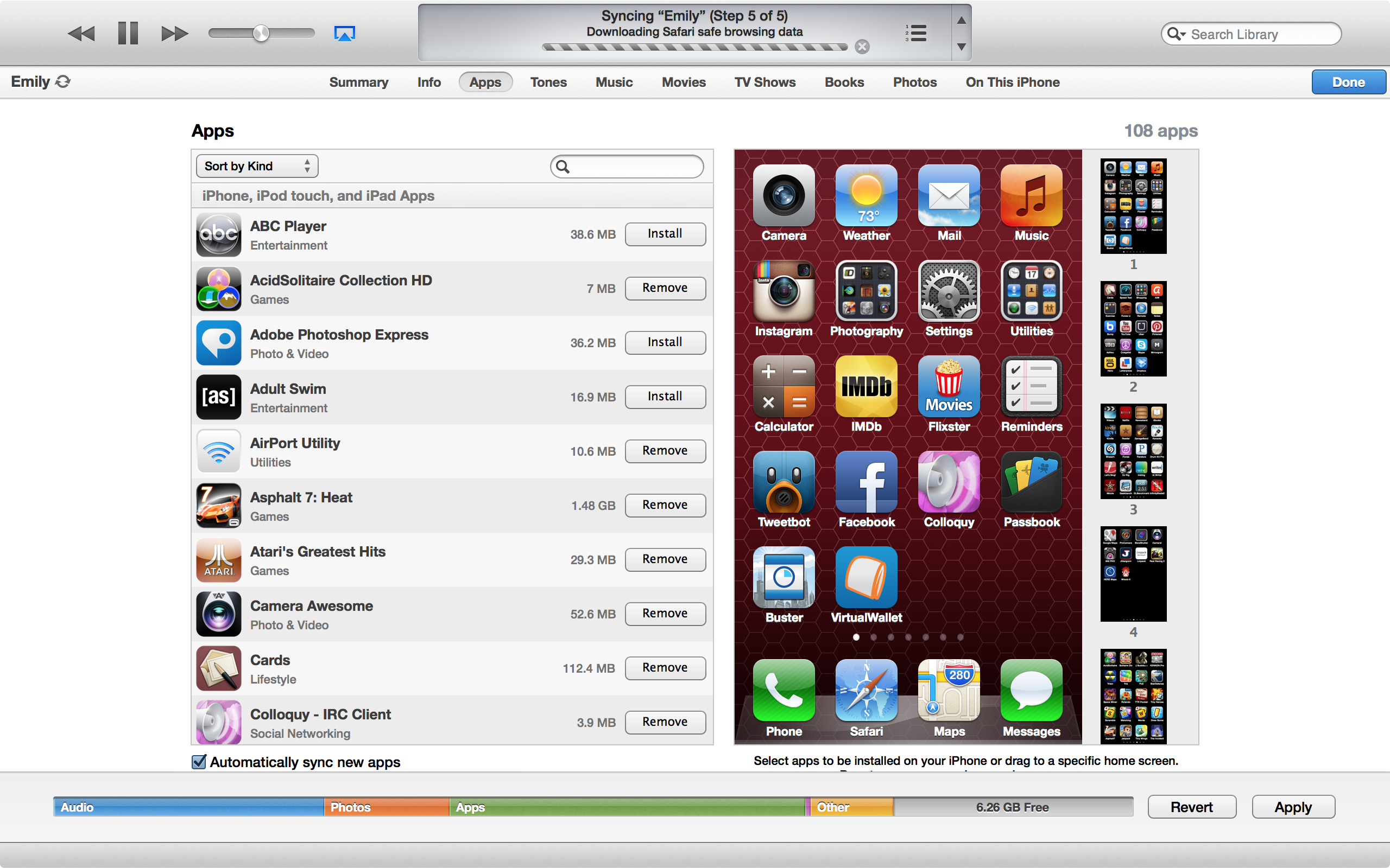
On the right of the navbar are buttons for accessing any connected iOS or iPod devices, as well as a button to access the iTunes Store. Selecting a device shows the now-familiar options for configuring and syncing an iOS device or iPod.
Clicking to iTunes Store button loads the new and improved store, which mimics what we already saw with the iOS 6 update on iOS. Featured content is displayed in an automatically rotating set of 3D-rendered "cards" at the top. Sideways scrolling lists of album, movie, or app icons are arranged under various headings like "New" and "What's hot." The tab bar allows you to narrow the Store's wares to Movies, TV Shows, Apps, etc. Along the side are lists of top sellers in various categories.
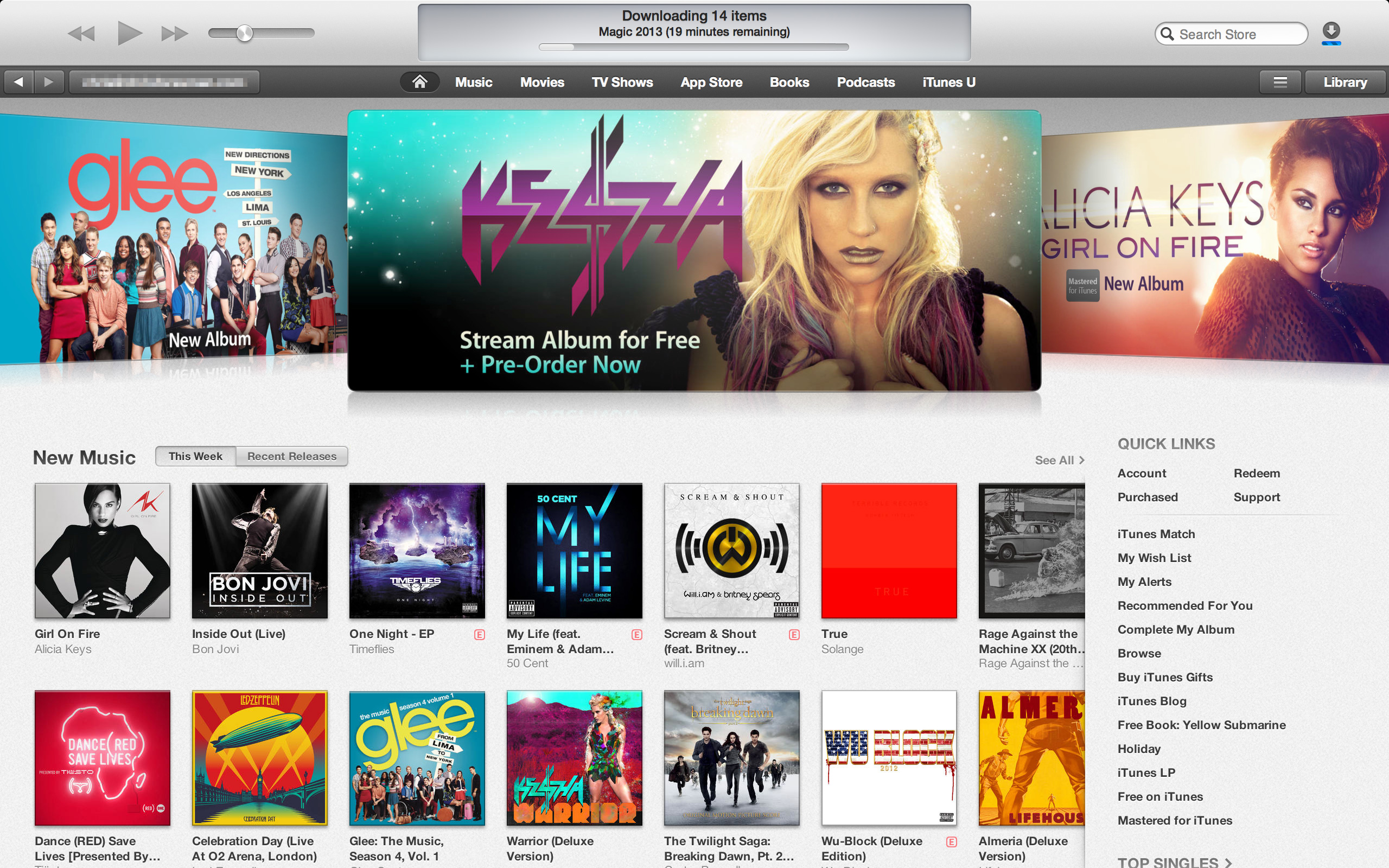
One nice touch is the new ability to scan an iTunes Gift card using your Mac's FaceTime camera (or presumably, any suitable webcam). The long strings of numbers and letters that make up the codes on iTunes Gift Cards can be bit of a pain to enter correctly. And according to a developer contracted by Apple to help build the new feature, it's also great for users with disabilities that might otherwise make it near impossible to redeem the gift cards without assistance.
This design isn't exactly new, but Ars Social Editor Cesar Torres suggests the new layout is a "great use of space" and that "the new layout seems to squeeze more titles in there than before."
But users who lament the missing sidebar can rejoice—you can easily bring it back with a simple click in the View menu. Anyone who hated iTunes 10's decidedly drab, monochrome icons in the sidebar will also be happy to note that their old color has returned.
If you also miss the information that once appeared in the bottom status bar of iTunes, you can bring that back, too. However, with the re-arranging of most of the controls that used to live here—in particular AirPlay—the status bar is largely vestigial.
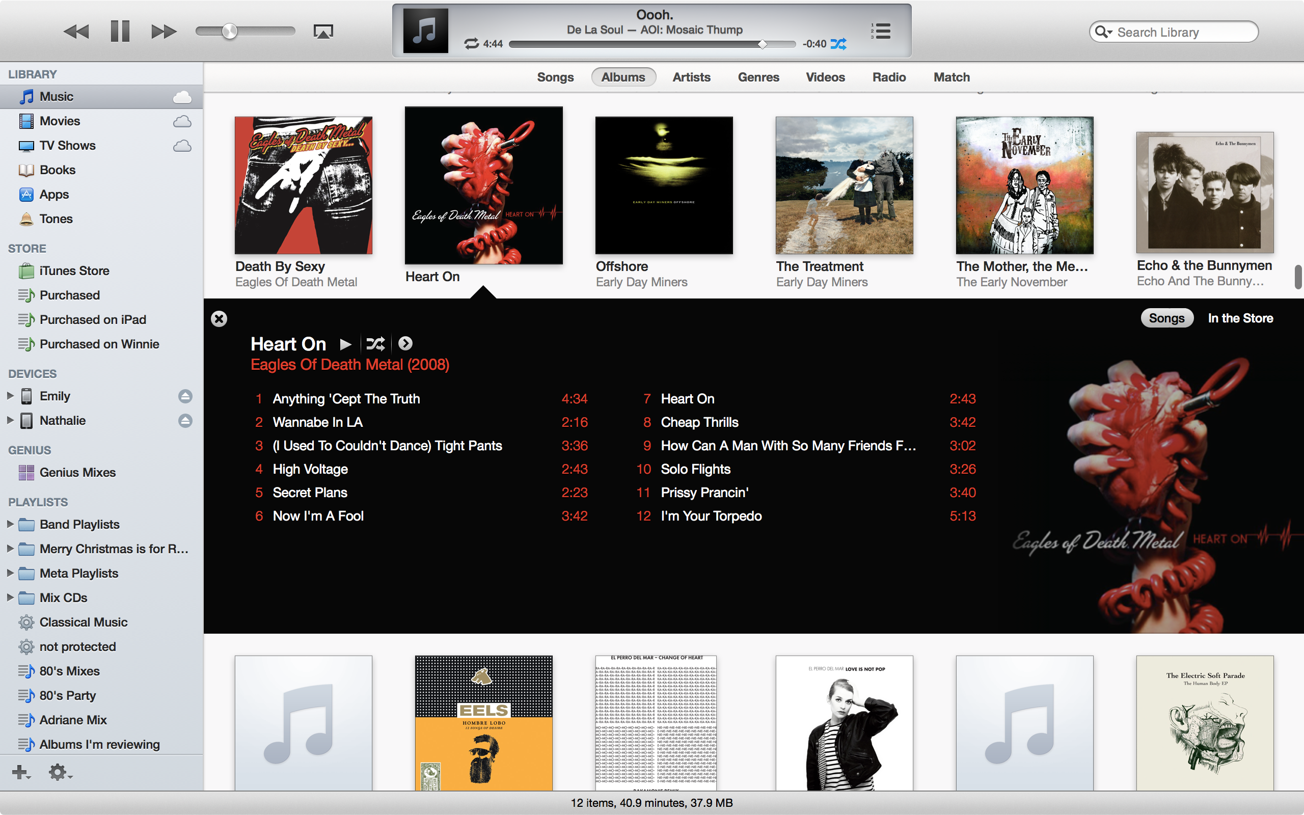
iTunes 11 also brings a new Album view. Here, all your albums are arranged in a scrollable grid. They can be sorted by artist, release year, or other criteria. Click an album, and a more detailed view of that album's songs rolls down. iTunes automatically "themes" this detail view using colors from the album cover for the background and text. It's a subtle but nice touch. An "In The Store" button lets you see what other songs from the artist or album are available.
Another major change is the new "mini player" window. Apple has thankfully stopped using the standard "zoom" window control to activate the mini player, instead adding a specific control just to the left of the standard "full-screen" control on the main toolbar.

In addition, the mini player is a bit more functional than the old design. The same "action" pop-up menu allows you to perform a number of actions on the currently playing song. Hovering over an album icon pops up the artist and song title. You can also access AirPlay, Up Next, and search options directly from the mini player, which gives users a lot of control outside of the main iTunes window.
It's worth noting that you can't switch on the mini player mode if iTunes is running as a full-screen app. But there is a workaround; you can switch iTunes out of full-screen mode, enable iTunes to show up in all spaces, open a mini player window, and then switch the full-size window to full-screen. The only downside: you're then stuck with iTunes showing up on all Spaces when not in full-screen mode. It might be easier for users if Apple simply automatically switched out of full-screen mode when users want to switch to the mini player.
The overall design definitely feels cleaner. Gradients and shadows are subtle, and various lists and organizational interface elements seem to use space more efficiently. Even the judicious use of white space makes the overall interface feel a little less busy.
In particular, Apple replaced the default Lucida Grande UI font from OS X with Helvetica, the main UI font on iOS. The change lends a certain aesthetic to the overall UI, but not everyone has been happy with it. As noted by John Gruber, it does indeed look "gorgeous" on a Retina display Mac (such as the 13-inch Retina MacBook Pro I used to check out iTunes 11). Helvetica looks fine on non-Retina displays, but perhaps not as good as the screen-optimized Lucida Grande. The overall design actually feels geared toward Retina displays, right down to the tiny cover art icons that are crisp and recognizable on such displays.
As a bonus, the app seems to be a bit better overall when it comes to performance—at least on OS X. iTunes has never been especially speedy with any sort of sizable library, but long lists of apps and albums in my library scrolled swiftly and smoothly.
reader comments
210