Apple’s iTunes 11 officially launched to the public today, after an unveiling in September at the iPhone 5 special announcement event. Originally planned for an October release, iTunes 11 apparently required a little more time in the oven to bake, and now arrives just under the wire of its revised November timeline. But it’s understandable that this release took a little longer than expected: it’s a significant change, one of the biggest since the introduction of iTunes.
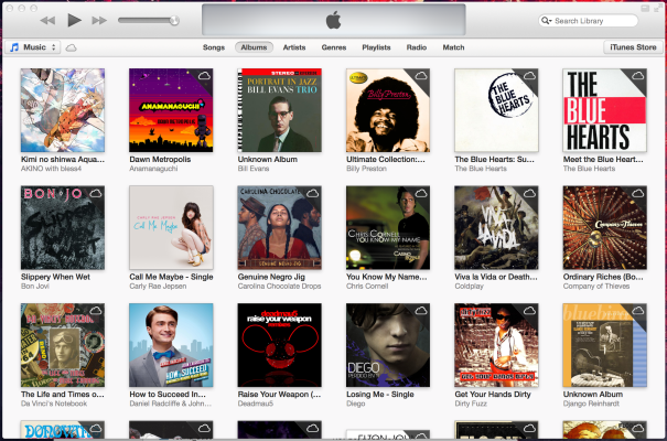
What’s so different? Well, on the surface, Apple has paid a lot of attention to streamlining the experience and getting rid of additional clutter. Now when you’re looking at your music, you’re not also looking at a sidebar, a store window, a lists of playlists and a lot of extraneous information. Library views drill down to the content type you’re after, and only that content, switching entirely for music, TV shows, apps and movies, and bringing sub-navigation to the top of the interface.
In many ways, it’s a cleaner look, but in some, it could actually be a bit more messy. Case in point: In a new album view, Apple now offers up store recommendations, including the ability to preview and purchase additional tracks from the same album directly, and access to the “Complete My Album” feature. That’s handy if you’re not sure exactly where you go the track to begin with and want to find more, but it could be annoying if you’re just looking for the stuff you bought, and had good reason not to get anything else.
It’s a different, arguably more muted way of Apple trying to maximize the sales side integration of its iTunes Store into the media player proper. But there are plenty of other changes that also aim to de-clutter the interface, including a redesigned mini player, options for picking the next track or album to play quickly and easily without wading through your entire collection, and a new store redesign that takes the overwrought mess that marketplace has become and distills it down to a less dense, more usable interface.
Finally, one of the bigger set pieces here is iCloud access, which is improved with timeline syncing across devices for movies, TV shows, podcasts, iTunes U content, and even audiobooks. That means you can start on one device and pick up on another, right where you left off, kind of like you can with Netflix. It’s a feature that should be standard for any media service trying to operate on whatever devices users own, and it’s a welcome addition to iTunes as Apple continues to evolve its digital content delivery model.
The one thing that remains to be seen is whether this new iTunes does as much to streamline the backend as it does the UI. iTunes has become somewhat bloated, slow and system resource-heavy over the years, and many are hoping this will change that. Now we’ll finally get a chance to see what kind of improvements, if any, Apple has made in that regard.