Today, Rdio showed Spotify how to make a modern iOS client for a music streaming service.
I’ve been a Rdio user for over a year now. As I’ve previously written, tweeted, and discussed on various podcast appearances (including one on Generational that will be posted next week) I was a Spotify fan for years. At some point, however, I realized that the playlist-based nature of the service wasn’t working for me, and I switched to Rdio, a competing music streaming service that, like Spotify, lets you listen to a huge catalog of music for a monthly fee.
The distinction between a playlist-based user experience and being able to organize my music in a Collection with albums, songs, and artists made all the difference for me. I don’t like Spotify’s approach to forcing the listener to organize music in a playlist. A group of albums isn’t a playlist: it’s a collection.
From my analysis of the Spotify iPad app:
When it comes to discovering and managing your music, there is simply no comparison: Rdio is better. Whereas Rdio looks and works like a service that wants to help you build and discover a music library in the cloud, Spotify keeps on being a service focused on playlist creation and search. Look for a song, tap on it, and listen. Perhaps check out some related artists and star songs. Having tried both for several months (I was a Spotify user for years, and recently renewed my subscription when I heard the iPad app was coming), I can see how Rdio has convinced many music aficionados’ to switch thanks to its rich and constantly updated discovery options and social features. On the flip side, Spotify is looking more and more like an on-demand radio, with non-existent library management functionalities and poorly explained “what’s new” and “recommended” sections.
I didn’t switch to Rdio for its Collection merits alone, though. With time, I started to appreciate the service’s focus on enabling “social discovery”, a concept that I had been avoiding for fear of exposing my music tastes to a large audience. Essentially, Rdio lets you follow and unfollow people, like Twitter, and check out their “profile pages”, which list collections, recently played songs, and other people they’re following. It’s a chain effect: a friend of mine may follow someone else with music tastes that are similar to mine. Ultimately, Rdio rewards the social explorer who’s willing to get out of his comfort zone to “try” and discover music he may not know about. I have discovered dozens of new bands thanks to people I started following on Rdio or the “social widget” in the sidebar, which, Facebook-style, shows you a real-time feed of what your friends are listening to.
It goes deeper than the social aspect. A music service shouldn’t be complex to describe (“Here’s your music, here’s what you pay, here’s how you hit Play”), but, it turns out, there are tricky decisions to make about how you present content to your users. And I like the decisions made by Rdio better than Spotify’s.
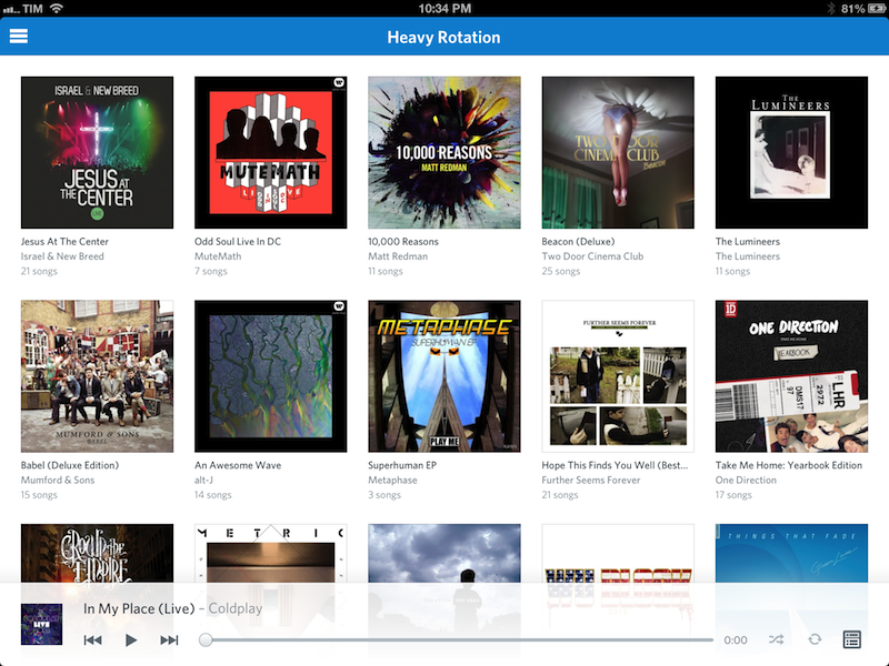
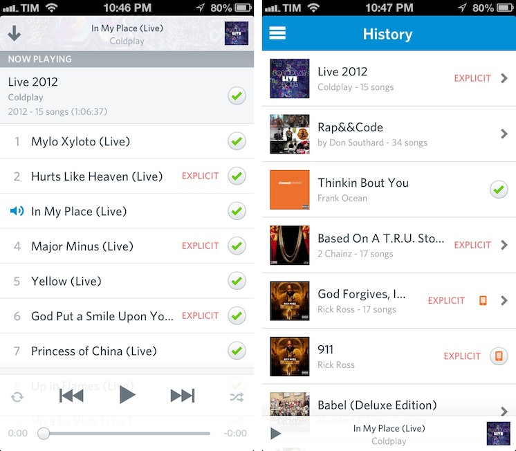
Whereas Spotify seems to focus on a jukebox-like experience based on playlists and search, Rdio is more reminiscent of an iTunes in the cloud - the rumored one, not the one shipping today. There’s the aforementioned Collection, but there’s also a weekly summary of new releases curated by the Rdio team (they don’t skip a beat - the New Releases section is promptly updated every Tuesday), Charts, social playlists, easy offline caching, and, my favorite feature, a History tab.
I wouldn’t be able to use any other music streaming service that doesn’t have a History section. Rather than just showing me what’s playing or an activity feed comprehensive of music, social updates, and playlists, Rdio has a History section that simply shows everything you’ve been listening to from newest to oldest item. You can really go back to what you were listening to three months ago and play again if you want. This is essential to my music habits: I tend to “get into” a new band (or rediscovering an old one) on a weekly basis, and History provides a nice way to get an overview of what I have been listening to lately. History is obviously synced across devices: the iOS and Mac apps and the web player will all share the same History. I have wondered if anyone has ever considered the idea of plugging into the Rdio API to visualize a user’s History over time with graphs and charts to show common trends. But that’s for another topic.
To sum up: I use Rdio because it works better than Spotify for me.
As a heavy Rdio user, I was expecting the 2.0 version of the iOS app to bring a much needed change to the iPhone and iPad. I knew Rdio’s mobile team had been working on a new UI, and I didn’t need a master degree to guess they would introduce a side panel to speed up navigation. What I didn’t know was that they also thought of a fantastic way to sync playing status across clients.
Navigation and switching between sections was one of Rdio’s biggest weaknesses on iOS. The iPhone app had long been constrained inside an old-Facebook-like grid-based system that forced users to tap multiple times if they wanted to, say, move from History to a specific playlist. It screamed 2009 from every pixel. The iPad app, on the other hand, featured a sidebar that partially made navigation better, but it also came with a UI that Rdio dropped months ago and that the team didn’t care to update. It was confusing, ugly, and broken.
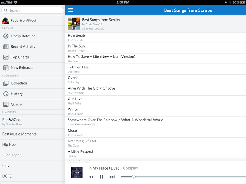
Rdio 2.0 is much better. The new-Facebook-like side-panel has turned out to be a proven interface element that, whilst not super-innovative, gets the job done. In a sidebar on the left, you can now browse Heavy Rotation, Recent Activity, Top Charts, and New Releases. Underneath the Browse section there are links for your Collection (including History), and if you keep scrolling you’ll see all the playlists you have created or subscribed to. Settings and Sync are available at the end of the sidebar.
I have two nitpicks about this approach. Firstly, I can’t seem to find an option to hide Playlists from the sidebar, and I imagine this could become a problem for users who have many. I don’t think scrolling a never-ending sidebar is a good idea, so I’d like Rdio to introduce an option to hide a playlist from the sidebar. This choice, obviously, has also the consequence of not providing a single Playlists link in the sidebar to view all your playlists; to access such view, you have to tap on your Profile, then Playlists. I’d prefer this section to be linked in the sidebar.
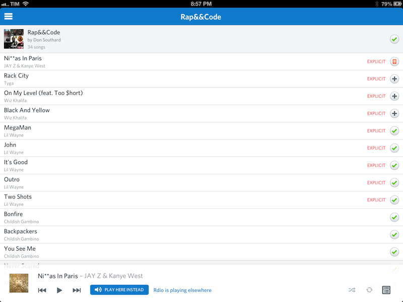
Second, I’d like the iPad version of the app to always show the sidebar. Right now, several areas of the iPad client look like a blown-up iPhone app, whereas others show that the Rdio team took advantage of the larger screen with grid views and modal windows. However, in albums or playlists the interface is made by a vertical list that looks awfully similar to the Android tablet apps Tim Cook made fun of. There’s too much wasted space that could otherwise be used for the sidebar or, perhaps even better, the social ticker that is still exclusive to the Mac app and web player. The whitespace becomes particularly annoying, in my opinion, when you consider how the Rdio sharing menu is exclusively available by tapping on a button at the rightmost side of a song. You can’t tap & hold a song to bring up the menu (which contains links to share, sync, play later, etc); instead, you have to move your finger all the way to the right.
At the same time, I want to point out how the swipe gesture to bring up the sidebar is incredibly smooth, both on the iPhone and iPad.
I wasn’t a fan of the uber-minimal Rdio redesign, but it’s been growing on me. Especially with cover album grids, the white background really gives music a chance to shine and be front and center. I like the font choices of the new iOS app, but I’m not completely sold on the “flatness” of the title bar and buttons. It’s a unique design, but it also feels somewhat extraneous to the iOS environment. It’s too early for me to tell whether I appreciate the graphical changes or not.
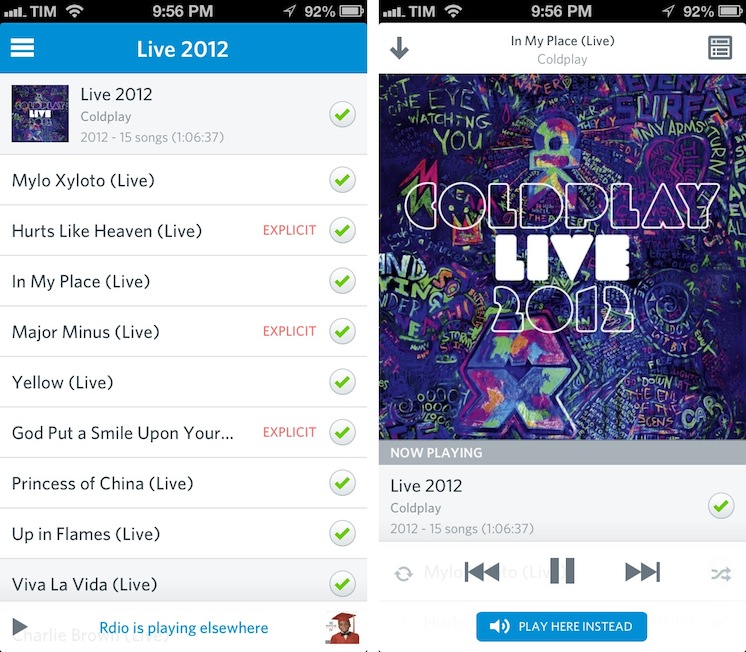
The best feature of Rdio 2.0 is the unified player with sync. Since the introduction of the taller iPhone 5, developers of apps with audio players have found themselves struggling to properly display artwork on screen. My friend Rene Ritchie proposed some interesting solutions over at iMore. Rdio avoids the problem entirely by unifying song information, artwork, queue, and stations in a single Now Playing screen on the iPhone. The layout is neatly organized and I don’t get the feeling that artwork isn’t properly centered. In the title bar, there’s a button on the left to collapse the artwork and go back to browsing (but you can tap on the entire title bar to dismiss it); on the right, a queue button scrolls directly to the bottom part of the screen featuring Now Playing (as a tappable item), the album or playlist (if you’re playing one), your Queue, Play Later, and Rdio stations. A nice touch is how the Queue button becomes the artwork of the currently-playing song after you tap on it.
The new player is synced across devices and the web. Every Play Later item or queue will be synced instantly with your Rdio account, so it’ll be available on any platform. In my tests, this refresh happened in less than two seconds with the iOS and OS X apps and the web player already opened in the Player interface. The new Player is always accessible on the iPhone with a widget at the bottom of the app; on the iPad, the player is also displayed at the bottom with controls always visible. I still don’t like how many developers think it’s okay to omit on-screen volume controls, and Rdio is no exception.
What’s great about the unified player isn’t the single-screen availability of multiple items per se. It’s the sync component combined with the Remote Control feature. You can now control other Rdio apps remotely: you can pause Rdio for Mac from your iPhone, or pause an iPad from the web browser.
This is an incredibly powerful concept on paper. It is a step closer to Joshua Topolsky’s so-called Continuous Client: a way for apps and websites connected to the same cloud platform to instantly and seamlessly present the same information depending on the user’s need.
In practice, Rdio’s remote control needs a bit more work. When you play something on one device, a “Play Here Instead” blue button appears instantly on the other. The way play status is synced is indeed quite impressive. When you hit the Play Here button, though, music doesn’t start playing right away. On the Mac app, I managed to get the player to automatically scroll to my listening position synced from iOS, but it wasn’t precise to the second. On iOS, I couldn’t get the player to scroll to any position at all - it just offered to start playing the song from the start again. And that’s the main issue: when you press Play Here, songs don’t start playing automatically, they’re simply “brought over” and you’ll have to manually press Play again. To make this option perfect, Rdio would need to figure out how to really sync position in a song and start playing it automatically - or at least just make synced position work properly on every platform.
In spite of the initial flaws, a functionality that Rdio’s new synced player enables is control of apps remotely. Allow me to rephrase: you can use desktop controllers, not just the Mac app, to pause the music on your iPhone or iPad.
Try it: using Take Five on OS X, which requires the Rdio Mac app to be open, hit the keyboard shortcut for play/pause. Rdio on your iOS device will pause. I hope this never changes (Take Five hasn’t been updated in a while) because I find it extremely cool and convenient to be able to control my phone over the Internet with a keyboard shortcut.
As a side note, I’m glad the existing URL scheme still works. Rdio 2.0 doesn’t seem to break compatibility with Launch Center Pro and Bang On. The URL scheme could be simpler, but adding rd.io short URLs to rdio:// still works. Here’s an example of link you can use on iOS to directly open a song: rdio://rd.io/x/QVfpRTdeP1On.
–
Rdio 2.0 is a great improvement. The new swipe gesture and sidebar make it easy to navigate across sections, and the synced player is a wonderful addition. There are some things that could be done better: Rdio still isn’t sharing the specifics of song quality they stream, the iPad UI could be more compact, and the unified player needs more seamless sync of play position. I hope Rdio will bring back Recommendations, too, as they’re gone entirely with this update.
Rdio 2.0 is an example of what a streaming service’s iOS client should be like. I’m glad to be a subscriber.