
As the Apple and Samsung trial now enters its third week, Samsung’s senior user experience designer Jeeyuen Wang explained via an interpreter that the company did not copy Apple’s own icon designs on its line of Galaxy smartphones.
On the contrary, Samsung’s choice of icons – which so closely resemble Apple’s it’s ridiculous – was the result of many many hours of research and testing. For instance, Samsung’s design decision regarding the green phone icon was chosen because it “resonated best with users.”
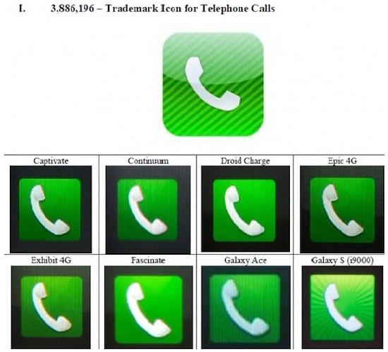
And believe it or not, and despite internal Samsung documents to the contrary, Wang, when asked if she referenced Apple’s icon designs when designing Samsung’s said, “We did not.” And note, that Wang’s name appears on some of these documents.
Makes for a great story, but let us revisit once again an internal Samsung document which makes it abundantly clear that Samsung was out to copy, quite explicitly, the design aesthetic of Apple’s iPhone.
Apple of course brought this to light during its cross-examination though Wang, ever so instructed by Samsung’s legal team, maintained that Samsung was simply trying to create icons specific to Samsung, but that all designers aim to create “icons that are simple and not confusing to users.”
Well, I guess if you copy the iPhone, that’s one way to familiarize users with the icon scheme and layout. I mean, come on. The same icon design with the same color scheme essentially and we’re supposed to believe that it’s all just a coincidence?
Wang added at the end of her cross-exam, “We tried to develop Samsung icons, something that represents Samsung.”
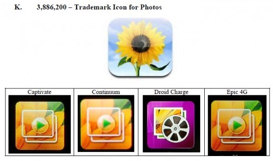
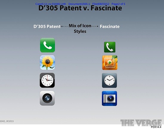
Here are some more examples brought to light by Apple.

via All Things D

Wed, Aug 15, 2012
Legal, News