Yes, here’s another weather app review for you. Instead of inventing new intros for these posts, I would like you to think about that special day when an iOS developer combines all of the single ideas of the new weather apps available - from minimalist UI elements over cool animations to perfectly displayed and visualized data - into one single application. We could finally purchase the perfect weather app for our iOS devices, and we no longer need weather app reviews like this one.
But we still desperately search for and find new, special, almost perfect weather apps with features every month, download them, try them out, and then what? We send them back into the black app hole of washed-out, used apps after some weeks, just because they do not fit our individual needs and style, and then the cycle starts again. If I’m right, this will always be the case, especially when it comes to iPhone weather apps. I believe that no UI concept in the world could visualize all important weather data possibly needed while still having a totally intuitive and simple UI on such a small screen size. On the iPad, the situation is a bit different. My personal weather app of choice for the iPad is now Weather HD 2, which I recently reviewed, because of its stunning animations, which make impressive use of the device’s Retina display. Although I won’t go away from Weather HD, there are also many other apps for people with a different taste in UI design, like minimeteo for lovers of minimalist UI or Aelios for fans of polished interfaces.
Today’s subject, Partly Cloudy, an iPhone app by German development cave Raureif, is perfectly suited for data visualization geeks. The app displays a rather limited set of weather information: temperature, wind speed (measured using the Beaufort wind force scale), precipitation and the overall current outlook. Its forecast view can be set to 12 hours, 24 hours and 7 days. All other imaginable features, like cloud movements or visibility range apps like WeatherSnitch advertise with, were completely left aside in order to provide space for Partly Cloudy’s most interesting feature: the radial clock visualization diagram.
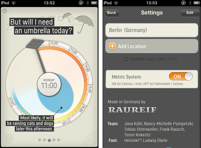
After the first launch, you are greeted with an extensive tutorial explaining the features of the app and how to read the mentioned clock diagram the app is focusing on. You can always re-visit this tutorial via the information button in the top left corner. When you’re done with the tutorial, you start adding all the cities you want weather forecasts for. Adding new cities and change the temperature metric system between Celsius and Fahrenheit is possible in the app’s (rather poorly designed) settings. During the writing process of this post, the app already received its first update with Retina-optimized graphics, so it now looks perfect on your iPhone 4 and 4S. Unfortunately, you still cannot switch between locations by swiping over the screen, a gesture that would be very beneficial, and in my opinion should be included in a future update as it is standard in most weather apps.
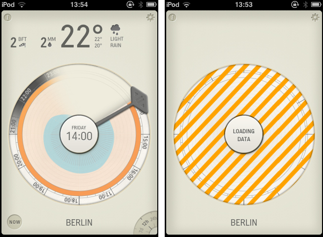
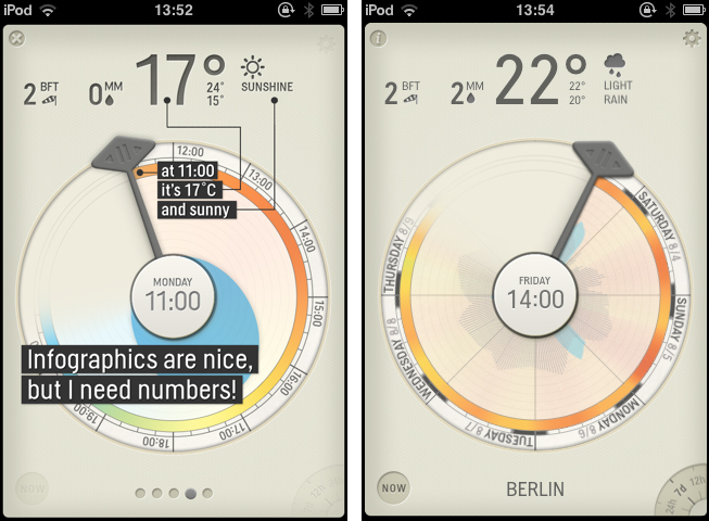
Okay, enough criticism. Let’s focus on innovative features which make Partly Cloudy very interesting: the elements of main window in which the forecasts are displayed. At the top, displayed in bold Helsinki typeface letters (designed by the award-winning type designer Ludwig Übele), you find the weather data numbers. With one glance you have a quick overview of the current weather situation. Right below the numbers, you find the radial “clock visualization” feature the app uses to display forecasts. It works as follows: using a draggable indicator, you move it to the specific time or date you want a forecast for, which the app then displays in the center of the clock; the numbers at the top then change accordingly. To support the numbers, the clock features visualization of the temperature, precipitation and wind speed data. Temperature is displayed in the outer ring of the clock, right beside the time, using colors from blue (cold) to red (hot). The amount of possible precipitation is visualized through a smooth, wobbling graph filled with the color blue. The more blue color fills the circle, the more rain will likely fall at that point in time. The wind speed is displayed quite similar, but instead of a full 360° graph, it’s displayed using single lines (larger lines equal higher wind speed) which have their starting point in the center of the circle as well. The whole clock diagram is colored and styled properly. The colors fit to the overall beige tone of the rest of the app’s UI. The single details (except the settings) like the settings wheel in the lower right corner with which you change the forecast period or the indicator are lovely crafted.
The clock visualization is definitely not suited for the “average weather app user”. You need some time to get used to it, and you cannot really scan it to get a quick glance of the forecasts. It is more of a precise weather discovery tool for specific points in time than a fast weather information center. I personally won’t use Partly Cloudy on the iPhone in the future, the numbers are just way too small to fit my taste, and I don’t need that geeky visualization concept. I simply want to see how warm or cold it’s going to be today and the next week. But maybe there are people out there who have searched just for this visualization method. If you think you are such a person, you should give it a try. Partly Cloudy is available in the App Store for $0.99.


