Moving to Pelican - Design Planning
Previously on “As the Pelican Turns”: Moving a WordPress site.
In this installment, I’ll share some of what I learned about building a customized Pelican static blog. Specifically, the theme planning and design work. I’ll talk about coding Pelican themes in a later, equally dull, post.
Disclaimer
I am not a designer. I am not a web developer. I wear Hawaiian shirts a lot and I’ve been known to wear sandals with socks. But I read A LOT and I know what a bad reading experience feels like. Follow my advise at your own peril.
Tools
There were a couple tools that I found very helpful:
I collected all of my design references in Pinboard.in. My public links are available to anyone. I dump anything I might want to remember. My project tags begin with underscores. This project is tagged “_pelican” and “design”.
I used Acorn a lot. It has a great color picker and it’s fast. I have Pixelmator, but I always come back to Acorn.
Coda is my copilot. Just fantastic on both the Mac and iPad.
I used Dabblet for testing some CSS.
SquareSpace is the easiest way to prototype any web site.
Ground Rules
I wanted a few things out of the new site design.
- Small pages that load fast
- My own look
- Easy to read
- Works on iPhone, iPad and a 27" monitor
I wasn’t willing to sacrifice any of these for the others.
Actually, Size Does Matter
This was an important one for me. I really think one of the biggest benefits to a static blog is how fast a page loads. It’s just text and images. There’s no database query. There’s no dynamic page building. Why not try to make it lean and mean? Most of the web is actually pretty lean.
I’m happy with the results. Some of the tools I used along the way were provided by Google.1
Google Web Developer tools are great. Specifically, I can use Chrome and a couple of plugins to see exactly what is loading and how long it takes.
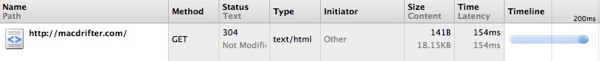
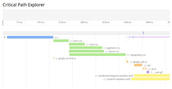
Safari on the Mac also has some nice tools for understanding what is dragging down page loads. For this site, most of the bottle necks are for things out of my control like GoogleAd JS required for Syndicate Ads. Even those are not that significant.
Nice but Different
Pelican comes with a very attractive theme by default. Here’s a good example with some nice information. But for me, it is too recognizable as a Pelican site, much like a typical Octopress site looks like an Octopress site. Most of the work to get this site up was spent on design work.
Before and during the planning, I made a list of sites I enjoyed reading on and then made a list of reasons why I like reading there. I like different aspects of each of these sites and I generally read them on the site:
Easy to Read
This seems obvious, but there are many sites that I really can not read. Either the text is too small or the colors are way off. I read every post I make on my site after it is posted. I want to enjoy the reading experience. I wanted to not need Instapaper or Readability to read. Here’s a test for any site: Open the same article on the website and in Instapaper. Is one much better looking than the other? That’s the one people will read.
Adaptive Web
I wanted a site that worked well on a small device like iPhone but also on a huge 27" monitor. I don’t like serving different versions of the site to different devices. I think iOS Safari works great and there’s no reason to reformat the content if the site is designed well.
My old site limited the maximum width of the article content to 600px. That looked dumb on a large monitor. I chose a “fluid” design for the article content on the new site. It’s just basic CSS but it makes the page scale well to the device. On iOS I can double tap the article text to zoom in and ignore the sidebar. On my Mac, I can stretch the window as wide as I like to avoid scrolling. It’s old school but it still works for me.
It’s simple to accomplish. I wrapped everything in a div named “contentliquid” and apply this CSS:
:::css
#contentliquid {
    float: left;
    width: 100%;
}
Design Planning
Color Schemes
I already had a fairly modest palette for this site. I translated most of that to the new design. I wanted to add one additional call out color for special content.
Kuler.com was very convenient for browsing color schemes. I also used the heck out of Acorn on the Mac to test colors side by side.
I initially built the site with a pure white background but I didn’t like the reading experience on my iPad. So I chose a very light grey instead. So far I like it. I also went with dark grey on the navigation bar and sidebar for similar reasons.
Changing the styling in Pelican is as simple as working with any other CSS. I can add div tags in my Pelican HTML templates and fiddle with CSS endlessly.
Browser Support
I didn’t go out of my way to support IE or old browsers. IE is a pain in the ass because Microsoft likes to invent their own rules. This site looks like crap on IE 8. I’m ok with that.
I try to support Webkit and Firefox where possible and convenient. If it’s just a couple extra lines of CSS then I support it. If it requires JS to manipulate the DOM, then I have no desire to support it.
Fonts
Typography is important to me. It’s not important enough to criticize significant scientific discoveries based on the font of their presentation, but it is enough to send a website to Instapaper if it is hard to read.
I previously used TypeKit and it worked well and was moderately easy to implement. When I started prototyping I noticed that TypeKit caused a significant delay to page loading. It also added quite a bit to page size. I decided to try loading my own fonts and used FontSquirrel to acquire some tasteful fonts. Fonts still contribute to a significant amount of the page load time but I think it’s worth it.
CSS and JS
I opted to not load any JS libraries that were not absolutely necessary. For example, there’s no JQuery. I have tried to do as much as possible with CSS.
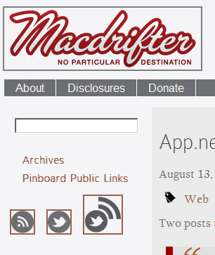
Graphics
I’m using several icons from Picons. I’ve created customized versions and optimized the images to reduce page size. I’m still using the same logo designed by Aaron Mahnke. I reduced the size slightly. Keeping with the goal of reducing the load time, I’ve tried to cut out image loading everywhere other than in the articles.
I also decided to keep my images in article posts to a maximum size of 600px. This allows them to display completely on iPhone and iPad while reading. It also means that the article text is limited to a minimum width of 600px.
I’m using ImageOptim as much as possible to create lossless versions of images and reduce file size.
I’ve considered making a Retina enabled version of the site, but I’ve decided not to bother yet. It would mean that images would be enormous on iOS and a lot of people still use 3G or slow WiFi.
Favicons
I added new favicons for the site. But I went fullmonty. I added retina favicons for iOS so they look nice as bookmarks on the springboard. I also wanted the site to look moderately acceptable in Reeder.
I created the favicon myself (and it shows). Loading them into the site is simple. I just added them to my Base Pelican template.
:::html
<link rel="apple-touch-icon-precomposed" href="/theme/images/touch-icon-iphone.png" />
<link rel="apple-touch-icon-precomposed" sizes="72x72" href="/theme/images/touch-icon-ipad.png" />
<link rel="apple-touch-icon-precomposed" sizes="114x114" href="/theme/images/touch-icon-iphone4.png" />
<link rel="apple-touch-icon-precomposed" sizes="144x144" href="/theme/images/touch-icon-ipad3.png" />
<link rel="apple-touch-icon" href="/theme/images/touch-icon-iphone.png" />
Design Elements
Page Layout
I changed the front page design. Only the most recent post is shown in its entirety. Older articles are shown as excerpts. This was done on purpose to reduce the overall page size of the landing page index but still allow browsing recent articles. It seems to be working out.
Menus and Sidebars
I wanted to keep the sidebar and navigation bar from the old site. I don’t run a bunch of ads but I do have a Syndicate ad and I plan to add back my favorite apps to the sidebar. The navigation bar helps to spread the clutter out a bit and serves a single purpose. It’s also only CSS and HTML. I consider using some fancy navbars but they require additional JS that I didn’t want to add.
Making a menu bar is simple. Here’s the HTML:
:::html
<div id="menu">
    <ul id="navlist">
        <li>
            <a href="/pages/about.html">About</a>
        </li>
        <li>
            <a href="/pages/disclosures.html">Disclosures</a>
        </li>
        <li>
            <a href="/pages/donations.html">Donate</a>
        </li>
    </ul>
</div>
Here’s the CSS:
:::css
#menu ul {
padding-left: 0;
margin-left: 0;
background-color: #6D6E71;
color: #F5F4F6;
float: left;
width: 100%;
font-family: arial, helvetica, sans-serif;

}

#menu ul li { display: inline; }

#menu ul li a
{
padding: 0.2em 1em;
background-color: #6D6E71;
color: White;
text-decoration: none;
float: left;
border-right: 1px solid #fff;
}

#menu ul li a:hover
{
background-color: #A90101;
color: #fff;
}
Search Box
I still prefer DuckDuckGo. While I was building the new site, I blocked search crawlers. I didn’t want a bogus set of search results. The downside was that after lifting the ban it takes DuckDuckGo a rather long time to reindex. In fact it appears to have required an email to DDG support. But I’ve noticed DDG still has many of my old URL’s indexed. Most of them automatically redirect, some do not.
Hover
I like to have links in the article to be obvious but not distracting. It’s why I use a muted color. But I also wanted them to jump out during mouse-over events to make it obvious something will happen when they are clicked. Same goes for the navigation bar.
To accomplish this, I’m using CSS on-hover and fade effects. It’s very easy.
For example, the “read more” link on each article uses this CSS:
:::css
a.readmore {
    color: #A90101;
    text-decoration: none;
    -o-transition:1s;
    -ms-transition:1s;
    -moz-transition:1s;
    -webkit-transition:1s;
    transition:1s;
}

a:hover.readmore {
    text-decoration: underline;
    color: #334040;
    background-color: #FDCC80;
}
Code Formatting
I spent a huge amount of time testing and prototyping code display on this site. I’m still not thrilled with it but it’s getting better. I first tried using SyntaxHighlighter which is a JS library for dynamically highlighting code. It’s very cool and there is even support for AppleScript. Unfortunately, it requires major changes to the way code is inserted into a post.
I also tried using Highlight.js. It is very pretty and supports a lot of languages. But much like Apple, it does not support AppleScript. Highlight.js allowed me to used simple code blocks and I was generally happy with the outcome. If it had built in support for AppleScript I probably would have stopped looking.
Pelican supports Pygments out of the box (as long as the Python library is installed). Pygments is interesting because of how it works. It is a Python module that converts code blocks from Markdown into standard html with CSS class properties. The site then delivers CSS to format those classes. So when you look at code like this:
:::css
ul.horizontal {
    list-style: none;
    padding: 0;
}
ul.horizontal li{
    display: inline;
    padding-right: 20px;
}

ul.fakelist {
    list-style: none;
    margin: 10px 0 10px 20px;
    padding: 0;
}
you are looking at plain old HTML and CSS, not a code block. What initially turned me off was how code blocks need to be tagged in the Markdown. The above code looks like this in Markdown:
:::text
:::html
ul.horizontal {
  list-style: none;
  padding: 0;
}
ul.horizontal li{
  display: inline;
  padding-right: 20px;
}

ul.fakelist {
  list-style: none;
  margin: 10px 0 10px 20px;
  padding: 0;
}
The block still must be indented but it also must have the header line identifying the language. There are a lot of supported languages, even AppleScript. The problem I still have is that old posts are not formatted correctly. The code looks like crap. I have to manually edit each old post to change the code block.
Outside of that, I really like Pygments. Changing the style is simple and involves using a different CSS definition. It’s also easy to type since I don’t need to wrap the code in tags.
Here’s a the Solarized-light CSS I am using. Here’s the Solarized-dark CSS. Just look around Github for more.
Other Design Elements
Blockquotes are a big deal to me. Quoting in general is a big deal. I like for the quote to figuratively jump off the page.2 To accomplish this, I’ve always used a bit of overly fancy CSS.
:::css
blockquote {
quotes: none;
}

blockquote {
word-wrap: break-word;
text-align: justify;
color: #990000;
border-left-color: #990000;
background:#e1e1e1;
border-left:10px solid;
margin:1.5em 10px;
padding:.5em 10px;
quotes:"\201C""\201D""\2018""\2019";
width: 500px;
font: italic normal 12pt/1.2em Georgia;
}

blockquote:before {
color: #b35e3b;
content:open-quote;
font-size:4em;
line-height:.1em;
margin-right:.25em;
vertical-align:-.4em;
}

blockquote p {
display:inline;
}
It’s a modification of this tip and generates quotes like this:3
Say what you will about the sweet miracle of unquestioning faith, I consider a capacity for it terrifying and absolutely vile!
I’m also framing images in the articles with some CSS:
:::css
#article img {
    padding:5px;
    border:1px solid #969696;
    background-color:#e1e1e1;

}
This gives me a nice little border around the images, like this:

I use a bunch of other CSS but I’ll save that for another completely inaccurate and boring post. This one has reached its quota.