:format(webp)/cdn.vox-cdn.com/uploads/chorus_asset/file/13975574/DSC02004_Snapseed.1419969028.jpg)
Pulp has been around for a while now, but it occupies a curious niche in the App Store — it's somewhere between Flipboard and Reeder, with the comfortable newspaper-style layout of the former and the flexibility of the latter. You can place RSS feeds anywhere you like in a customized layout and control how they appear, so for example you could have a simple list of headlines from the New York Times next to Verge stories with lead images. Version 2.5 is out now for both iOS and OS X, and it's a significant update that adds iCloud syncing between both platforms, Retina display support for the new iPad, a revamped homescreen that automatically pulls in relevant content from your feeds, and more.
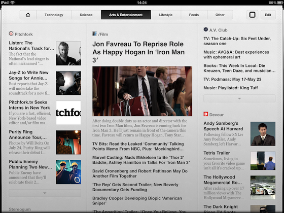
The app takes a bit of time to set up in a way that'll work for you, but if you're anything like me you'll appreciate having a familiar layout where sources remain in the same place. I never quite got into apps like Flipboard, because I couldn't shake the feeling that I'd miss something important. Pulp's new homescreen works in a similar fashion and is good for people who just want to dip into the news, but users with slightly more obsessive content requirements can go to their fully customized pages instead. Selecting an article will cause it to take over the app's entire screen, and you can use swipe gestures to move back and forth between stories from the same source.
A few skeuomorphic visual flourishes
The interface is well-designed, and it looks especially good on the new iPad. The Mac version is almost identical to the iOS app, but I'm not a fan of its full-screen mode — it stretches the page out a little bit and sets it against a faux-wood background that takes up far too much screen space. I use an 11-inch MacBook Air, so screen space is at a premium with this sort of app and it's a little disappointing that it doesn't work as well as something like Reeder. Both versions of Pulp have a few paper-themed skeuomorphic visual flourishes that don't get in the way too much, but while the app is generally attractive the OS X fullscreen mode is a definite example of over-design.
Overall I like Pulp quite a bit — it's versatile and mostly attractive in use. It's a little too flashy to replace Reeder for me, as I wouldn't be able to catch up on a high volume of news nearly as quickly, but it's a great way to keep on top of more casual reading. Both versions are on sale for 50 percent off until the weekend: it'll set you back $2.99 on iPad and Mac.
:format(webp)/cdn.vox-cdn.com/uploads/chorus_asset/file/25289972/vudu.jpg)
:format(webp)/cdn.vox-cdn.com/uploads/chorus_asset/file/23932923/acastro_STK108__01.jpg)
:format(webp)/cdn.vox-cdn.com/uploads/chorus_asset/file/24931969/236794_iPhone_15_pro_pro_Max_VPavic_0011.jpg)
:format(webp)/cdn.vox-cdn.com/uploads/chorus_asset/file/25287814/HT012_Google_Keep.png)