Data is useful only when put in perspective. Yesterday’s post on the Android Income Statement showed how sales and revenues are captured and how costs are paid for that revenue. The data was shown for the entire calendar year 2011 and the maximum value in the vertical axis was $1.5 billion.
Google has also reported that their revenue “run rate” is now in excess of $2.5 billion so there is significant growth, as would be expected from an exponentially increasing user base.
However, it’s important to place this growth in perspective, both in absolute and in relative terms.
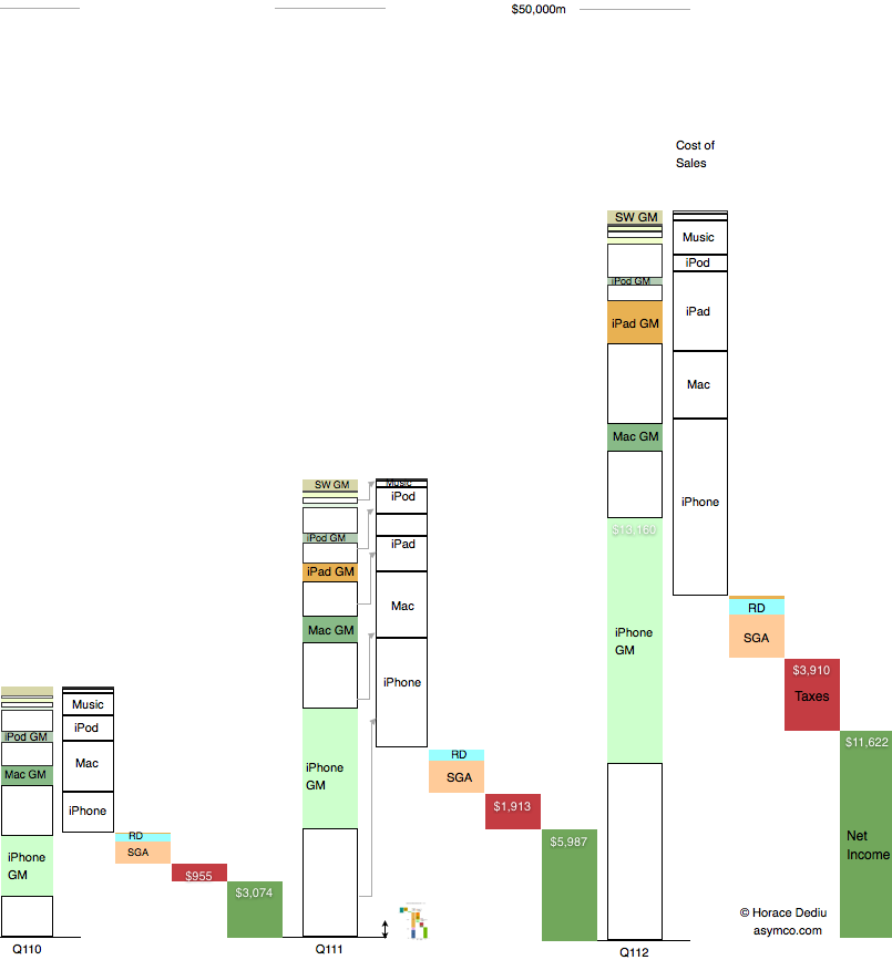
Below is a diagram showing Apple’s revenues for the first calendar quarters of 2010, 2011 and 2012. Each product group (iPhone, Mac, iPad and iPod) is shown separately with estimated gross margins (GM). Operational costs, taxes and net income are also shown.
Consistent with previous versions of this data are the color schemes where white areas represent costs of goods sold.
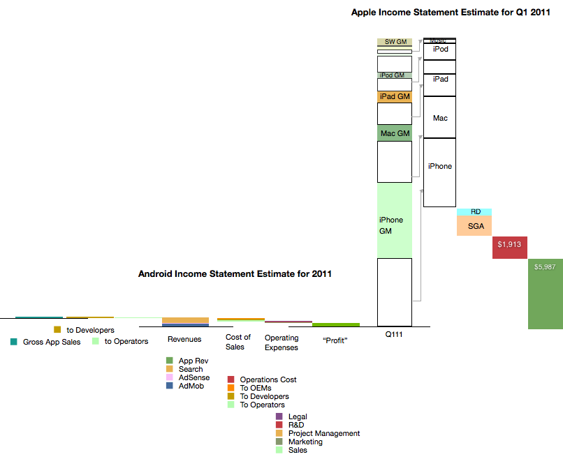
I also placed a scaled version of the Android Income statement next to the first quarter 2011 revenue bar for Apple. The scale is maintained where $1 billion is represented by the double-ended arrow line.[1]
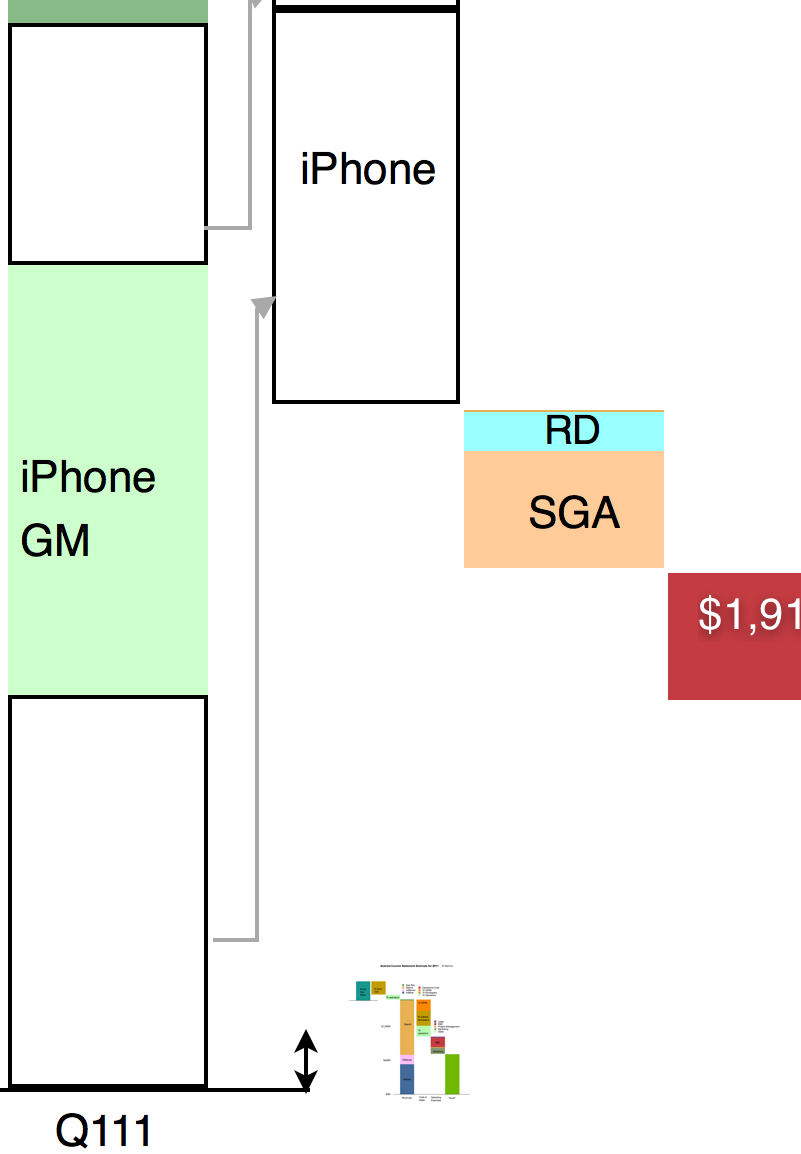
It might be hard to see the Android section of the chart so I expanded it below at 400% the original:
It is still difficult to resolve the data at this resolution but the picture should become clear nevertheless. Keep in mind that the iPhone data is for one quarter while the Android data is for one year. Comparing revenue “run rates”, on a yearly basis Android is 2.5% of iPhone or 1.6% of iOS.
As various members of the Android ecosystem are rewarded from the 40% revenue share of Android, it would be important to consider the scales involved in these illustrations when considering the influence Google exerts. It could be argued that Google’s spreading of wealth from search creates strong incentives for participation in its ecosystem.
However, there is little wealth created. 40% of a little is a lot less.
—
Note:
- The scaling of the image in both X and Y dimensions can be deceptive. I provide the following view where only the vertical dimension (value) is reduced for Android
 :
:


