Google is marching steadily towards Larry Page’s reported goal of a “single, unified, ‘beautiful’ product, across everything.” It started last year, as redesigns came to all of Google’s big products, Search, Maps, Translate, Reader, Gmail, YouTube, etc, etc. A black navbar appeared, which Google later announced it was removing, only to then reverse course and keep it. And then, earlier this month, it announced Google Play.
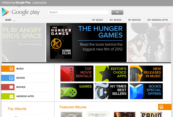
The Android Market itself has undergone a number of changes over the last year, catching the redesign bug, along with adding a whole slew of content (eBooks, music, videos, etc.) on top of apps. Google has been busy building a digital media hub, and the “Android Market” moniker represented an older iteration, a mobile-focused platform, so Google Play took its place, and has since made Google’s cross-platform intentions loud and clear.
Google wants to promote its top-billing products across screens and instances, increase visibility, and hopefully attract more users to premium content. Google has also been moving into direct-to-consumer content sales over the past year, and Google Play offers that unified storefront experience that provides a very direct alternative to the iTunes store. Again, it’s Google’s more “open,” cross-platform, approach (you don’t have to own an Android device to rent movies or purchase music, it’s all cloud-backed and browser accessible) — versus Apple’s Walled Garden.
How seriously is Google taking its new storefront and content initiatives? Well, last night Google Play begin emerging in the ubiquitous black navbar that appears atop Search and other Google products, and it’s front and center. Play is positioned prominently between Maps and YouTube, as products like Reader and options like “Video” have been moved to the “More” drop down menu.

The navbar has been tweaked several times since the launch of Google+, and today we have yet another lineup, although this could very likely end up being Google’s starting rotation. And, since Google crossed the 1 billion monthly unique visitors mark last year, putting Google Play access front and center makes perfect sense.
Of course, the opinions on Google’s navbar differ. Some think it’s taking up space, others view it as a ubiquitous advertisement for Google products. Before, that argument wouldn’t have held much weight, as Google Shopping and others mostly just pushed users offsite to make purchases. That’s not the case anymore with Google Play.
Then again, it’s also just a minor change to an already-existing navbar. It’s not a huge intrusion. And there’s a lot left to do with accessibility to Play content outside of the U.S., along with a few bugs here and there.
It will be interesting to see if the black navbar ever starts showing little red notification numbers for Gmail, YouTube, News, etc., or if Google ever opens it up to users to decide which of its products make it into the navbar. The last one is unlikely, but it’s nice to dream. Either way, welcome to the new Google.
For more, see The Verge’s post on Google Play installing a Russian email app on Samsung devices. And Devin’s epic critique of Google+ (and Google’s new philosophy) here.
