Mac OS X celebrates its tenth birthday today. The groundbreaking operating system was introduced to the public on March 24, 2001. Mac OS X helped reverse Apple’s fortunes in the desktop PC market, and has underpinned a lot of Apple’s subsequent success. Most importantly, it spawned iOS, which runs today’s iPads and iPhones.
Below is the story of how OS X’s game-changing interface came about. The story gives some insight into corporate creativity at Apple. OS X’s interface started as a side project. But as soon as Steve Jobs got wind of it, it was fast-tracked. Jobs became intimately involved in its development — a scary prospect for the programmers working on it.
But the struggle wasn’t just in its development. Apple had to nail the switch from the old Mac OS to the new, or it could have sunk the company. Guess which ally was crucial to the transition — Apple’s old enemy, Microsoft.
With the launch of OS X, Jobs finally took the title of Apple’s permanent CEO. Prior to that he’d been the interim CEO, or iCEO, and OS X was the last major part of the company he needed to fix.
This post contains affiliate links. Cult of Mac may earn a commission when you use our links to buy items.
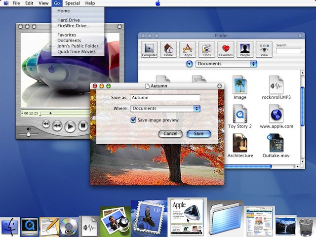
“We made the buttons on the screen look so good you’ll want to lick them.” — Steve Jobs, on Mac OS X’s user interface, in Fortune, January 24, 2000
Before Steve Jobs returned to Apple, the company had spent several years fruitlessly trying to develop a modern version of the Macintosh operating system. Since its debut in 1984, the old Mac OS had turned into a bloated, unstable patchwork of code. It had become a nightmare to maintain and upgrade. For users, it meant constant crashes, freezes, and restarts—and lots of lost data, frustration, and rage.
Because large portions of the Mac OS were still based on creaky old code, Apple decided that it had to start from scratch.

In 1994, programmers began a ground-up rewrite of the operating system, code-named Copland, after the famous American composer. But after a couple of years of effort, it became apparent the project was a gargantuan effort and would never be finished. The Apple executive team at the time decided it would be easier (and wiser) to purchase a next-generation operating system from another company rather than develop one itself. The search eventually led to the purchase of Steve Jobs’s NeXT.
Apple was interested in NeXTstep, a surprisingly advanced and sophisticated operating system that Jobs had developed during his wilderness years away from Apple. NeXTstep had everything the old Mac OS lacked. It was fast, stable, and almost crash-proof. It had modern networking features—essential in the Internet age—and a modular architecture that was easily modified and upgraded. It also came with a collection of great programming tools, which made it very easy for software developers to write programs for it.
Programming tools are a huge competitive advantage in the tech industry. Computer platforms are doomed unless they can attract talented programmers to create applications for them, just like game consoles are doomed unless they can attract great games. From the Mac to the Palm Pilot and the Xbox, the success of a platform is primarily determined by the software that can run on it. In some cases this is the so-called killer app—an essential piece of software that guarantees the success of the platform, like Office on Windows, or the game Halo on the Xbox.

What’s NeXT?
After buying NeXT, Apple had to figure out how to turn NeXTstep into a Macintosh operating system. At first, the job looked so big that Apple’s programmers decided they should take the old interface in Mac OS 8 and try to graft it on top of the NeXTstep codebase. According to Cordell Ratzlaff, the manager who was charged with overseeing the job, the interface graft didn’t look like it would present much of a challenge. “We assigned one designer to OS X,” he recalled. “His job was pretty boring: make the new stuff look like the old stuff.”
But Ratzlaff thought it was a shame to put an ugly facade on such an elegant system, and he soon had designers creating mockups of new interface designs. He told me that the mockups were designed to show off many of the advanced technologies under NeXTstep’s hood — especially its powerful graphics and animation capabilities.
Ratzlaff, a soft-spoken designer at Kapitall, worked at Apple for nine years. Starting as a designer, he rose through the ranks to lead the human interface group for Mac OS. In this role, he was in charge of the look and feel of Apple’s operating systems from Mac OS 8 through the first release of OS X.
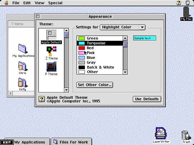
Interfaces these days are colorful and dynamic, but in the late 1990s, both Apple’s and Microsoft’s operating systems were plain and gray, with boxy windows, sharp corners, and lots of bevels. Then Apple came out with the tear-shaped iMac, a computer with a transparent plastic shell and curvy organic lines. It was a big inspiration to Ratzlaff and his colleagues. They soon had mockups of colorful, airy interfaces with see-through menus, soft edges, and round, organic buttons.
Ratzlaff’s boss, Bertrand Serlet, who just resigned as Apple’s senior vice president of software engineering, admired the mockups but made it clear there was neither the time nor resources to implement them. OS X’s lone designer continued to graft the old Mac interface onto NeXTstep.
After several months of work, Apple held an off-site for all the engineering groups working on OS X to gather a status report. Ratzlaff was asked to show his mockups, mostly just for kicks. His talk would be some light relief at the end of a long, hard week. He was scheduled as the last speaker on the last day. But he secretly hoped there’d be support for the new designs and they’d be implemented, although he didn’t rate his chances. As the two-day event wore on, it became clearer and clearer what an enormous project OS X was. Everyone was wondering how it was ever going to get done. “And then here at the end, here’s me saying, ‘Oh, and here’s a new user interface. It’s translucent, there’s real-time animation, and a full alpha channel,’” Ratzlaff recalled. “There was literally laughter in the room because there was no way we were going to redo the user interface. I was pretty depressed afterwards.”
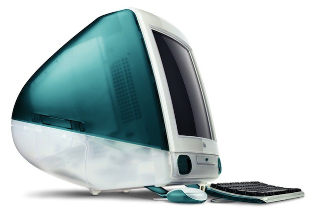
Photo: Apple
“You’re a Bunch of Idiots”
Two weeks later Ratzlaff got a call from Steve Jobs’s assistant. Jobs hadn’t seen the mockups at the off-site—he hadn’t attended—but now he wanted a peek. At the time, Jobs was still conducting his survey of all the product groups. Ratzlaff and his designers were sitting in a conference room waiting for Jobs, when he walked in and immediately called them “a bunch of amateurs.”
“You’re the guys who designed Mac OS, right?” he asked them. They sheepishly nodded yes. “Well, you’re a bunch of idiots.”
Jobs rattled off all the things he hated about the old Mac interface, which was just about everything. One of the things he hated most were all the different mechanisms for opening windows and folders. There were at least eight different ways of accessing folders—from dropdown menus to pop-up menus, the DragStrip, the Launcher, and the Finder. “The trouble was, you had too many windows,” said Ratzlaff. “Steve wanted to simplify window management.” Because Ratzlaff was the one primarily responsible for these features, he started to get nervous about his job, but after twenty minutes of withering criticism, Ratzlaff realized his position was probably safe. “I figure he’s not going to fire us, because that would’ve happened already,” Ratzlaff said.
Jobs, Ratzlaff, and the designers settled into an in-depth discussion of the old Mac interface and how it might be overhauled. Ratzlaff’s team showed Jobs their mockups and the meeting wrapped up well. “Prototype these things and show them to me,” Jobs instructed them.
The design team worked for three weeks, night and day, building working prototypes in Macromedia Director, a multimedia authoring tool often used for mocking up custom interfaces for software or websites. “We knew our jobs were on the line so we were pretty worried,” he said. “He [Jobs] came over to the offices. We spent the whole afternoon with him. He was blown away. From that point on, it was clear there was going to be a new user interface for OS X.”
Jobs was so impressed that he said to Ratzlaff: “This is the first evidence of three-digit intelligence at Apple I’ve seen yet.” Ratzlaff was happy to take the compliment. For Jobs, acknowledging you have an IQ higher than 100 is a glowing endorsement. Confident that their jobs were safe, Ratzlaff and the designers celebrated with a few six-packs of beer. But they became nervous when they saw Jobs coming back down the corridor with Phil Schiller, Apple’s head of marketing. Luckily, Jobs was pleased. As Jobs approached, they heard him tell Schiller excitedly, “You’ve got to see this.”
“From then on we had no trouble,” Ratzlaff said.
No Detail Too Small
For the next eighteen months, Ratzlaff’s team had a weekly meeting with Jobs during which they’d show him their latest mockups. For each element of the new interface—the menus, the dialogs, the radio buttons—Jobs requested several variations so that he could select the best ones. As we’ll see in more detail later, Jobs always asks for multiple versions of products in development—both hardware and software. During the meetings with Ratzlaff, Jobs gave lots of feedback for refining the designs, and only when he was satisfied could features be ticked off.
The design team’s mockups, in Macromedia Director, were dynamic, but they weren’t functioning software. Jobs could open and close windows, pull down menus, and see how the system would work. But they were only animations. They weren’t working code. The team had the working code running on another machine that was placed next to the Director demo. When they’d show the working code to Jobs, he’d lean forward, his nose to the screen, and examine them closely, moving from the demo to the prototype and back again.
“He would compare them pixel by pixel to see if they matched,” Ratzlaff said. “He was way down into the details. He would scrutinize everything, down to the pixel level.” If they didn’t match, Ratzlaff said, “some engineer would get yelled at.”

Incredibly, Ratzlaff’s team spent six months refining the scrollbars to Jobs’s satisfaction. Scrollbars are an important part of any computer operating system but are hardly the most visible element of the user interface. Nonetheless, Jobs insisted the scrollbars look just so, and Ratzlaff ’s team had to design version after version. “It had to be done right,” said Ratzlaff, laughing at the effort that went into such a seemingly minor detail.
At first, the design team found it very difficult to get the scrollbar details true. The little arrows were the wrong size, or in the wrong place, or the color was off. The scrollbars had to look different if the window was the currently active window or one of the background windows. “It was pretty hard to get them to fit with the rest of the design in all these different states,” Ratzlaff said with a note of weariness in his voice. “We kept at it until it was right. We worked on it for a long, long time.”

OS X’s interface was designed with new users in mind. Because the system would be new to everyone—even veteran Mac users—Jobs focused on simplifying the interface as much as possible. For example, in the old Mac OS, most of the settings that determined system behavior were hidden away in myriad System Extensions, Control Panel menus, and special dialog boxes of the various system components. Setting up an Internet connection used to involve tweaking settings in up to half a dozen different places.
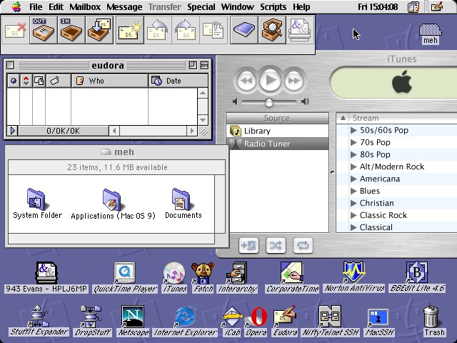
To simplify things, Jobs ordered as many settings as possible to be collected together into a single System Preferences box that lived in a new navigation element called “the Dock.”
The Dock is an icon-filled bar that sits at the bottom of the screen. It is home to commonly used applications and the system trash can. It can accommodate all kinds of stuff, from frequently used folders to mini-programs called “scripts.”
Jobs insisted on stripping back as many interface elements as possible, maintaining that the content of the windows was the most important thing, not the windows themselves. His desire to strip back and simplify put an end to several major features, including a single-window mode that the design team had worked on for many months.
Jobs hated having multiple windows open. Every time a new folder or document was opened, it spawned a new window. Quickly, the screen was filled with overlapping windows. So the designers created a special single-window mode. Everything was displayed in the same window, no matter which software program the user was working in. The window would display a spreadsheet, then a text document or a digital photo. The effect was rather like jumping from website to website in a single Web browser window, except here it was between documents stored on the local hard drive.
Sometimes the system worked well, but the window often had to be resized to display different kinds of documents. When working with a text document, the window was best made thin and narrow to make it easy to scroll up and down the text. But if the user opened an image in landscape format, the window would have to be widened.
But this wasn’t the biggest problem. Critically for Jobs, the system required the designers to create a dedicated button in the window toolbar to switch it on and off. Jobs decided, in the interest of simplicity, to take the button away. He could live with resizing windows, but not the additional button cluttering the menu bar. “The extra button wasn’t justified by the functionality,” Ratzlaff said. Jobs’s decision to excise that button illustrates his obsession with simplicity, and his long-running desire to build systems as minimalist in design as possible.
While working on the new interface, Jobs would sometimes suggest what at first seemed to be crazy ideas but later turned out to be good ones. At one meeting, he was scrutinizing the three tiny buttons in the top left corner of every window. The three buttons were for closing, shrinking, and expanding the window, respectively. The designers had made all the buttons the same muted gray, to prevent them from distracting the user, but it was difficult to tell what the buttons were for. It was suggested that their functions should be illustrated by an animation that was triggered when the mouse cursor hovered over them.
But then Jobs made what seemed like an odd suggestion: that the buttons should be colored like traffic stoplights: red to close the window, yellow to shrink it, and green to expand it. “When we heard that, we felt that was a strange thing to associate with a computer,” Ratzlaff said. “But we worked on it for a little while and he was right.” The color of the button implicitly suggested the consequence of clicking it, especially the red button, which suggested “danger” if the user clicked it but didn’t mean to close the window.

Introducing OS X
Here is Steve Jobs introducing Mac OS X for the first time:
Jobs knew that OS X would cause a huge outcry from Apple’s outside software developers, who would have to rewrite all their software to run on the new system. Even with OS X’s great programming tools, there would be pushback from developers. Jobs and his executives struggled with the best way to approach the software community. Eventually they came up with a strategy: if they could persuade just three of the biggest companies to embrace OS X, everyone else would follow. The big three were Microsoft, Adobe, and Macromedia.
It worked—eventually. Microsoft supported OS X from the get-go, thanks to Jobs’s 1998 deal with Bill Gates that cemented five years of software support. But Adobe and Macromedia weren’t so quick to convert their big applications like Photoshop and Dreamweaver. Both companies eventually ported them over, but they refused to rewrite their consumer applications for OS X, a decision that eventually had a major impact on Apple and its business: it led Apple to develop its own hugely popular application software suites (iLife and iWork) and, indirectly, to the invention of the iPod and iPhone.
While it was no secret Apple was working on OS X, the fact that it had a new interface was. The interface was designed in intense secrecy. Only the handful of people working on it knew it was being overhauled. One of Jobs’s stated rationales for keeping the new interface secret was to prevent others— Microsoft in particular—from copying it.
But more important, Jobs didn’t want to kill sales of the current Macintosh operating system. He wanted to avoid what’s known as the Osborne effect, in which a company commits suicide by announcing cool technology still under development, before it is ready to be sold.
As soon as OS X development started, Jobs directed everyone at Apple to stop criticizing the current Mac OS in public. For years, Apple’s programmers had been quite frank about the system’s problems and shortcomings. “OS X was his baby, so he knew how great it was,” said Peter Hoddie. “But he said for the next few years we’ve got to focus on Mac OS because we’ll never get there without it. He was like Khrushchev, banging his shoe on the table. ‘You’ve got to support the Mac OS, kids. Get this through your heads.’”
Jobs unveiled OS X in January 2000 at Macworld, after nearly two and a half years of work by almost one thousand programmers. OS X was a colossal undertaking. It was—and arguably still is—the most sophisticated computer interface designed to date, with complex, real-time graphics effects like transparency, shadowing, and animation. But it had to run on every G3 processor Apple had on the market, and it had to run in as little as 8 MB of video memory. It was a very tall order.
While introducing OS X at Macworld, Jobs also announced that he was becoming Apple’s permanent CEO, which drew huge applause from the keynote crowd. Several Apple employees have noted that Jobs didn’t become the company’s permanent CEO until after OS X shipped in March 2001. By this point, Jobs had been at Apple’s helm for two and a half years, and had replaced almost all the directors and senior staff, fixed marketing and advertising, reinvigorated hardware with the iMac, and reorganized sales. Ratzlaff noted that with OS X, Jobs had overhauled the company and all of Apple’s major products.
“He was waiting for the last big parts of the company to be running to his standards before he took on the role of Apple CEO,” said Ratzlaff.
Steve Jobs drops the “interim” from iCEO:
Excerpted from Inside Steve’s Brain, Expanded Edition.
![How Mac OS X Came To Be [Exclusive 10th Anniversary Story] The instillation disk for Max OS X. Photo by malagent: http://www.flickr.com/photos/49368060@N00/2310215514/](https://www.cultofmac.com/wp-content/uploads/2011/03/mac_os_x_disk.jpg)
