Apple announced iBooks 2 on Thursday, targeting the education market with an upgrade to the iBooks app for iOS. Though the updated e-book reader is advertised in the App Store as iBooks 2, users who currently have the first iBooks app will just see it as an update. Using iBooks Author, educators and other publishers will be able to create interactive e-books for the iBooks app. Though Apple has placed much of its focus on promoting the app's new multimedia features, the new iBooks 2 showcases several changes to its user interface. Some of these changes are meant to accommodate the more interactive features built into the format, though users may feel disoriented by having to learn new interactions to learn how to use these textbooks.
E.O. Wilson's Life on Earth is the only title freely available right now, so we downloaded a copy to explore the changes to the iBooks interface. We also used a copy of Michael Pollan's non-fiction title Botany of Desire to compare some of the original features and gestures used for iBooks against the new textbooks.
Navigating away from the metaphors of paper (sort of)
Apple has not changed the look and feel of the wooden shelves of the iBooks app, though it has added a new category to the store for the new textbooks. We downloaded the free samples and the full copy of Life on Earth, and the iBooks store swivels back and forth like a secret passage door to toggle between the bookshelves and the store, though the user is still inside the iBooks app. You can buy books separately in the iTunes Store to add to the confusion, but for now, let's just assume you are okay with going through the secret passage door interaction of iBooks 2 without any problems.
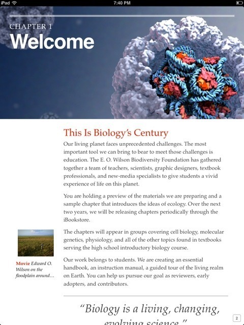
At first glance, the new textbooks don't look any different on the shelf than their more traditional counterparts. Once we clicked on the book's cover, however, the introduction made it clear that this wasn't the battered hardcover you used for Biology 101 in college.
The first tap on the book's cover set off an introduction that looked and felt like watching a trailer for the BBC's Planet Earth Series. Biologist E.O. Wilson himself introduces the textbook as a voiceover in the movie clip, providing a closer relationship between author and reader. After the clip ends, the first chapter initially resembles a page we might be more familiar with. Chapter 1 showed an elegant, if conventional, layout with headers and a wide margin on the left, featuring a lengthier introduction movie starring Wilson. Since iBooks 2 doesn't come in with any built-in instructions on how to use its features, we went on to try some gestures to begin reading the text.
iBooks, which encompasses both the iOS applications and the iBookstore to purchase books, has kept the library and bookshelf metaphor to guide its visual design. This metaphor was previously extended to the gestures used for reading of a book. If you flip the page using a single-finger gesture, the page rolls over under your finger, and if you look closely, you can see the transparency of the text underneath. Other e-readers have taken a swifter approach in their applications as the screen flashes to a new page. iBooks 2 is moving further away from these metaphors in a few ways.
A table of contents in a book generally lets one see a list of all chapters, and in most e-readers, clicking on the chapter takes the user to the chapter selected. In landscape view, though, Life on Earth only shows two numbered headers for the welcome and "Introduction to Ecology." At first glance, these seem to be chapter headings, but arrows on the right serve as navigation to expand a list of chapters under each of those headers. Clicking on the header itself goes to the location in the book for the section, so be careful on which one you click.
Textbooks in iBooks 2 show a significant change in navigation, because reading through a book from beginning to end now happens vertically. E-readers most often use the book's left to right (or right to left) structure to mark progress through a text. iBooks 2's design borrows most from the Web, in which pages are read from top to bottom. Taking its cues from Mac OS X Lion's "scrollers," iBooks 2 now shows a scroller on the right-hand side to track progress. (This anachronistic feature may make scholars chuckle, since the scroll came before the book.)
In order to help the user, page numbers now appear on the lower right hand of the screen, and they change dynamically as a user scrolls through the textbook. However, if you try to read the text in landscape mode, the familiar page turning gesture works just as it does with regular iBooks titles. This inconsistent behavior also moves the page number to the center of the screen without a dynamic box.
Even if the navigation between landscape and vertical is a bit clunky, the differences in their layouts reveal some subtle touches that work nicely to create a smoother experience. Text wraps around the playable movie of a globe while in landscape mode, making the transition from page to page a single, smooth movement. If you look at the same graphic in portrait mode, the globe movie is resized to fit in the margin. Graphic and interaction designers will probably enjoy designing for these contrasting views.

Previously, reading a book in iBooks happened by reading from left to right, in the same way that one might read a paper book. Flipping pages triggered the page turn animations, and the app displayed the page location at the bottom. A single tap also revealed a progress bar to quickly jump to other sections of the book. However, without tapping on the screen, there is no apparent way for someone to know their location in the book. (It's worth noting that Amazon's Kindle app for iOS exhibits the same behavior when it comes to showing your reading progress.)
Multimedia and Interactive features
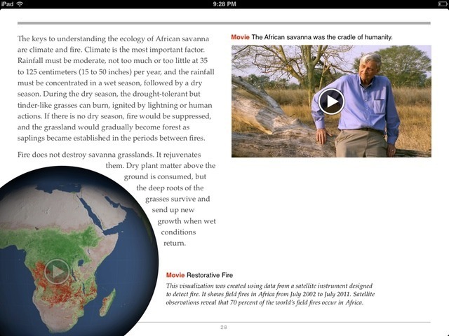
The first chapter offers a movie clip of Wilson introducing the book. Photos, graphics, and other images display in the margins, and clicking on them zooms in on them at a higher resolution. We first tried to click on the 3D model of a chromatin fiber, expecting a 3D model we could rotate with gestures, but it simply showed a graphic instead.
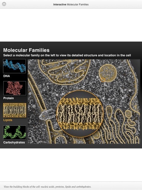
Features in the margin or body that are more dynamic are labeled "interactive," and in one case, we were able to see the detailed structures of of molecules inside a cell as a colored overlay. The close-up detail showed animations of the molecules as a nice effect. We could return to the main text by closing out the window or pinching it shut. These types of graphics still feel a little flat, but it's nice to be able to show multiple panes or layers of an image in one single screen. Other features included scrollers and timelines that the user can control to affect maps and other graphics. On my third try, I was rewarded with a model of a DNA molecule that zoomed into bigger detail. I was able to rotate the model in 360 degrees with a gesture and even zoom in on it.
iBooks 2 also offers several quizzes to test reader's comprehension of the text, and quizzes can be accessed in the margin or at the end of chapters. This feature made the text feel like something more than an electronic textbook, and we wonder whether polling or more social features might be included in the future as part of these texts.
Annotations, Search and Study Cards
Apple has introduced study cards as a way to test your knowledge from the chapter. These pre-formatted cards test students on concepts in the text, though there didn't seem to be any apparent way to make custom notecards for oneself. Highlighting and notes appeared to be the same as in previous versions of iBooks, offering the reader the ability to highlight text and place notes on the text. Users can now pull up a screen that shows all notes taken, which makes them easy to locate. Notes can be e-mailed, but there's no other way to organize them or share collaboratively with others. The built-in dictionary is the same as its predecessor.
The search feature, which can be used in line with the text, offers an index of locations where the search terms appear. We were glad to see that the search also indexed images in the textbook. Users can also access Web and Wikipedia searches from the same search tool.
Conclusion
Reading in iBooks 2 feels very similar to reading nonfiction books in iBooks (or any other e-reader), but its seamless design offers lots of multimedia without making it feel like a moving billboard. Users don't have to interact with the new features unless they want to. The features that students will use often to study, such as annotating and highlighting, feel a little basic and could benefit from sharing capabilities. E-mailing notes from the text could become cumbersome, especially since so many students nowadays collaborate using Dropbox, wikis, and other collaborative tools.
The experience of iBooks 2 does feel richer, though, and most textbooks will probably benefit from the inclusion of images, audio, and video (as long as they have the rights to use them). At $14.99 per text, the price for iBooks seems reasonable, but the price of the iPad must be weighed in conjunction with the benefits of paper books. Paper books, after all, can be annotated on, highlighted, scribbled, lent out to friends, or sold at the end of the semester, and aren't likely to shatter when accidentally dropped on the sidewalk, either.
reader comments
52