Bad Apple #2: Alphabetize Settings in iOS
Welcome back to my Bad Apple column, in which I chastise Apple — constructively! — for poor decisions that are easily changed. TidBITS readers have sent me lots of suggestions for this column, and for that, thank you! For those who are sharing personal horror stories, my condolences, and I’ll try to help, but for Bad Apple, I want to focus on problems that any Apple user could encounter, not things that are specific to a particular account or machine.
This time around, I want to look at the Settings app in iOS, which has become a morass of muddlement. It doesn’t help that Apple seemingly reorganizes it with nearly every major release of iOS, sometimes even within minor releases. For instance, the relatively new settings item at the very top of the Settings app, which combines options for Apple ID, iCloud, iTunes & App Store, and Device Info all in one is seemingly helpful, but it’s devilishly hard to write about, since it’s named for the user, not for what’s inside.

But my gripe with Apple isn’t about this new personal settings item’s name; it’s about what it represents, or how Apple tries to group items in the Settings app by function and relationship, making it difficult even for experienced users to scroll to the right spot in Settings. Apple may have a rationale for its groupings, but it’s not obvious to anyone outside Apple. All too often, I give up trying to tap my way through Settings and instead pull down to reveal the Search field, before being reminded that searches in Settings often fail.
Apple’s grouping approach isn’t completely irrational, but it assumes a great deal more familiarity with the Settings app — and with iOS in general — than nearly any user has. It’s worse even than the System Preferences app in macOS, which at least shows all preference panes without the need to scroll. In fact, System Preferences points to the simple way Apple could rearrange the Settings app to make it easier to navigate.
Did you know that when System Preferences is the frontmost app on the Mac, you can go to the menu bar and choose View > Organize Alphabetically? No more hunting for Accessibility in the bottom-right corner, or wishing that so many of the icons weren’t blue blobs. System Preferences still displays its icons in a grid, making the alphabetical organization a bit less useful than it would be in a linear list, but you can return to the View menu for that. (Remember, if you’re reading on the TidBITS Web site, click any image to expand it.)
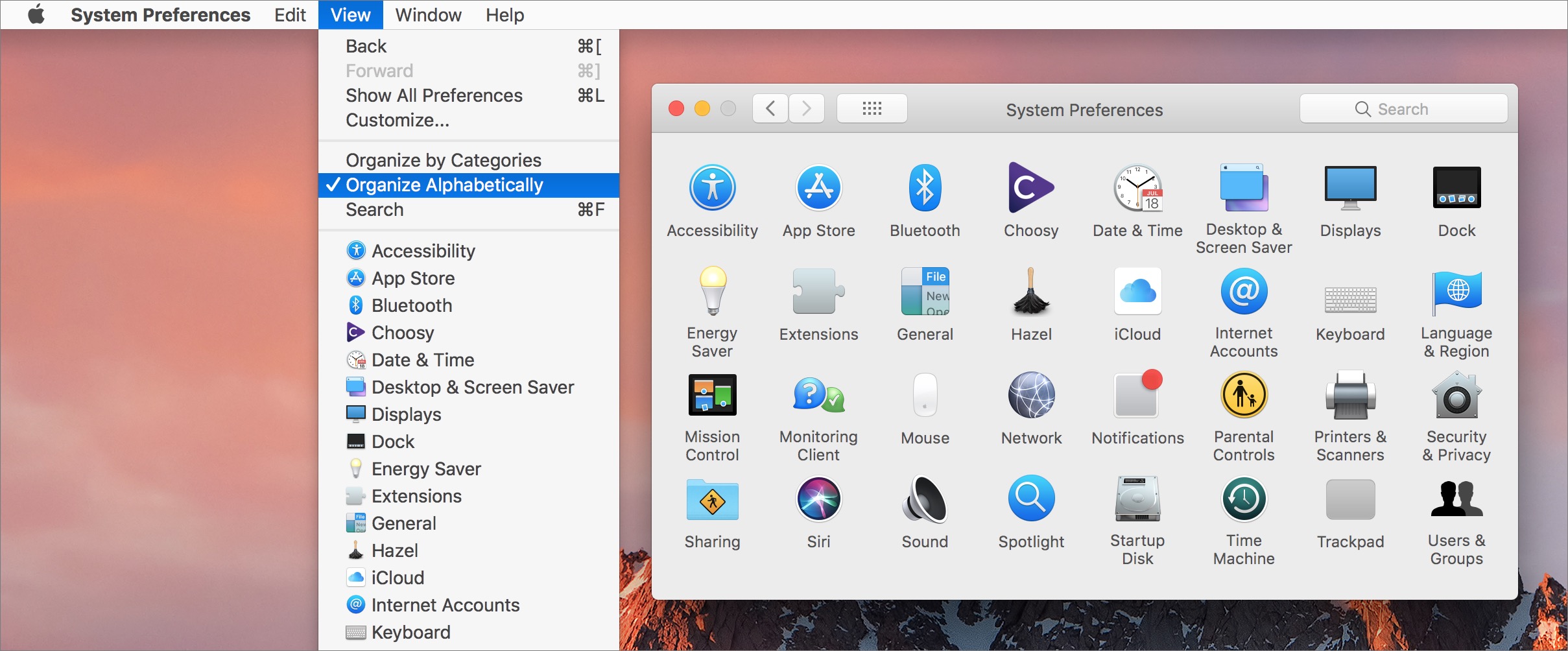
So why doesn’t Apple provide a similar alphabetical organization within iOS’s Settings app? (Yes, I realize alphabetization would vary by language, but that’s a solved problem.) Some functional groupings could remain, but within each grouping, rather than Apple grasping at logical straws that few users understand, why not just organize everything alphabetically? And why doesn’t each collection at least have a label that would give the user a hint as to the connection between the various
settings? Bad Apple!
(As an aside, if you want even more evidence that Settings has spun out of control, look no further than the mindmap that Allison Sheridan created of all the settings in iOS 11. If I’m calculating correctly from her Markdown version, Settings has over 1200 items total!)
Let’s consider the possibilities of what the main screen of Settings could look like. (These screenshots all come from iOS 11.2.6, running on an iPhone X. You may see slight differences on other devices and iOS versions.)
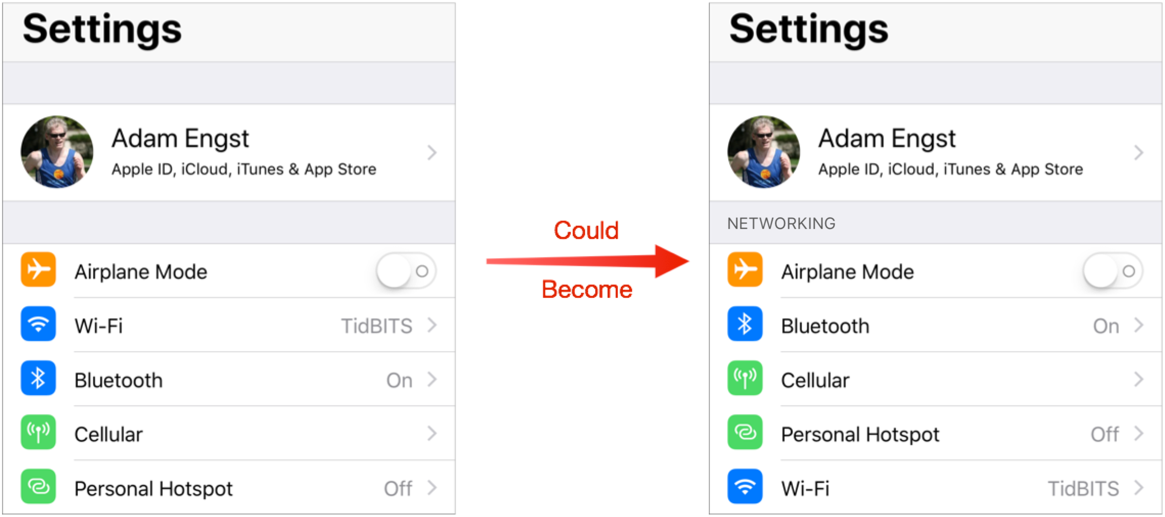
Networking — I’ll start at the top, with what I call Networking. As it stands, Airplane Mode is the first setting after the personal settings collection. That’s presumably for ease of access for business travelers who fly weekly, though the vast majority of iOS users probably touch it at most once or twice a year. But whatever; it starts with A, so we can leave it there. After that, Apple has Wi-Fi above Bluetooth, perhaps because people access Wi-Fi settings more often? And then Cellular comes before Personal Hotspot, which is slightly sensible under the assumption that Personal Hotspot is subordinate to Cellular. In fact, Personal Hotspot is duplicated within the Cellular settings.
This group of settings isn’t hard to parse — there are only five — but is it any harder to parse if they’re simply listed alphabetically, as in the right-hand screenshot below? I think not.
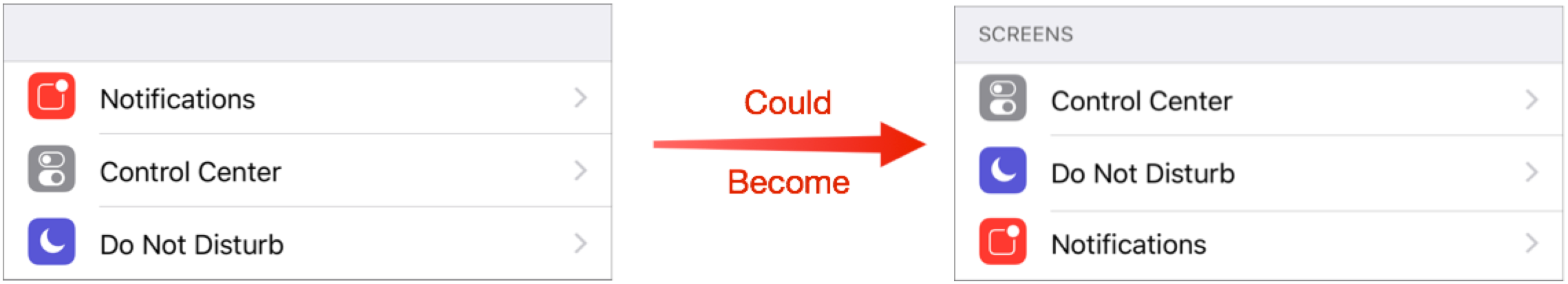
Screens — My label for this next collection of settings is poor, but that’s because the grouping of Notifications, Control Center, and Do Not Disturb makes little sense today. My guess is that Apple once considered Notification Center and Control Center as parallel screens, and it was reasonable to position Do Not Disturb near Notifications. But Notification Center no longer exists; you see your notifications on the Lock screen when you swipe down from the top of the screen.
Frankly, I believe this grouping should disappear, with its items merged into the next group, but in the assumption that there’s a good reason for lumping these items together, let’s take it alphabetical. At least that puts Do Not Disturb and Notifications next to each other, which wasn’t even true before.
System — The next group looks like a grab-bag, but when you scrutinize it, you realize that it’s basically all the settings for iOS and your device’s hardware. The problem is that it’s almost entirely random. Having General come first makes some sense, I guess, since it’s, well, the most general. Display & Brightness and Wallpaper are conceptually somewhat related, but after that, there is no apparent organization at all, forcing you to absorb the entire list to pull out a particular item. Bad Apple!
When I alphabetize the group, Battery comes first, which is a nice side effect, since it’s a commonly used option by anyone with an older device. After that, the alphabetical order just makes it easier to jump directly to the item you want. And I see no reason Control Center, Do Not Disturb, and Notifications wouldn’t fit in here.
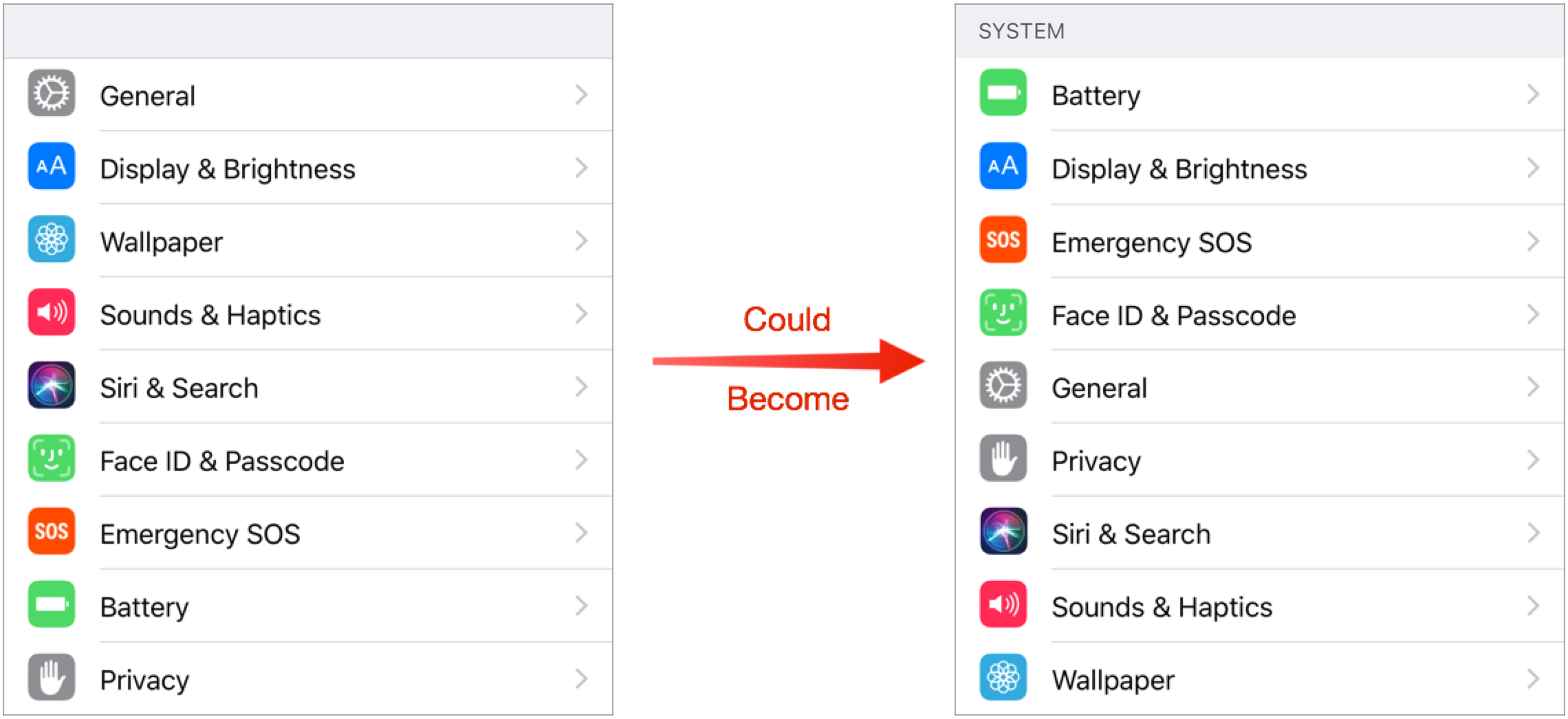
This isn’t the place to get into details, but General is itself a mishmash. What’s the rationale for putting things like Accessibility, Keyboard, and Software Update in General? Or maybe Display & Brightness and Wallpaper should be inside General? Who knows!
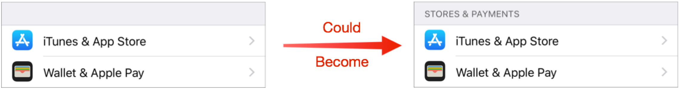
Stores & Payments — The next group has only two options and they’re already alphabetized, so the only change I’ve made is to add a label that clarifies why they’re together.
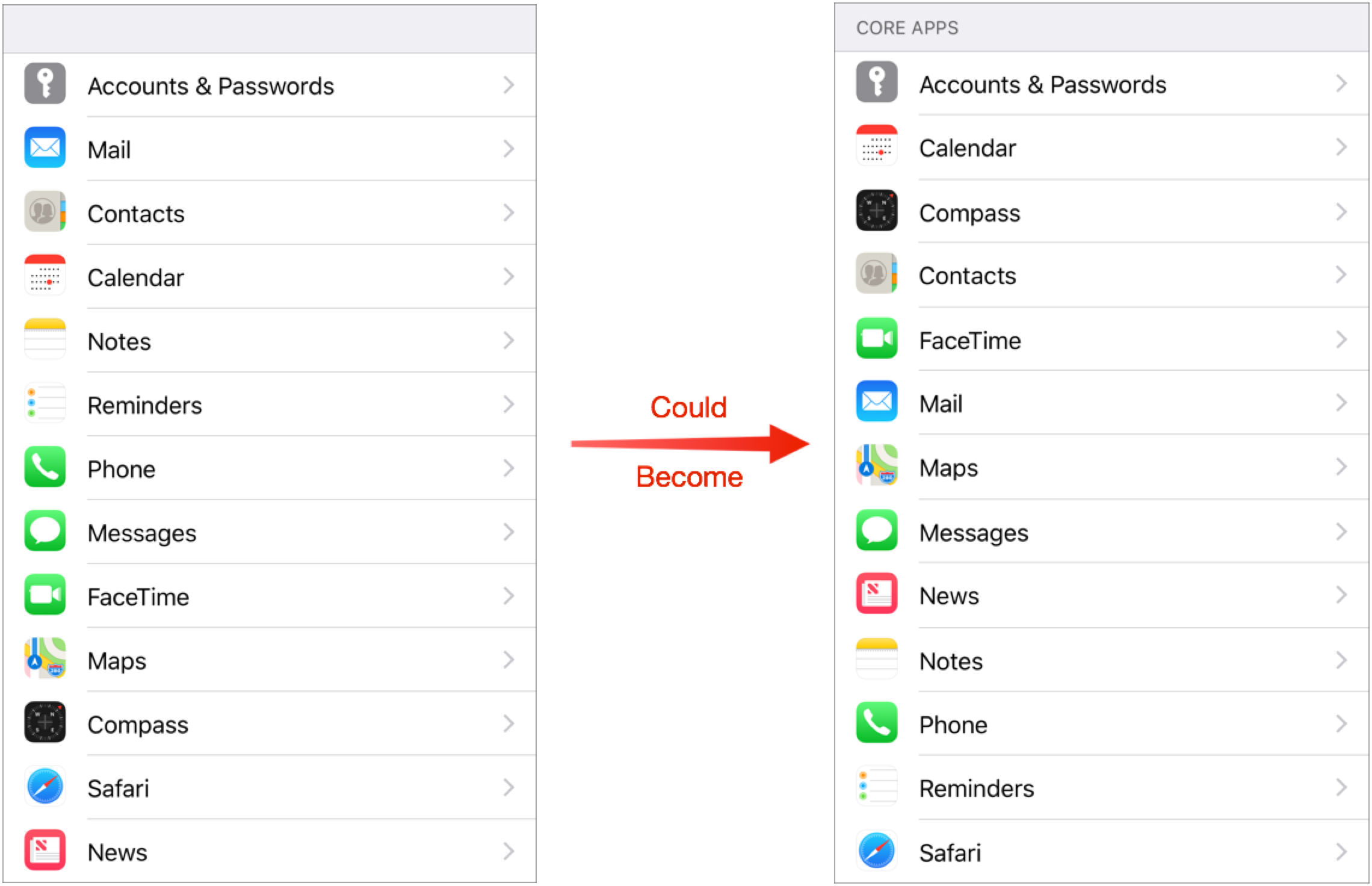
Core Apps — This next grouping has a good deal of logic behind it, but not enough to leave it alone. Accounts & Passwords feels out of place and isn’t itself an app, but it’s where you configure the accounts for Mail, Contacts, Calendar, Notes, and Reminders. Weirdly, Apple did not duplicate the account settings inside each of those subsequent settings screens, so if you’re just looking for your mail account, you won’t find it in Mail. The other reason those three go together is that, long ago, they were a single entry called “Mail, Contacts, Calendar.” But if you didn’t remember that, or know it to start, the grouping may feel arbitrary. That said, Notes and Reminders feel related, as do Phone, Messages, and FaceTime. There’s even an argument for why Maps and Compass are next to each other, even though hardly anyone uses Compass (and its only setting is Use True North). But then why are Safari and News shoved down to the bottom?
Regardless of whether or not there are some internal sets within this collection that make sense, taken as a whole, it’s random and difficult to navigate, especially if you’re looking for Safari or News. You have to read every item in the list every time you look at it. Contrast that with a simple alphabetical sort. It loses any logical grouping, but you know exactly where you are in the list and what’s coming next as you read.
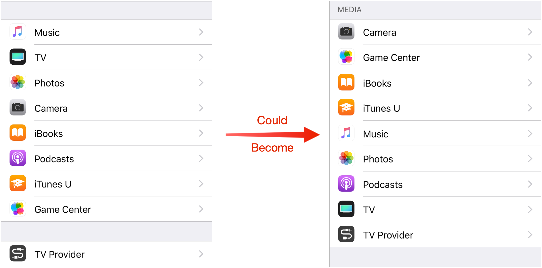
Media — The final Apple-provided collection of settings is clearly related to media. Or rather, it would be the final collection except for Apple’s inexplicable decision to emphasize TV Provider by putting it in a group by itself. Bad Apple! As best I can guess, Apple is arranging these in perceived order of importance, with Music and TV at the top and iTunes U and Game Center at the bottom.
But since not everyone views the world in the same way, it’s far more sensibly arranged alphabetically, with TV Provider lumped in. No, TV Provider isn’t an app like the rest, but there’s no good reason to break it out. After all, Apple lumped Accounts & Passwords in with the core apps above because it controls settings common to several. TV Provider is similar, in that it provides a setting that other media apps would use. And it’s still at the bottom, right next to TV.
A Is for Apple — A few closing thoughts. Suggesting that Apple alphabetize more of the contents of the Settings app shouldn’t be a radical proposal. After all, once you scroll past the Media settings, you get to the options for third-party apps you’ve installed, which, you’ll notice, are listed alphabetically! Similarly, whenever you see any other list of installed apps, such as in the Cellular Data, Notification Style, or Search & Siri Suggestions lists, they’re alphabetical. Nothing else makes sense.
But whenever Apple provides a list of its own apps or services, it throws them together in one of these inscrutable hodgepodges. Just look at the lists in Apps Using iCloud or in Privacy — if they’re not random, the organization scheme is so unintuitive that it may as well be random.

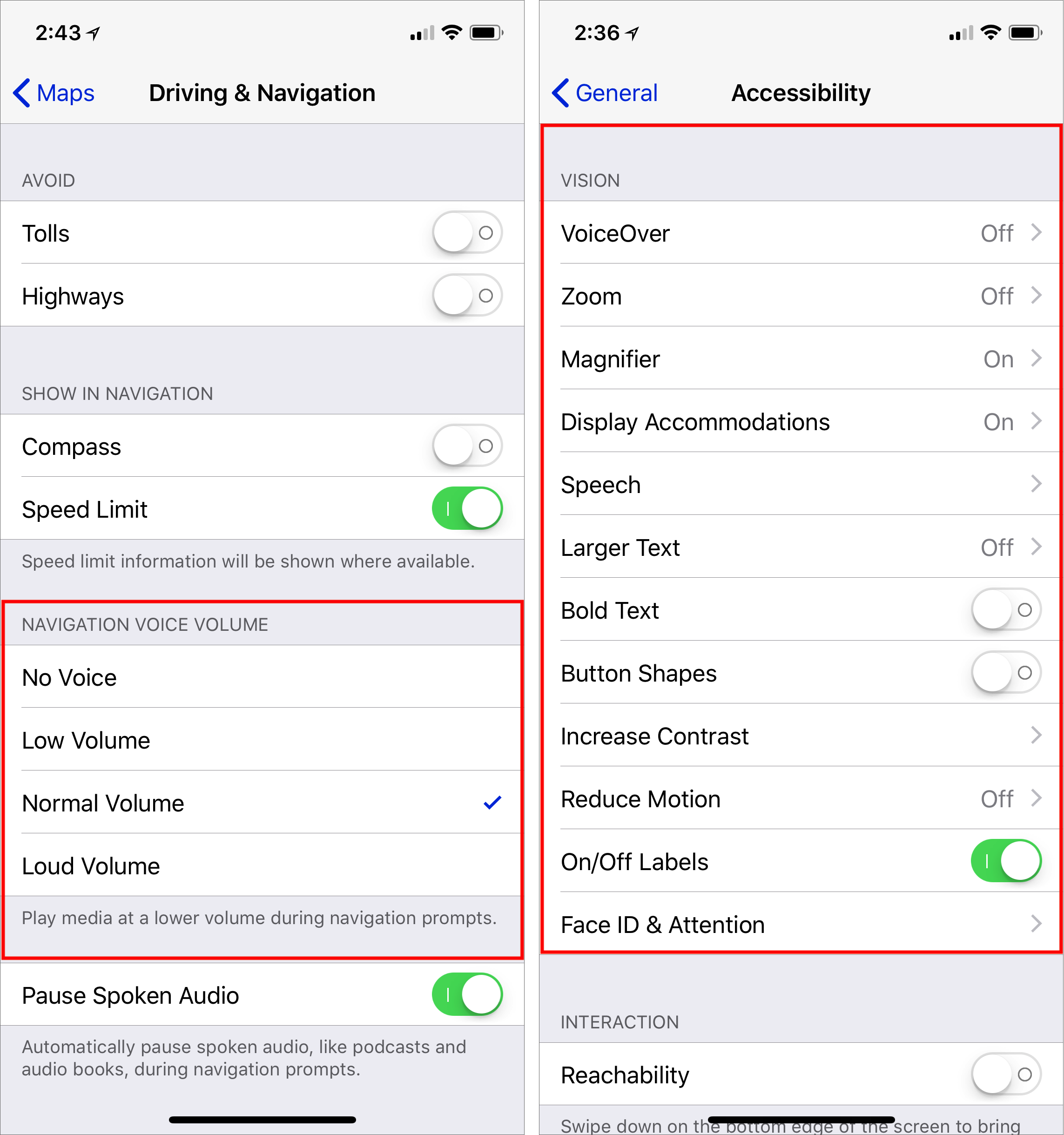
Don’t get me wrong. I’m not suggesting that Apple alphabetize everything slavishly. For lists of five or fewer items, you can take in all the items in one gulp and see the one you need. In some cases, such as Navigation Voice Volume, there are other approaches (low to high) that make much more sense (left, below). But for longer lists without such an obvious organizational scheme, such as the Vision settings in Settings > General > Accessibility (right, below), why not alphabetize them? Seems like that would be more accessible for all of us.
From your lips!
Aaargh! I was always aware of the weird listing arrangement.. but now that you've pointed out I "can't unsee" it.
Keep up the great work! ;-)
Sorry! :-)
Adam, looking at the order of the various settings controls, I think that the reason that Apple didn't list them alphabetically is that would have been an arbitrary organization.
It is apparent that Apple listed the controls in order of importance and expected frequency of use by the user. For example, General is more likely to be used than the settings below it, therefore it sits at the top of the list.
Alphabetical is arbitrary, but easily parsed by users who don't know what Apple's imposed order is. Yes, more people might want General than Display & Brightness, but do more people really want Wallpaper than anything below it? Who knows? Who could guess? Everyone's usage patterns are different, so guessing at what the average user wants will fail an awful lot of the time.
Speaking of weird arrangements... why can I not remove anything I don't want in Control Center? My iPhone is not my music player. I can't remember using the Lock function there. Volume already has handy-dandy buttons (at least for now, they may also be removed by Apple's button phobia). :rolleyes:
I'd really like to see an option to alphabetize the apps so I can readily find them when I want to delete one. At least the settings has a search feature.
That's a good idea, especially in the new world order where you can't do app management in iTunes. It could easily be added to the Settings app, which already provides alphabetical lists of apps in several places.
Of course, you can search for apps by pulling down on the home screen, but that's only helpful for launching them, not deleting them.
The General section is indeed a big mess.
I believe part of the Settings disarray stems form the days when Apple was concerned about people being able to quickly reach often switched settings (like wifi). But the proper solution to that was to make sure such settings can be toggled or accessed through Control Center. Once they've put everything in there that needs to be access frequently, that problem's fixed and they can set out to group things in Settings more logically and then alphabetically within for long lists.
By the way, I have been using alphabetical sorting in my macOS preferences forever and always felt like I was the only person in the world using it that way. To this day, I have not seen a single other user have it set up that way.
Very few people seem to know about Organize Alphabetically in System Preferences. But more do now!
Tipping my hat to you, Sir. :)
That is how I have the Control Panels in System Preferences arranged.
I talk about viewing System Preferences alphabetically in my "Take Control of Mac Basics" ebook, and I've been surprised at the level of feedback about that particular factoid in the ebook. It seems that quite a few power users have been unaware of this feature, but are delighted to discover it. (Dinner table conversations at my house often focus on obscure Mac tricks and tips. :-) )
Sys Prefs seems to launch more quickly when I use alphabetical sorting. On my older MacBook, it launches very slowly with the default display.
I don't find the layout that bad. What's bad is where things are placed IN the layout. The other day, I realized I had subscribed to a calendar twice and had duplicates. No problem, I'll unsubscribe to one.
I go to Settings->Calendar. Hmmm... Not there. I go to Mail because Calendars were there once. Nope. I go to iCloud settings on the top because that's where I setup my account. Not there.
I search for "Calendar". THere's Calendar under "Privacy", Calendar under "General", Calendar under "Calendar Alerts", Calendar under Privacy, and of course Calendar. I can't even find it when I Search for it!
I now go to Safari and search for unsubscribing a calendar on the iPhone. I get six different sets of directions because it was located in six different places in the last six iterations of iOS.
I finally discover that this setting is under "Accounts and Passwords". Under all of my accounts is "Subscribed Calendars". It took me, someone who had been an exclusive user of Apple products and has been on an iPhone for a decade 20 minutes to locate it.
"A" for Amen
Brilliant! You're hired!! (but you wouldn't want to move to Cupertino...)
Not enough weather out there for my tastes! :-)
To me the confusing thing with settings in iOS is that for some things you have to go to the Settings app whereas for others you have to tap the cog wheel in the app itself. I can sort of understand why it made sense with early editions of the iPhone but for my iPad this arrangement just doesn't work.
On the Mac the Finder's preferences are just a laugh, and while the System Preferences are sometimes confusingly organised, they do seem to focus on system-wide things.
I am a relatively newcomer to iOS-world, but it still feels odd every time to have to go to a different place to modify the behaviour of a given app.
But this cannot be a Bad Apple, because there is no simple solution, it all stems from the much simpler idea of how iPhones should work.
Yes, you've identified an inconsistency in the iOS approach — should preferences be in the app or always externalized? I think early on, Apple tried to get developers to externalize them, but that seems to have largely gone away, perhaps because many apps' preferences are in essence managing online accounts, rather than local device behavior.
All this wouldn’t be so bad if the Search function in Settings actually worked (as you briefly touched on). Why oh why doesn’t this work? Most of my searches come up blank and then I’m back to searching though all 1200 settings to find the one I’m looking for.
Yeah, it's unconscionable that search in Settings is so bad. Just index every darn word in the app!
The only setting I use every day on my iphone and ipad is the Safari delete all cookies etc. On my mac I also delete all local storage files and databases. Otherwise I select the settings I want at the outset and leave them untouched. Surely the latter is what most people do?
Everyone is different — I think your regular deletion of Safari data is extremely unusual, but hey, whatever works for you. Just don't assume others are similar. :-)
People who are watching cellular data usage would be checking that regularly; people who have older devices might be looking at battery usage regularly, etc. It just depends on your situation.
I didn't suggest most people would regularly delete Safari data and cookies. I suggested - hence the word “latter”- that most people surely would choose their settings at the outset and leave it at that.
(Amongst my other extremely unusuals is to delete all text messages and last calls on my iPhone as I go.).
More what I'm saying is that everyone has their own unusual behavior. The specifics of what you do may be uncommon, but the fact that you have such a behavior is not. Settings is a very commonly used app by an awful lot of people.
And Apple doesn't like individual unusual behavior; it is "Apple's Way or the highway!"
amen to that.
as you mention „search“ often failing in the settings app... search is another thing that might qualify as a „bad apple“ topic. „search“ in finder is hardly best in class and imho still quite behind where windows was even 20 years ago. (yes, „smart searches“ are nice, but i‘d prefer „good“ searches before that), „search“ in settings is just lazy by not implementing every word and menu options in settings. and „search“ in mail is pretty bad - i often can‘t even find fairly recent mails (say, within a week) of which i exactly know relevant keywords of. i usually either scroll down and search manually or open my gmail account on the web and find the mail i‘m looking for, using the exact same keyword.
If they could give my an option to alphabetize the iPhone Storage list of apps I could finally be happy with iOS.
I have used the application offloading to really free up space on py phone with the only downside being having to wait a bit to reinstall an app once in a while.
Sure, iOS is supposed to do this itself, but it's just not aggressive enough. Apps I rarely use are offloaded, and when I need them they install, then I want to uninstall them, but the list is in order of app size, which for my purposes is useless. It doesn't matter how big it is, if I need it. It needs to be sortable either by access date, or name.
This is an example of YMMV / different strokes for different folks in so many ways -- I use Airplane mode at least daily and battery almost never on my iPhone SE, while you say 'most' use them twice a year and often, respectively. Do Not Disturb is not a better solution than Airplane Mode for some situations, and has the bonus effect of saving battery charge!
Something that I didn't want to get into, because it was slightly off topic, is the fact that Apple has already broken out many frequently used controls from Settings into Control Center. So something like Airplane Mode, which is accessible via a swipe and tap in Control Center, doesn't need to be featured as prominently in Settings anymore. (Obviously, Settings predates Control Center.)
That said, you're absolutely right that people have very different usage patterns. My comment about very few people using Airplane Mode regularly was based on the fact that most people don't fly more than once or twice per year, if at all, and thus have no reason to use it for its intended purpose. But if it works for you as a "Do not bother me with anything at all" toggle, there's nothing wrong with that.
Even better would be to allow the user to rearrange ALL lists however they wish. Apple seems to have become Microsoft: "WE know what is best for you!" Apple: Get your freaking fingers off MY iPhone! You are providing MORE bloatware on it than PC vendors add to Windows. I would love to dump most of the pre-installed apps from iOS beginning with the garbage named iBooks.
Rearranging settings is problematic for a variety of reasons, not the least of which is that it makes tech support nearly impossible.
However, if you want to delete the pre-installed apps, nothing prevents you from doing that with many of them, including iBooks. Apple changed that a few versions of iOS ago.
There are still some, like Settings and Phone and Camera, that you can't delete, presumably because they're core functionality without which the iPhone makes no sense (what would happen if there was an incoming phone call and no Phone app?).
So if you don't like those apps, just put them in a folder and hide it on the farthest right home screen.
But should UI design for an *Apple* product be guided by supportability? I'd like to believe Apple's UIs are designed for near-zero support requirement.
Obviously that's a bit utopian (not to mention maybe no longer a priority for today's Apple), but it can nevertheless serve as the guideline. That said, there's always the search at the top that supporters could use to guide people to the right setting regardless of what arrangement a user has chosen.
Yes, everything should be designed for supportability because something that is easily supported is more easily understood generally.
It's the same with documentation — we've hit this many times over the years. If you can't document how to perform some task easily, the interface is badly done.
Documentation is entirely different. No matter how much documentation, it does not hamper the UI to have it.
But in the case of support, you are advocating UI not be improved (as suggested here) because that could interfere with support.
I claim support is only such an issue because the UI is poorly done in the first place. IMHO if they fix the underlying UI mess, support will not be necessary to the same degree. And even if it would be, support would not be affected if the present search functionality were fixed (like it should have been a long time ago).
All I'm saying is that in my extensive experience with thousands of Mac and iOS apps, if it's hard to document or support, it's also hard to use. Allowing users to rearrange settings willy-nilly would be a nightmare because people don't remember what customizations they've made, and then they get confused.
Heck, I've fallen into that trap myself when reporting bugs sometimes since I forget that I'm running some utility that changes the behavior underneath an app.
Two items
First, I use Airplane mode not only when I (infrequently) fly, but often as a handy single control to stop the phone from receiving any calls/messages/etc. which would cause a sound notification at times when sound would disturb others. I am pretty sure other people do make the same use of Airplane mode.
Second, a placement which I find awkward is the Reset Statistics control which is at the bottom of the entire Cellular item. I reset statistics once a month so I can keep track of the current months usage. To get to the control I have to scroll past the total list of apps with the button that controls wether each app can use cellular data. It would be more convenient to put all the statistics and the reset control above the long list of apps
I absolutely agree with your second point.
Regarding your first point, what is it that Airplane mode gets you that DND doesn't? Not questioning your use, just curious since I'm trying to figure out what I should be doing. I realize there's a battery bonus from AM compared to DND, but if the iPhone's plugged in anyhow (in my case)...
Why not allow the user to prioritize the settings most convenient to her? How difficult would it be to make the Settings menu rearrangeable for the convenience of the consumer? I'm surprised Adam didn't mention this. Apple allows list reorganization in Bookmarks, for example, and we can also customize the Control Center. Settings should be next!
I think the reason is that it would make tech support nearly impossible. Anytime someone called Apple or a consultant, unable to figure something out because of a setting, the only recourse would be to reset the user's prioritization.
Now, of course, this could be implemented in such a way that it would be easy to reset to default and easy to return to the user's preferred organization, but considering that there are 1200 items in Settings, that's kind of insane.
A better approach would be to give the user a special section at the top of Settings to which any Settings item could be added, without removing it from its normal spot. That way, users could get quick access to things they wanted, without losing the option of working through the entire set in a way that everyone else could understand and replicate.
Nope. Search is right there at the top. Not really a problem.
If search worked well, which it doesn't. :-(
I agree, but I consider that a reason to improve search, not hamper other UI improvements.
OMG, my thoughts exactly! I've been working on Macs since 1990. And every-time I have to deal with iOS while working with clients I have to make excuses for Apple's increasing lack of user interface acumen. Frankly, it's frickin' unintelligible. I was just saying this last week, why the hell doesn't Apple just make it Alpha?!!
I ABSOLUTELY agree that iOS Settings can be illogical to navigate. Steve Jobs pushed SIMPLICITY. Apple needs to rethink his philosophy.
I couldn't believe it took so long to find someone talking about this. Ever since I got my iPhone SE I've been baffled by the settings app (?). The breaks seem so random, and there is nothing clear about hardly any of them. It's a hunt and peck nightmare and I can't believe Apple has allowed it to become the travesty it is. I still think back to the joys of System 7/8 MacOS and the "it just works" mentality and shake my head at what the MacOS and iOS have become. There are so many options and features that most people don't know about and don't know how to use b/c there is no documentation (no, google searching is NOT documentation!). Norman has it right: https://www.youtube.com/watch?v=yY96hTb8WgI