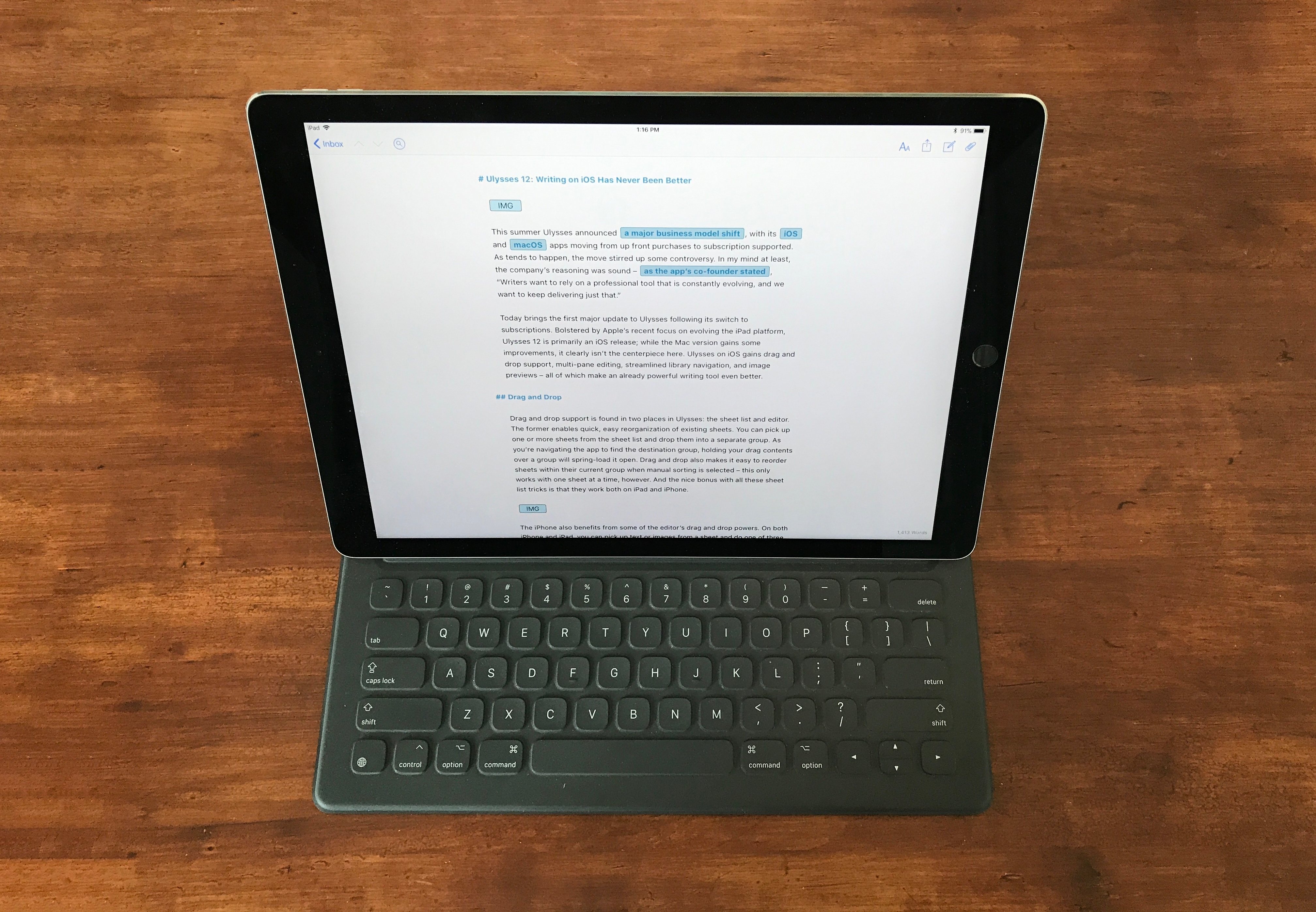
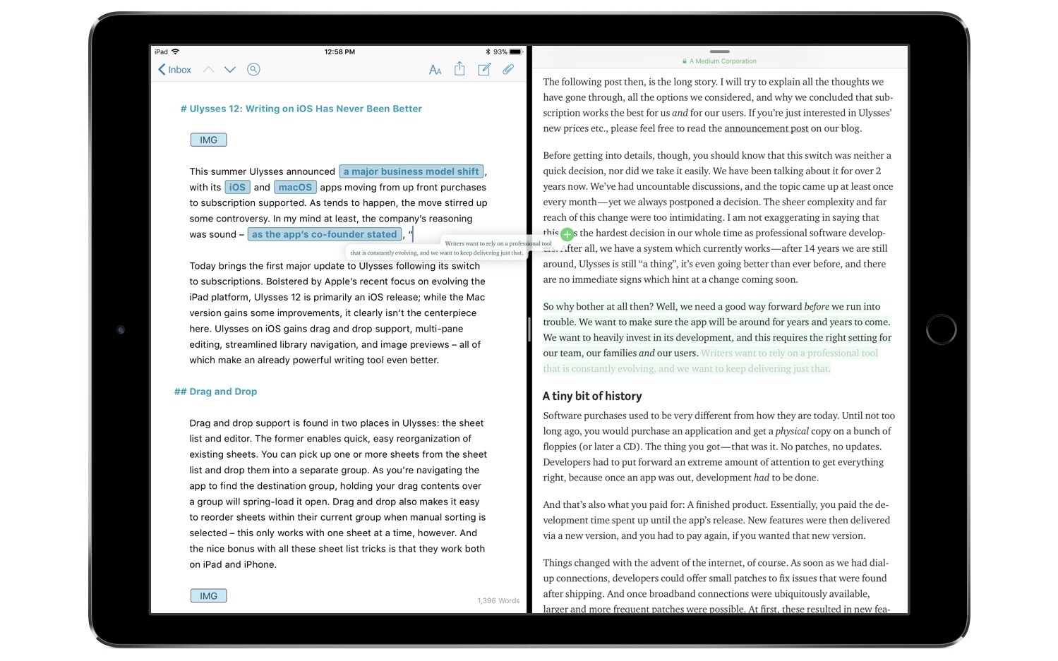
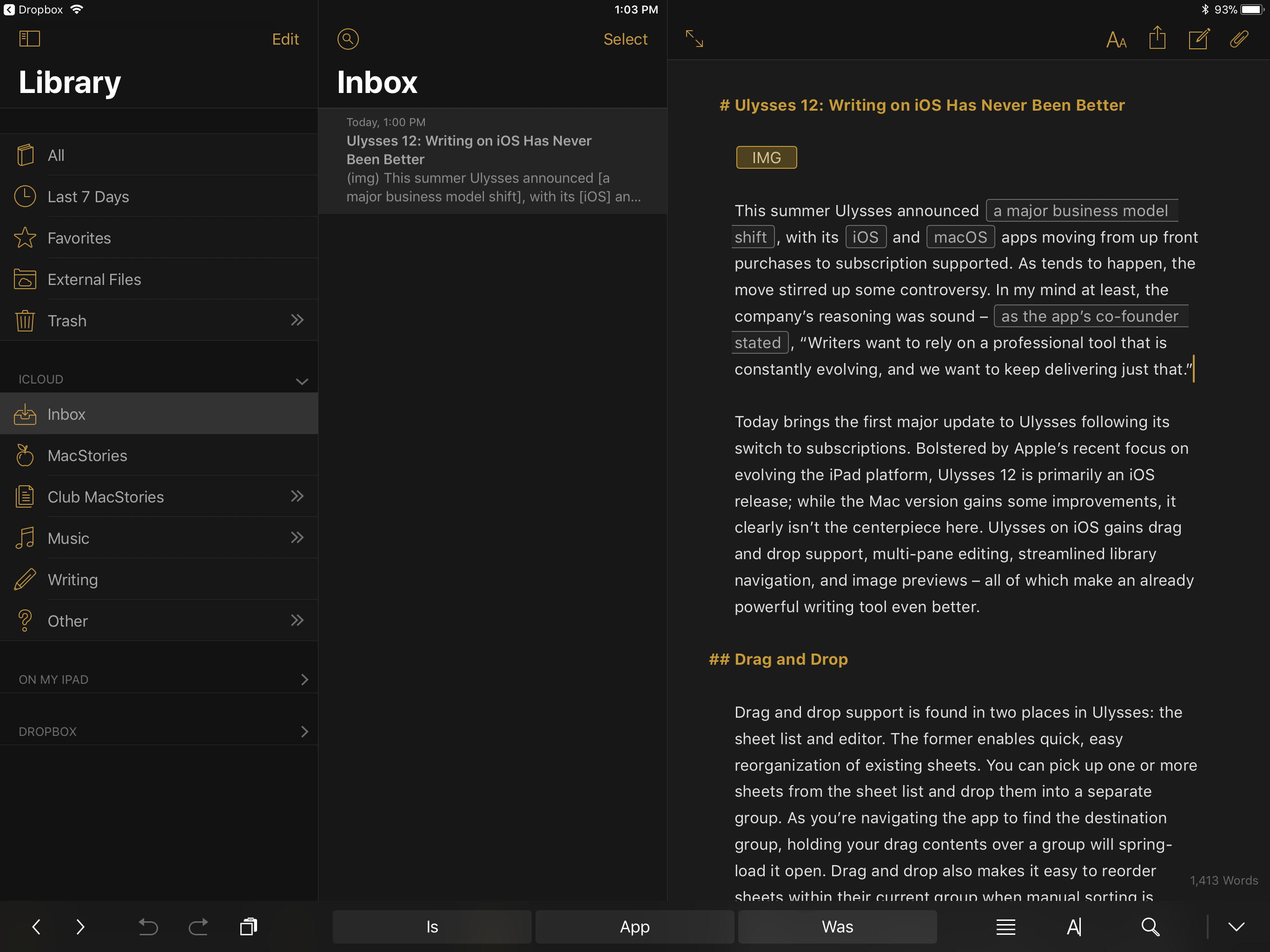
This summer Ulysses announced a major business model shift, with its iOS and macOS apps moving from up front purchases to subscription supported. As tends to happen, the move stirred up some controversy. In my mind at least, the company’s reasoning was sound – as the app’s co-founder stated, “Writers want to rely on a professional tool that is constantly evolving, and we want to keep delivering just that.”
Today brings the first major update to Ulysses following its switch to subscriptions. Bolstered by Apple’s recent focus on evolving the iPad platform, Ulysses 12 is primarily an iOS release; while the Mac version gains some improvements, it clearly isn’t the centerpiece here. Ulysses on iOS gains drag and drop support, multi-pane editing, streamlined library navigation, and image previews – all of which make an already powerful writing tool even better.
Drag and Drop
Drag and drop support is found in two main places in Ulysses: the sheet list and editor. The former enables quick, easy reorganization of existing sheets. You can pick up one or more sheets from the sheet list and drop them into a separate group. As you’re navigating the app to find the destination group, holding your drag contents over a group will spring-load it open. Drag and drop also makes it easy to reorder sheets within their current group when manual sorting is selected – this only works with one sheet at a time, however. And the nice bonus with all these sheet list tricks is that they work both on iPad and iPhone.
The iPhone also benefits from some of the editor’s drag and drop powers. On both iPhone and iPad, you can pick up text or images from a sheet and do one of three things with that lifted content: you can drop it inside its source sheet to move it within the sheet, drop it into a separate sheet to copy it there, or drop it into a sheet list to create a new sheet containing a copy of that content.
These in-app drag and drop features are thoughtful and thorough. As has been demonstrated by the iPhone-only Castro, drag and drop can be transformative even when limited to a single app. OmniFocus is another great example – even though it supports cross-app drag and drop, its in-app execution improves the task management experience in significant ways. The best thing about Ulysses treading a similar path is that the drag and drop actions you’d take on iPad work exactly the same on iPhone. No, you can’t take content out of the app like on iPad, but while working in the Ulysses app itself, your experience will be the same regardless of iOS device – a key benefit that shouldn’t be undervalued.
Aside from everything I’ve mentioned, Ulysses on iPad of course takes full advantage of the platform’s drag and drop privileges. Text and images can be dragged out of Ulysses or dropped into it. You can even drop text or images directly into the editor’s sidebar as attachments. My favorite application of cross-app drag and drop is dragging a portion of text from Safari into Ulysses – the selected text is seamlessly imported, and in most cases it’s converted automatically to the appropriate Markdown formatting, leaving no cleanup work for me to do.
Ulysses has promised that future updates will bring drag and drop to more areas of the app, such as export, but this doesn’t feel at all like a mere first take on drag and drop – if nothing more ever arrived, I’d still be content.
Multi-Pane Editing
For as long as I’ve used Ulysses on iPad, there has always been one annoying limitation I’ve wished would change: the inability to edit sheets while viewing your sheet list or library. Particularly because I work on a 12.9” iPad Pro, seeing the app’s various panes shift back and forth as I worked in each one, even though there was plenty of screen real estate to have everything stay on-screen at once, grew taxing. Ulysses 12 fixes this issue in a big way: now you can simultaneously view and work in as many panes as will comfortably fit on your screen. For me and my giant iPad, this means I can view the library, sheet list, and body of a sheet all at once – even while typing away.
Navigating different views in Ulysses is done with the simple swipe gesture found in prior versions of the app. This is a marked improvement over methods employed in Apple’s Notes and Mail, which require you to hit certain buttons to change views. It all works fluidly in Ulysses.
Image Previews
Historically, one of my favorite Ulysses features has been the way I can add Markdown links without needing to see the full syntax. That philosophy has always extended to inline images as well, but not in the way most users would want – image syntax has been hidden, but the image itself has been hidden too, behind a tag labeled ‘IMG’. This approach has made it impossible to view your images while doing the work of writing. I’ve grown used to regularly hitting the export button to see a WordPress publishing preview of my full post, images and all. But now, for many use cases at least, Ulysses provides image previews inline.
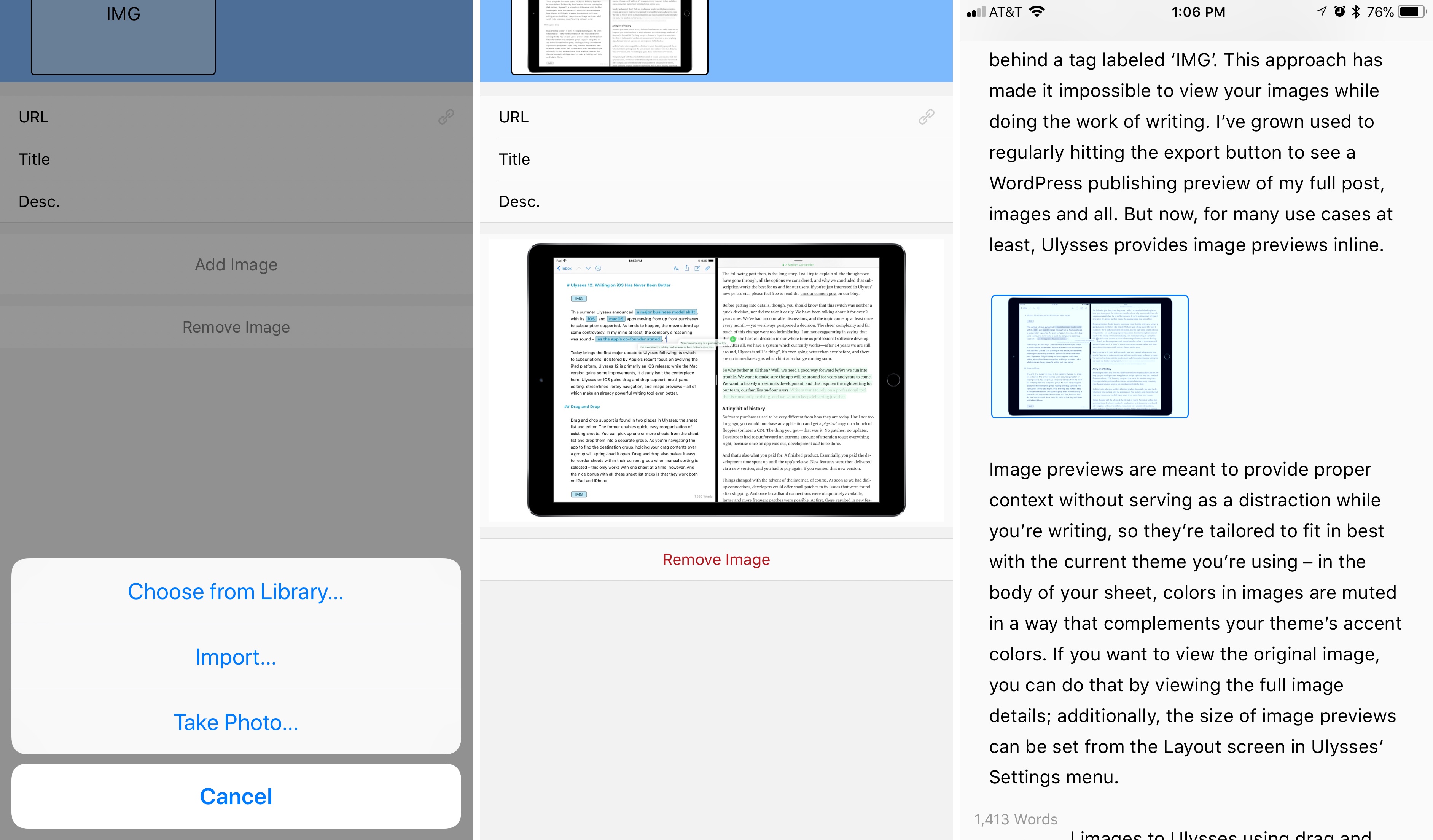
Image previews are meant to provide proper context without serving as a distraction while you’re writing, so they’re tailored to fit in best with the current theme you’re using – in the body of your sheet, colors in images are muted in a way that complements your theme’s accent colors. If you want to view the original image, you can do that by viewing the full image details; additionally, the size of image previews can be set from the Layout screen in Ulysses’ Settings menu.
If you add images to Ulysses using drag and drop or by adding from another app like Photos or Files, image previews will work great for you. Unfortunately, the way we handle images at MacStories prevents me from getting this benefit. We upload all images for the site to our CDN, then enter links to uploaded images in the body of our stories. Because the images aren’t actually stored directly in Ulysses, but are mere links, images for me continue to bear the ‘IMG’ tag inline with no actual preview.
Miscellany
Library: Like on the Mac, Ulysses’ library now contains all possible sources in one place, including iCloud, On My iPad/iPhone, and Dropbox. You can easily collapse and expand these, or disable the ones you don’t use in settings.
Design: Ulysses has implemented iOS 11’s trademark large titles, and also includes revised icons in several places throughout the app; I’m especially fond of the new icons, which provide greater clarity as to what actions they represent. Also, a sheet’s word count is now constantly visible, located at the bottom of the screen in a small, subtle grey font.
Mac Improvements: The Mac version of Ulysses gains image previews like its iOS companion, but besides that any new user-facing features are limited. The Ulysses team says the Mac version has received substantial performance improvements, but I never write on a Mac anymore, so I can’t adequately comment on those.
In early 2016 Ulysses proved that professional-level writing could be as great on iOS as it is on the Mac. Particularly on the iPad this rang true, but even the then-new iPhone edition of Ulysses was surprisingly good. Since that time the app has continued to evolve, making an already top-class writing experience even better.
I use Ulysses every day. Aside from a brief stint with Bear, it’s been my writing app of choice for over eighteen months now, during which time it’s proven itself the most capable, reliable, elegant tool to aid my work.
With its first major release after the switch to subscriptions, Ulysses proves that it’s still the best solution for me, and that it likely will be for a long while still. Drag and drop is a welcome addition, but it’s all the other changes and refinements that make this release truly special – my few small nitpicks with the app have almost all been taken care of in version 12.
Every user will have their own needs and preferences, but for my writing, I wouldn’t want to be without Ulysses.