This article is more than 1 year old
iPhone lawyers literally compare Apples with Pears in trademark war
'You shall not use the silhouette of any fruit' commands Cupertino idiot tax operation
In the never-ending effort by Apple to think higher of itself, the computer giant has opposed a trademark featuring the silhouette of a pear.
Pear Technology, which produces digital mapping software and services, applied for the pear logo in 2014 and was almost immediately challenged by Apple, which claimed it was confusingly similar to its own apple-with-a-bite-out-of-it silhouette logo.
The Cupertino intellectual property lawyers claimed that despite one being a picture of a pear and one being a picture of an apple they were, legally, the same. How? Here are the words that make this leap of logic possible: "abstract stylization" and "sleek, rounded silhouettes of the fruits."
As opposed to the jagged, spiky pears that you see in the supermarket all the time.
Even though the Pear Technologies trademark application had the word "Pear Technologies" written underneath as part of the mark, this mere detail was not enough to prevent consumers from being confused as to the difference between a pear and an apple, it seems.
The name Pear Technologies "must be assessed against the background of the fact that the word, where understood, merely reinforces the same concept as the one attributed to the sign's figurative element, thus creating a semantic unit."
And that's not even Apple's lawyer talking – that is the decision of the European Union Intellectual Property Office (EUIPO) which actually ruled for Apple and against Pear Technologies.
Nothing at all?
Surely they were able to see some variation in the two pictures – again, one being of a pear and one being of an apple?
"Admittedly, the arrangement of the oblong shapes differs in each sign, as, in the earlier mark, the leaf is angled to the right and stands separately from the apple shape, whereas in the contested sign, the stalk leans to the left and is attached to the pear-shape."
Uh-huh. Anything else? "Moreover, the signs differ in the specific shapes of the figurative elements, the fact that the contested sign features a grey shape with a black outline whereas the earlier mark is a solid black image, and the verbal element 'Pear Technologies' which has no counterpart in the earlier mark."
Normally, you would expect someone noticing that "the signs differ in the specific shapes of the figurative elements" would be enough to decide that they are actually two different things – but no.
However, these differences do not counter the visual similarity of the earlier mark to the image included in the contested sign ... Considering the foregoing deliberations from a visual perspective, the overall image arising from the graphic features of the pear in the contested sign would call to the relevant consumer's mind the earlier reputed trademark.
If all that isn't a textbook illustration of how over-paid lawyers use fancy words to try to hide a mountain of horseshit logic, we don't know what is.
But Apple won. Not only with this logo but also with another Pear Technologies logo that bears even less resemblance to the Apple logo. A pear made up of lots of different-sized squares no less. And then, it won again after Pear Technologies appealed and lost. We swear we're not making this up.
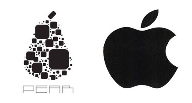
In case you can't tell, the pear is on the left
Nor are we making up that last month Apple went to court in Switzerland to prevent Swatch from using the advertising line "Tick Different" because, it claims, it infringes its "Think Different" tagline that it hasn't used for 20 years.
Which just goes to show, when it comes to trademarks, money talks and bullshit... bullshit is used to justify the decision. ®
