:format(webp)/cdn3.vox-cdn.com/uploads/chorus_asset/file/7349195/gallery_screen_family_01.png)
:format(webp)/cdn3.vox-cdn.com/uploads/chorus_asset/file/7349195/gallery_screen_family_01.png)
Google is launching a new suite of tools meant to make it easier for designers and app makers to collaborate. It’s partially an expansion of Google’s Material Design efforts, which launched two years ago as a way to rethink how software should be designed on touchscreens. But for Google, Material (which seems to be how Matias Duarte now refers to it) is much more about interaction than how it looks. And as part of that effort, Google is expanding its education about how Material works and making some collaboration tools that might be useful even if you’re not interested in Google’s app design philosophy.
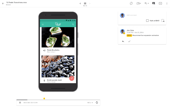
The first is simply called “Gallery,” and it’s a set of tools that work sort of like a GitHub for designers. It makes it easier for people to upload, share, and comment on designs. It will have some sort of version control, too, so you can add different iterations of what you’re working on and find them easily as you continue to work. It also has a presentation layer, so you can give out simple web links rather than pass around PDFs or Dropbox folders or whatever.
Inspired by Material Design, but works for anything
It’s the most interesting of the tools that Google is creating, because it takes the ideas and tools that engineers have used to iterate on their work and gives them to more creative people. (It’s also the sort of thing that might have made our own Brand Refresh process a little easier.)
Alongside Gallery, there’s Remixer, which allows app makers to create prototypes of apps that you can interact with directly — so you can both demo the design and change it on the fly right on your device or on a website. There’s also Stage, which speeds up the prototyping process and allows app makers to test out and demo movement in their apps at much earlier stages. It sort of combines tools we’ve seen before from Pixate and Form.
It all sounds pretty nerdy — and it is! But it’s nerdy in an interesting way, allowing designers and app makers to start playing around with how their projects will look and work way earlier in the process than before.
Though these tools are not meant exclusively for people trying to work with Material Design, they’re very much inspired by the same philosophy. The idea of integrating the motion and feel of apps early in the design process is essential to Material, and it’s probably why these things are showing up at material.io, the website for Google Material.
All the stuff we’ve traditionally expected from Material Design is there — guidelines on how to make buttons and tabs and drop shadows and all the rest. But Duarte is serious about talking about software design in a way that goes beyond how something looks and even beyond how it interacts or works — for him, Material is about what software is as an almost physical thing. Think of it as a sort of double reverse skeuomorphism — digital objects following physical rules, but rules native to the digital world. As Steve Jobs once put it, “Design is not just what it looks like and feels like. Design is how it works.”
But you don’t have to buy into that heady design philosophy to use the stuff that Google has created. Instead, you can head over to a new site, material.io, and sign up to try out all the news tools — most of which are going to be in limited beta to start.
Share this story